
Your landing page’s weakest score is CTA.
How Metronome ranks
- 1.
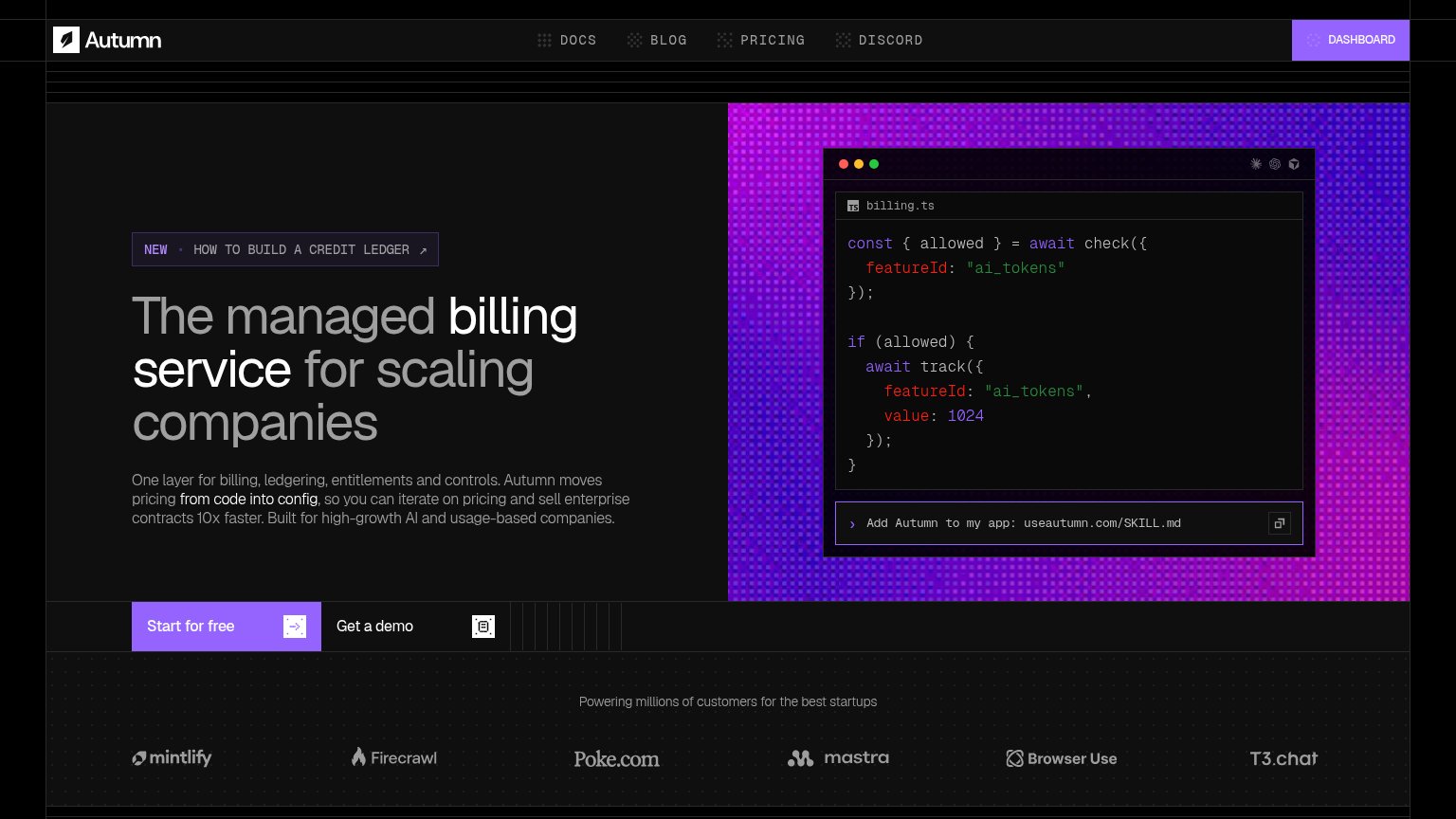
Autumn78
- 2.
Lago76
- 3.
Orb74
- 4.
Schematic74
- 5.
Metronome73
- 6.
Stigg70
CTA
72FairCopy, size, verb, cost-feel — does the primary CTA earn the click?

Problems
- header pushes 'Contact sales' instead
- generic label, no payoff named
- hero button small vs headline
- no header-echo of monetization promise
Value props
72FairTitle, subtitle, hero — do they sell the product's true value?
Metronome’s headline undersells
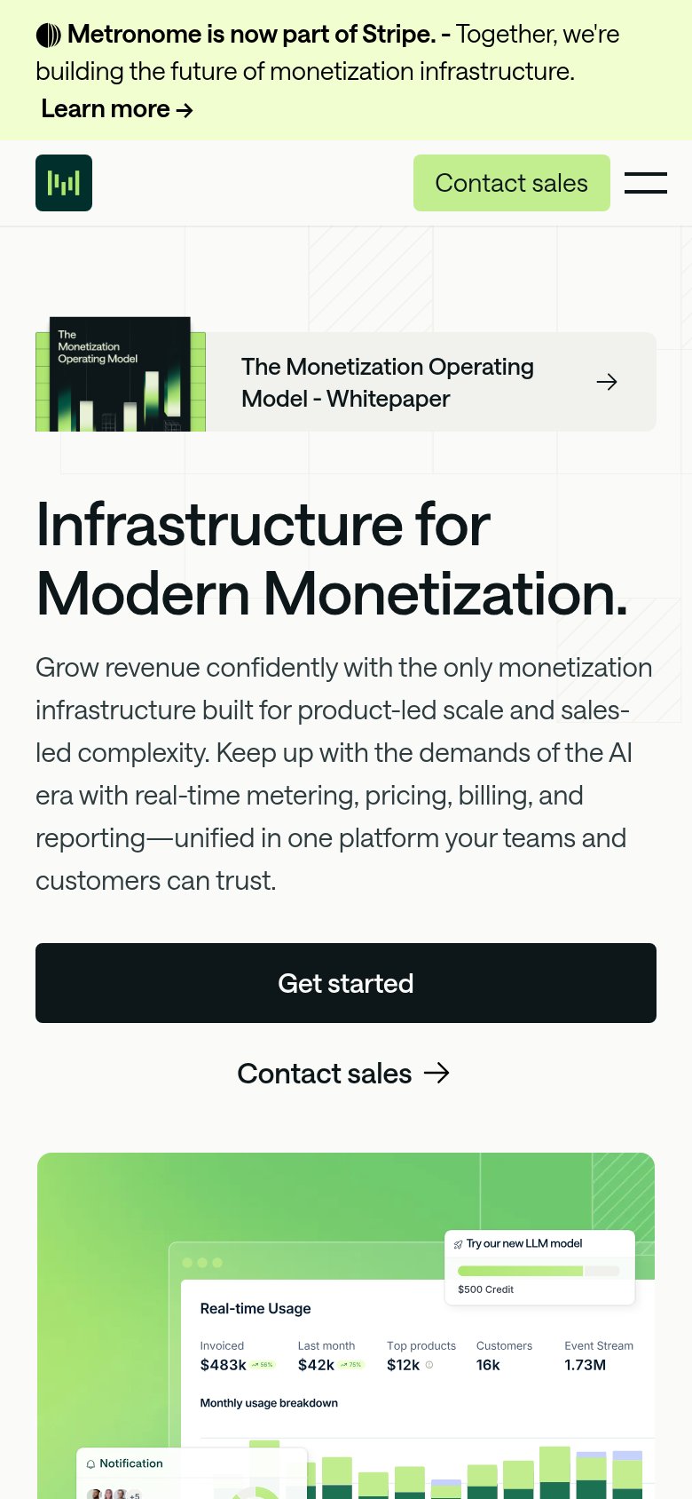
Infrastructure for Modern Monetization.
Grow revenue confidently with the only monetization infrastructure built for product-led scale and sales-led complexity. Keep up with the demands of the AI era with real-time metering, pricing, billing, and reporting—unified in one platform
Working
- Hero image shows real product dashboard
- Subhead names concrete capabilities
- "The only" stakes a differentiator claim
Could improve
- Headline is a category label, no outcome
- Subhead is long — 45+ words
- Numbers live in the image, not the copy
Trust
72FairProof that the product is real, competent, and safe to try.
How Metronome compares
Trust read
Mobile web
72FairThe phone experience as a first-class citizen.
What works
What to improve
Information hierarchy
78FairDoes the design help or inhibit what the page is trying to say?
What works
What to improve