
Your landing page’s weakest score is Value props.
How Subtrace ranks
- 1.
Coroot76
- 2.
Odigos75
- 3.
Subtrace70
- 4.
Pixie67
- 5.
Beyla (Grafana)66
70Growth scoreupdated
category scores
category scoresShowHide
Value props
58FairTitle, subtitle, hero — do they sell the product's true value?
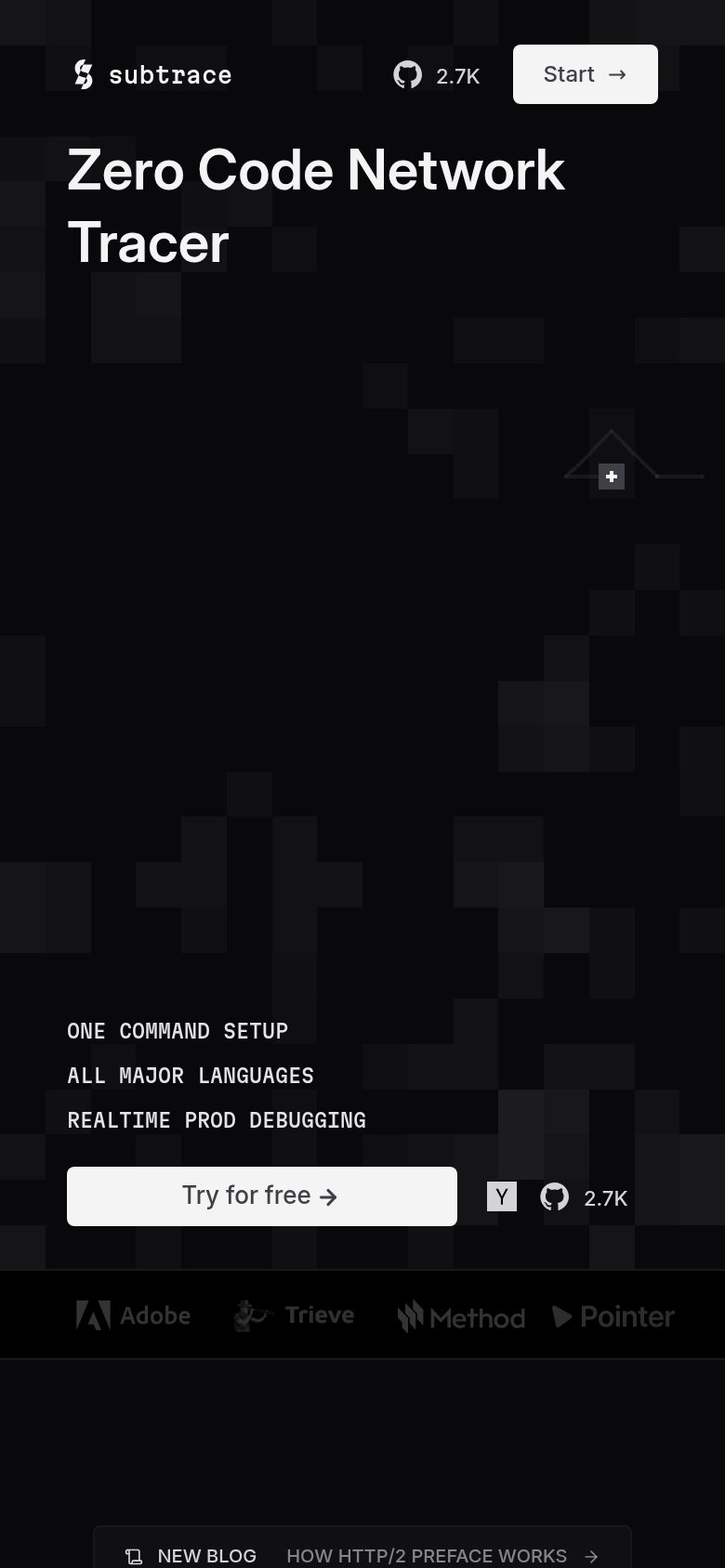
Subtrace’s headline undersells
Zero Code Network Tracer
Working
- Names the category plainly
- "Zero Code" flags the differentiator
- One-command setup hints at speed
Could improve
- No subhead explaining the outcome
- Hero art decorates, shows no product
- No numbers or proof in the copy
Information hierarchy
68FairDoes the design help or inhibit what the page is trying to say?
 123
- Hero benefit bullets — "ONE COMMAND SETUP" bullet stack is tiny monospace caps at the fold's bottom edge — the supporting message barely registers.
- Adjacent GitHub/HN icons — Y Combinator and GitHub star links sit flush against "Try for free", pulling clicks away at the moment of decision.
- Headline dead gap — ~400px of unanchored pixel-grid animation separates the headline from the bullets and CTA, breaking the scan path into two disconnected clusters.
Trust
68FairProof that the product is real, competent, and safe to try.
How Subtrace compares
Trust read
Mobile web
78FairThe phone experience as a first-class citizen.
What works
What to improve
CTA
80StrongCopy, size, verb, cost-feel — does the primary CTA earn the click?
How Subtrace compares
Recommended rewrites