
Your landing page’s weakest score is Trust.
How Pixie ranks
Trust
58FairProof that the product is real, competent, and safe to try.

| Trust read | |
|---|---|
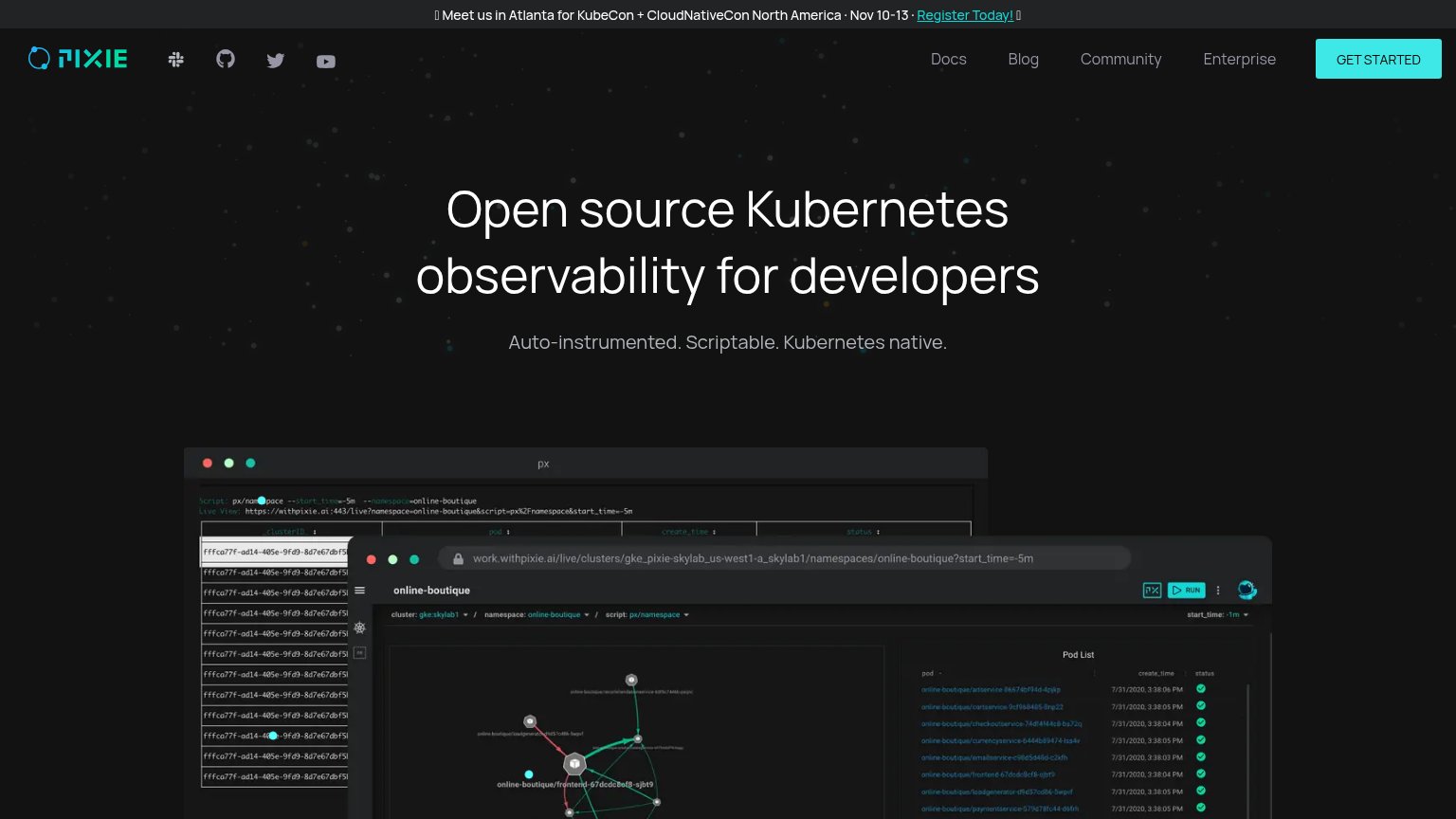
| Pixie | Real product screenshots: live Pixie UI at work.withpixie.ai showing a pod list, service dependency graph, and terminal |
| Customer logo strip: Adobe, Aetna, Hinge Health, Trieve, Method, Pointer | |
| Real "Service Map" product screenshot showing live services with RPS/latency data | |
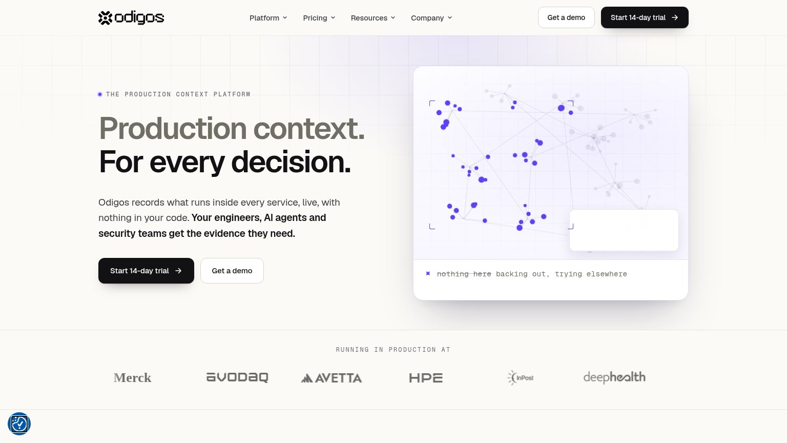
| "RUNNING IN PRODUCTION AT" logo strip with Merck, avodaq, Avetta, HPE, InPost, deepHealth | |
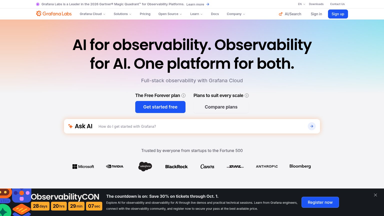
| "Grafana Labs is a Leader in the 2026 Gartner® Magic Quadrant™ for Observability Platforms" banner |
Mobile web
64FairThe phone experience as a first-class citizen.
 123
- GET STARTED button — Primary CTA sits a full viewport below the fold, behind a tall screenshot, and is not full-width.
- Product screenshot — Desktop-density UI shrunk to phone width; table text and labels are unreadably small.
- KubeCon promo bar — Wraps to three cramped lines and eats the top of the first viewport before the hero starts.
Value props
70FairTitle, subtitle, hero — do they sell the product's true value?
Pixie’s headline
Open source Kubernetes observability for developers
Auto-instrumented. Scriptable. Kubernetes native.
Working
Could improve
Information hierarchy
72FairDoes the design help or inhibit what the page is trying to say?
What works
What to improve
CTA
72FairCopy, size, verb, cost-feel — does the primary CTA earn the click?
How Pixie compares
Recommended rewrites