
Your landing page’s weakest score is Mobile web.
How Grafana Cloud ranks
- 1.
Datadog74
- 2.
Dynatrace74
- 3.
New Relic72
- 4.
Grafana Cloud66
- 5.
Honeycomb62
- 6.
Sazabi53
66Growth scoreupdated
category scores
category scoresShowHide
Mobile web
44PoorThe phone experience as a first-class citizen.
 1234
- ObservabilityCON promo overlay — Countdown promo covers the bottom ~40% of the first viewport and buries the primary 'Get started free' CTA below the fold.
- Hero headline block — Desktop-sized headline wraps into six cramped lines, consuming nearly the entire viewport before the value subhead finishes.
- Clipped subhead text — 'Full-stack observability with Grafana Cloud' is cut off mid-line by the promo overlay, breaking the value statement.
- Truncated announcement bar — Gartner banner truncates to 'Leader in the 202...', wasting the top strip on an unreadable message.
Value props
58FairTitle, subtitle, hero — do they sell the product's true value?
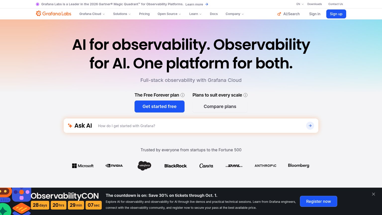
Grafana Cloud’s headline vague
AI for observability. Observability for AI. One platform for both.
Full-stack observability with Grafana Cloud
Working
- Fortune 500 logo bar builds credibility
- Gartner Leader banner adds proof
- Free Forever plan lowers entry barrier
Could improve
- Headline sells category, not outcome
- No product screenshot in the hero
- Subhead repeats buzzword, adds no specifics
Information hierarchy
62FairDoes the design help or inhibit what the page is trying to say?
What works
What to improve
Trust
82StrongProof that the product is real, competent, and safe to try.
How Grafana Cloud compares
Trust read
CTA
86StrongCopy, size, verb, cost-feel — does the primary CTA earn the click?
How Grafana Cloud compares
Recommended rewrites