
Your landing page’s weakest score is Trust.
How Coroot ranks
Trust
58FairProof that the product is real, competent, and safe to try.

| Trust read | |
|---|---|
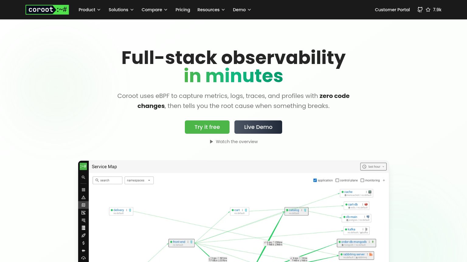
| Coroot | Real "Service Map" product screenshot showing live services with RPS/latency data |
| Customer logo strip: Adobe, Aetna, Hinge Health, Trieve, Method, Pointer | |
| Real product screenshots: live Pixie UI at work.withpixie.ai showing a pod list, service dependency graph, and terminal | |
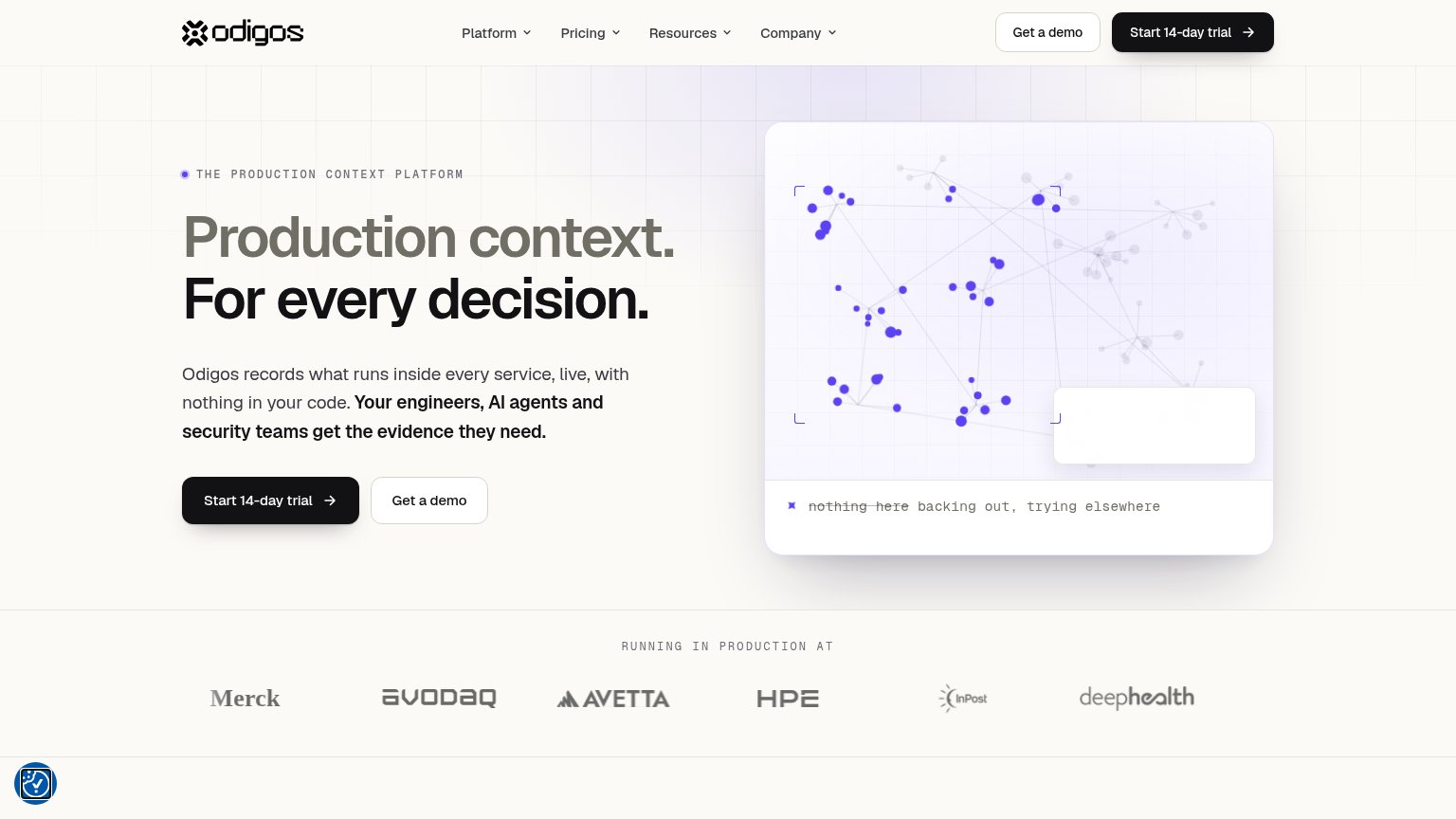
| "RUNNING IN PRODUCTION AT" logo strip with Merck, avodaq, Avetta, HPE, InPost, deepHealth | |
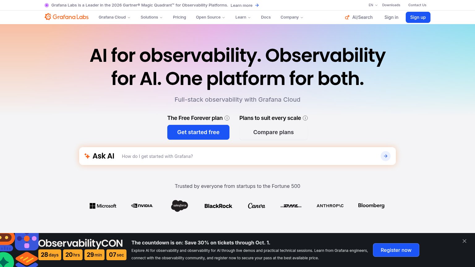
| "Grafana Labs is a Leader in the 2026 Gartner® Magic Quadrant™ for Observability Platforms" banner |
Mobile web
72FairThe phone experience as a first-class citizen.
 123
- Hero headline — Desktop-scale type wraps into three huge lines and eats half the fold before any CTA appears.
- Subheadline paragraph — Seven lines of oversized body copy push the primary CTA to the bottom third of the viewport.
- Service map screenshot — Product visual is cropped to an illegible sliver with microscopic labels, adding clutter without communicating anything.
Information hierarchy
82StrongDoes the design help or inhibit what the page is trying to say?
What works
What to improve
Value props
82StrongTitle, subtitle, hero — do they sell the product's true value?
Coroot’s headline
Full-stack observability in minutes
Coroot uses eBPF to capture metrics, logs, traces, and profiles with zero code changes, then tells you the root cause when something breaks.
Working
Could improve
CTA
87StrongCopy, size, verb, cost-feel — does the primary CTA earn the click?
How Coroot compares
Recommended rewrites