
Your landing page’s weakest score is CTA.
How Standout ranks
- 1.
Standout79
- 2.
Paraform77
- 3.
Wellfound76
- 4.
Underdog.io70
- 5.
Otta65
CTA
76FairCopy, size, verb, cost-feel — does the primary CTA earn the click?


Problems
- no 'free' despite visible free tag
- 'Talk to' implies a conversation cost
- nav 'Join' splits the label vocabulary
Trust
76FairProof that the product is real, competent, and safe to try.
| Trust read | |
|---|---|
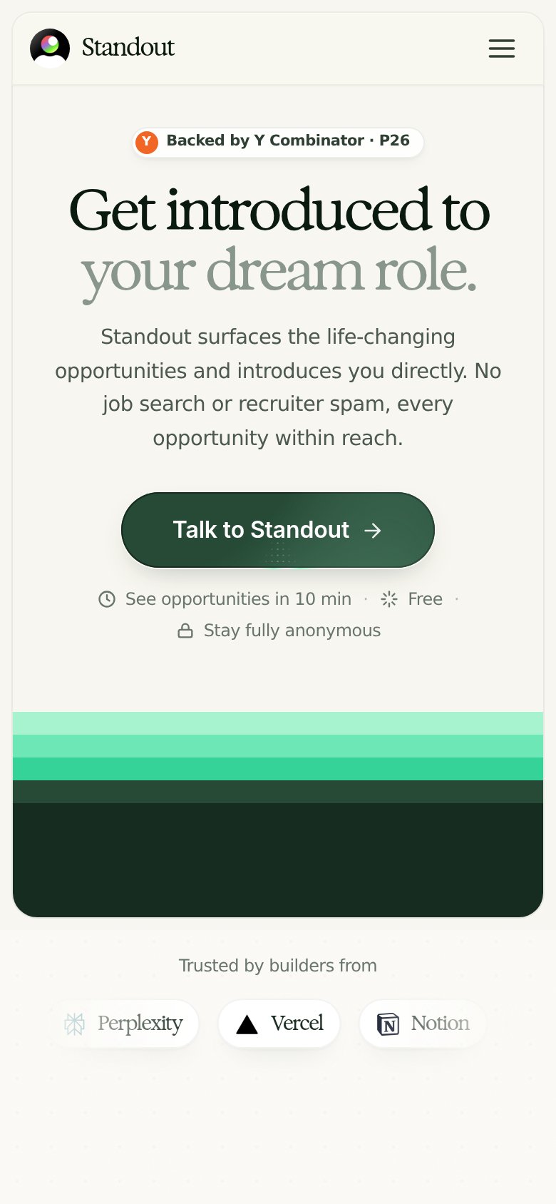
| Standout | "Backed by Y Combinator · P26" badge above the headline |
| "Apply directly to founders and hiring managers at 27,000+ startups" above the Browse jobs CTA | |
| implicit context Otta may benefit from pre-existing familiarity among its target audience. | |
| No visible trust signal identified. | |
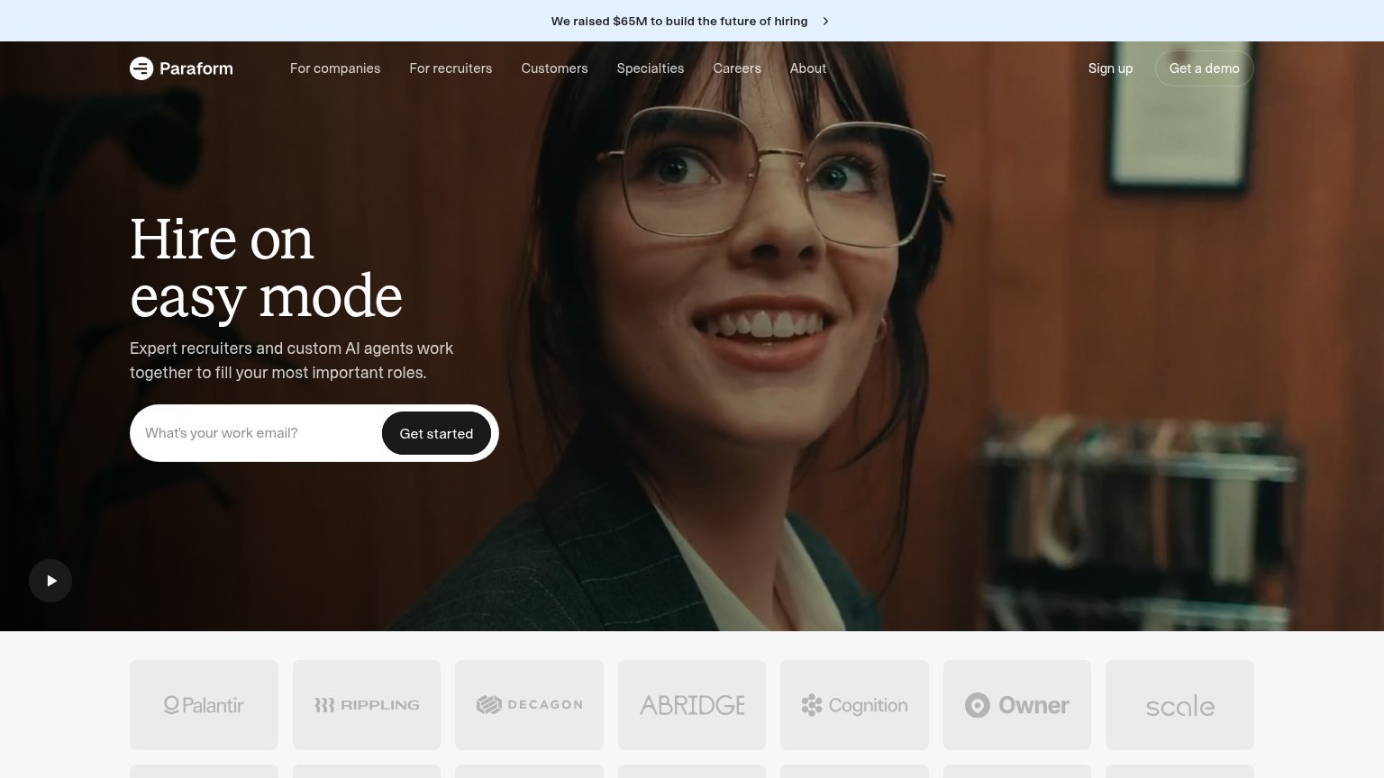
| Customer logo wall featuring Palantir, Rippling, Decagon, Abridge, Cognition, Owner, and Scale |
Information hierarchy
78FairDoes the design help or inhibit what the page is trying to say?
What works
What to improve
Value props
78FairTitle, subtitle, hero — do they sell the product's true value?
Standout’s headline
Get introduced to your dream role.
Standout surfaces the life-changing opportunities and introduces you directly. No job search or recruiter spam, every opportunity within reach.
Working
Could improve
Mobile web
86StrongThe phone experience as a first-class citizen.
What works
What to improve