
Your landing page’s weakest score is Trust.
How Otta ranks
Trust
38PoorProof that the product is real, competent, and safe to try.


| Trust read | |
|---|---|
| Otta | implicit context Otta may benefit from pre-existing familiarity among its target audience. |
| "Backed by Y Combinator · P26" badge above the headline | |
| "Apply directly to founders and hiring managers at 27,000+ startups" above the Browse jobs CTA | |
| No visible trust signal identified. | |
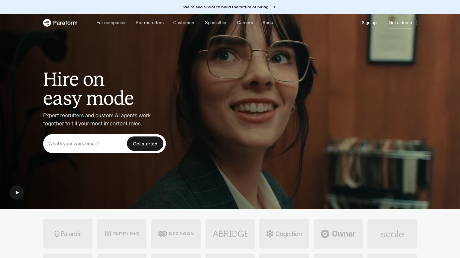
| Customer logo wall featuring Palantir, Rippling, Decagon, Abridge, Cognition, Owner, and Scale |
Mobile web
63FairThe phone experience as a first-class citizen.
 12
- Explore jobs CTA — Pushed to the very bottom of the fold beneath the illustration, headline, and four-line paragraph — most of the viewport must be scanned before the action appears.
- Hero illustration — Full-width illustration occupies roughly the top half of the mobile fold, displacing the headline and CTA downward without carrying the value proposition.
Value props
64FairTitle, subtitle, hero — do they sell the product's true value?
Otta’s headline
Find your people
Only relevant roles. Choose the right job, at the right company for you. Discover your top recommendations now.
Working
Could improve
CTA
78FairCopy, size, verb, cost-feel — does the primary CTA earn the click?

How Otta compares
Recommended rewrites
Information hierarchy
84StrongDoes the design help or inhibit what the page is trying to say?
What works
What to improve