
Your landing page’s weakest score is Trust.
How Wellfound ranks
Trust
72FairProof that the product is real, competent, and safe to try.

| Trust read | |
|---|---|
| Wellfound | "Apply directly to founders and hiring managers at 27,000+ startups" above the Browse jobs CTA |
| "Contrario launches after crossing $6M annualized revenue" announcement bar | |
| Customer logo wall featuring Palantir, Rippling, Decagon, Abridge, Cognition, Owner, and Scale | |
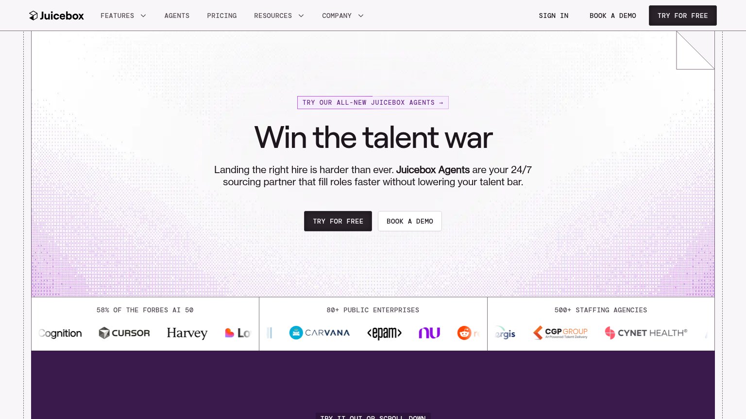
| "58% OF THE FORBES AI 50" logo band with Cursor, Harvey, Notion, Carvana, EPAM logos | |
| "Unmatched hiring transparency" table stating "This table shows every hire and the total cost to the company" |
Mobile web
72FairThe phone experience as a first-class citizen.
 12
- Start hiring button — Primary CTA sits far below the first viewport; nothing is tappable on landing except nav Sign up.
- Reach Agent feed — Employer activity cards consume the second scroll, pushing the candidate 'Browse jobs' path even deeper.
Information hierarchy
78FairDoes the design help or inhibit what the page is trying to say?
What works
What to improve
CTA
78FairCopy, size, verb, cost-feel — does the primary CTA earn the click?
How Wellfound compares
Recommended rewrites
Value props
78FairTitle, subtitle, hero — do they sell the product's true value?
Wellfound’s headline
Where great companies meet great people.
The AI recruiting platform for startups. Post jobs free, deploy AI sourcing agents, or hire with a dedicated recruiter.
Working
Could improve