
Your landing page’s weakest score is Trust.
How SnapCalorie ranks
81Growth scoreupdated
category scores
category scoresShowHide
Trust
72FairProof that the product is real, competent, and safe to try.
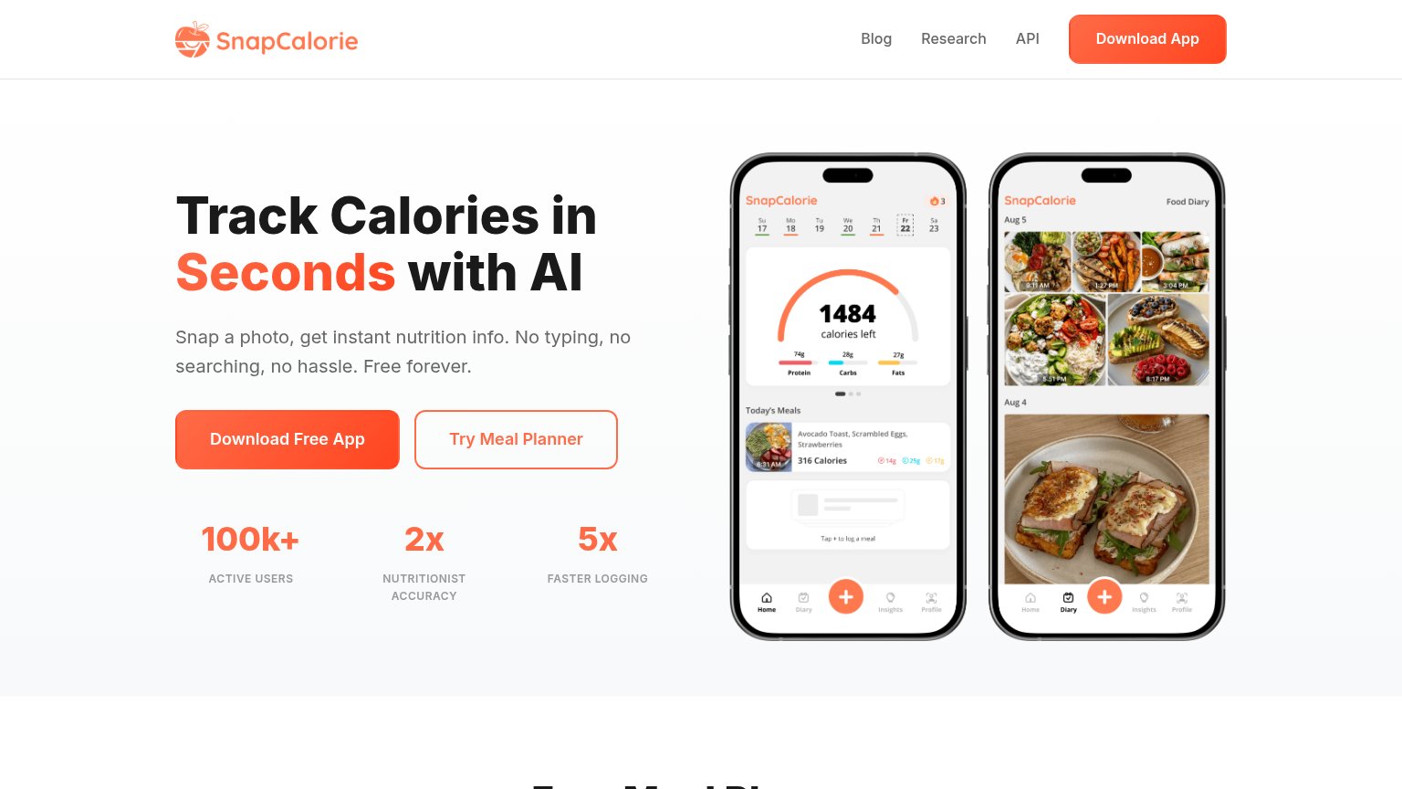
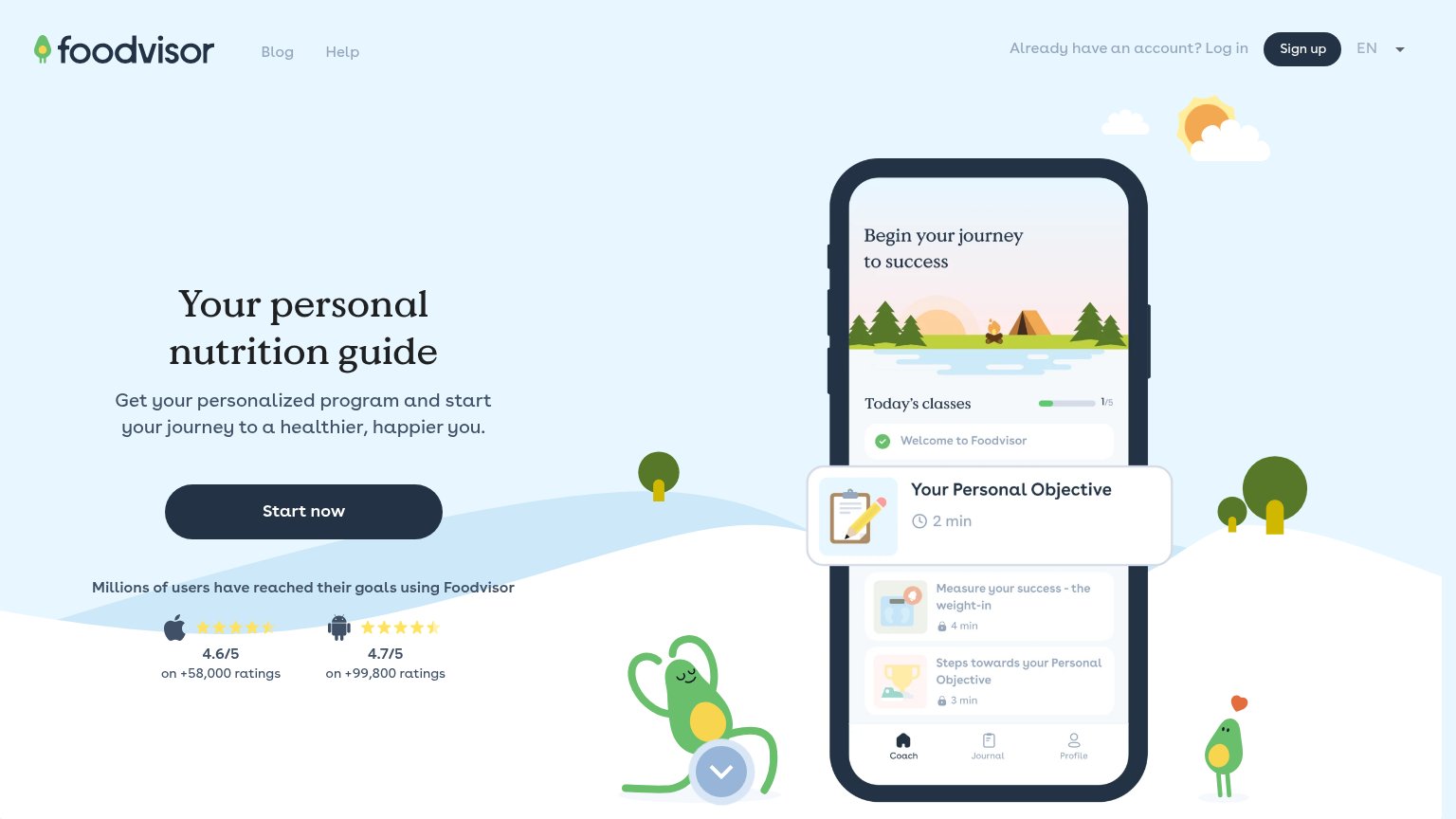
| Trust read | |
|---|---|
| SnapCalorie | "100k+ ACTIVE USERS" stat row beneath the CTA |
| Phone mockup showing meal scan UI labeling "Hokkaido Soup Curry" with "+12g Protein" and "+7g Fiber" | |
| "Loved by 5M users with 4.9 rating" pill with user avatars above the headline | |
| "4.6/5 on +58,000 ratings" (Apple) and "4.7/5 on +99,800 ratings" (Android) app store rating block | |
| "Nutrition Summary" dashboard UI with calorie/macro progress bars and Feeding Window timer | |
| Join over 280 million people on their journey to eat better, building lasting habits, and reach their goals. |
Information hierarchy
82StrongDoes the design help or inhibit what the page is trying to say?
123- Header Download App button — Duplicates the hero CTA at full weight, splitting attention between two identical actions.
- Try Meal Planner button — Same size as the primary CTA, creating a fork in the action path at the decision moment.
- Blog Research API nav — Three exit links sit in the scan path before the visitor reaches the conversion.
Mobile web
82StrongThe phone experience as a first-class citizen.
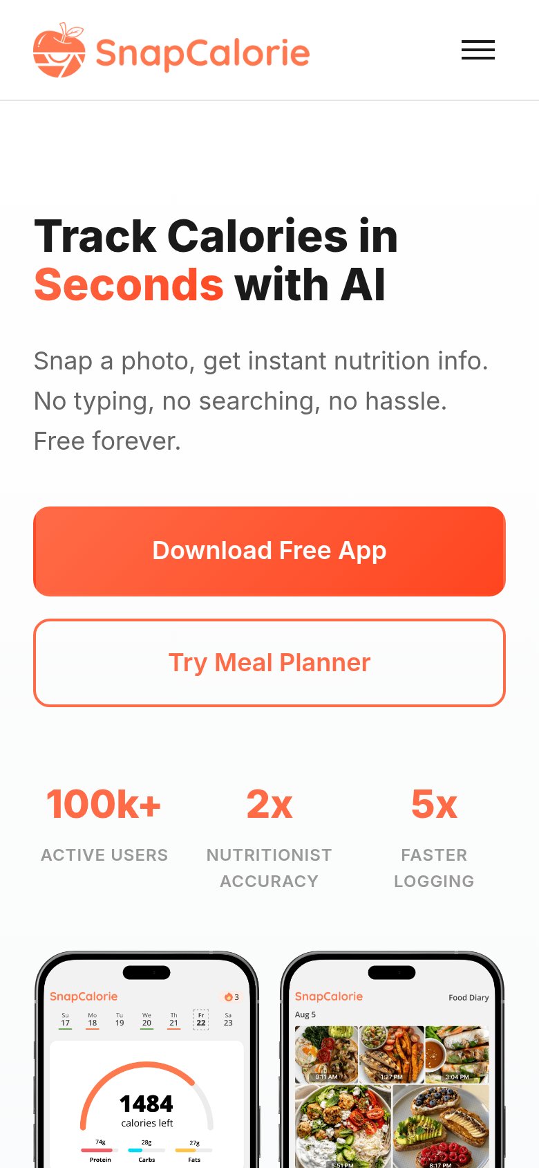
What works
What to improve
CTA
84StrongCopy, size, verb, cost-feel — does the primary CTA earn the click?
How SnapCalorie compares
Recommended rewrites
Value props
86StrongTitle, subtitle, hero — do they sell the product's true value?
SnapCalorie’s headline
Track Calories in Seconds with AI
Snap a photo, get instant nutrition info. No typing, no searching, no hassle. Free forever.
Working
Could improve