
Your landing page’s weakest score is Trust.
How MealSnap ranks
Trust
48PoorProof that the product is real, competent, and safe to try.
| Trust read | |
|---|---|
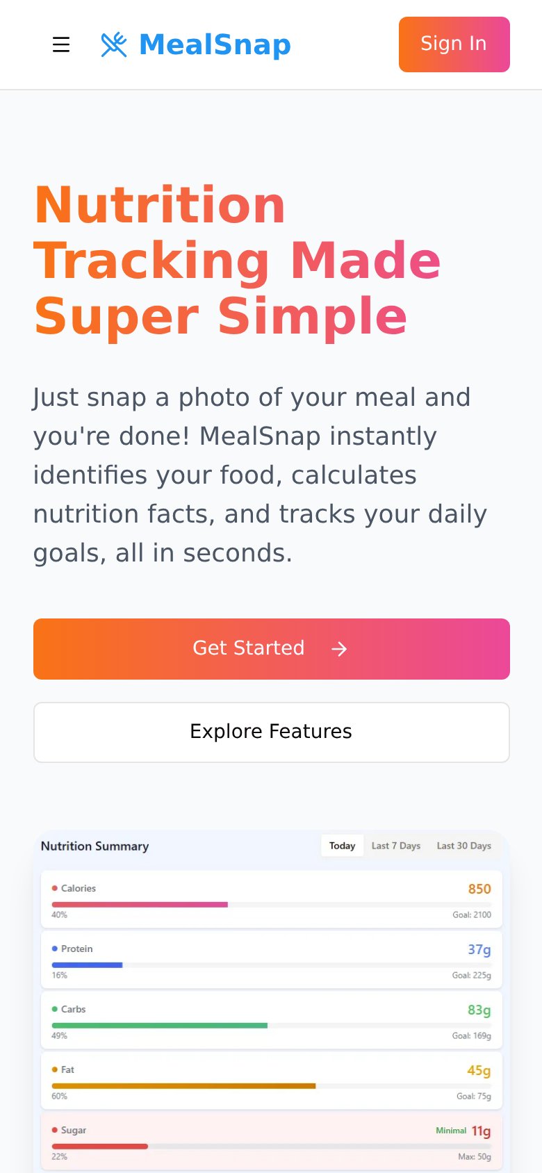
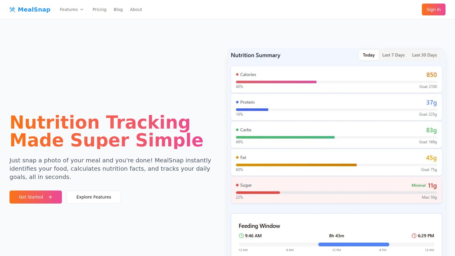
| MealSnap | "Nutrition Summary" dashboard UI with calorie/macro progress bars and Feeding Window timer |
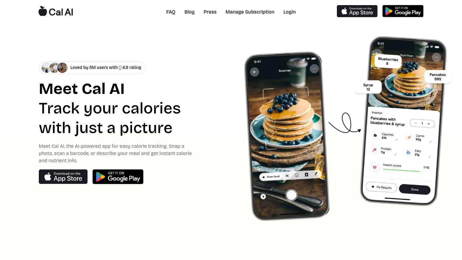
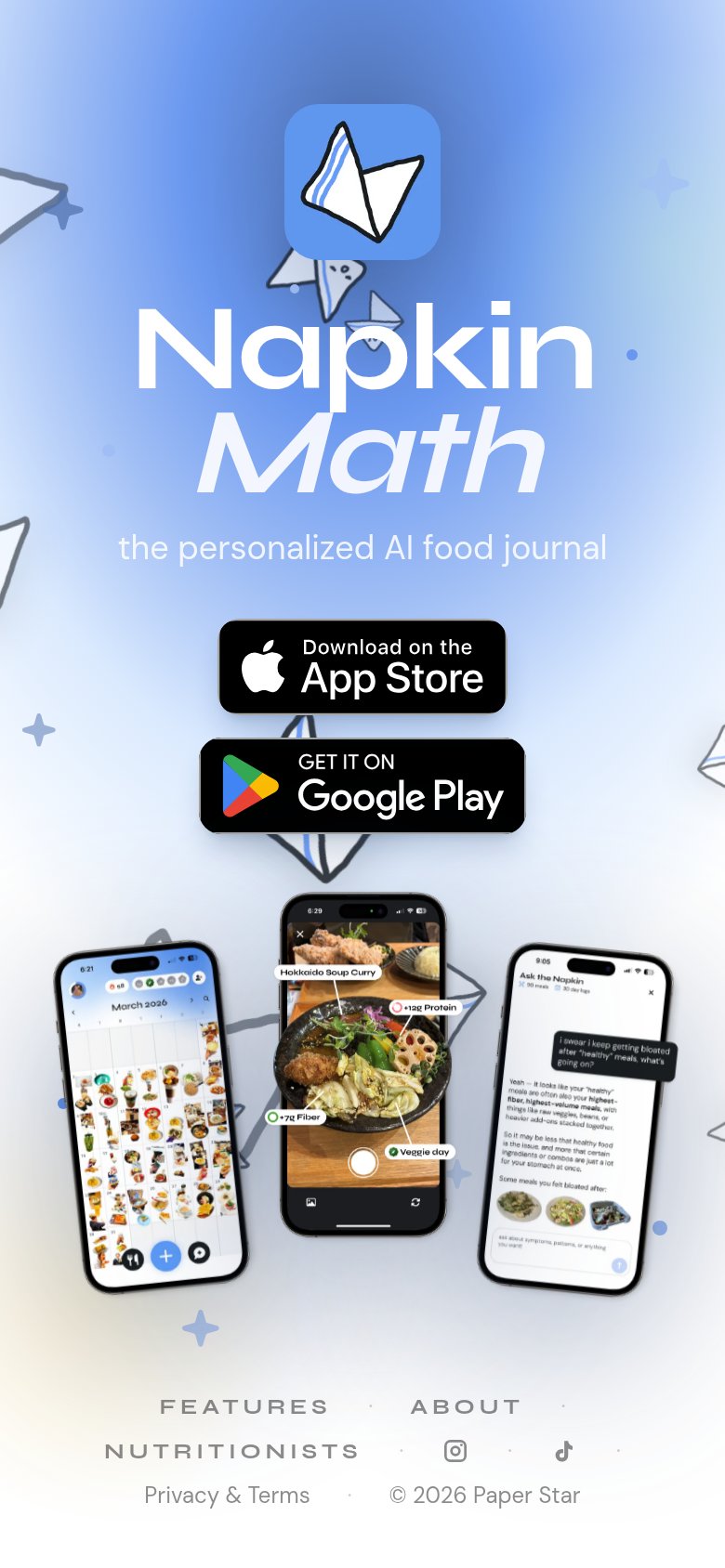
| Phone mockup showing meal scan UI labeling "Hokkaido Soup Curry" with "+12g Protein" and "+7g Fiber" | |
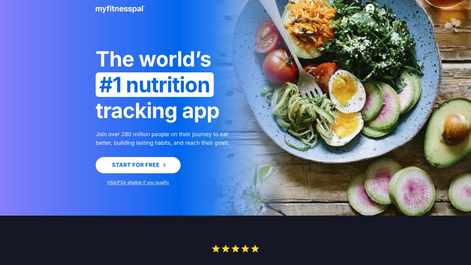
| "Loved by 5M users with 4.9 rating" pill with user avatars above the headline | |
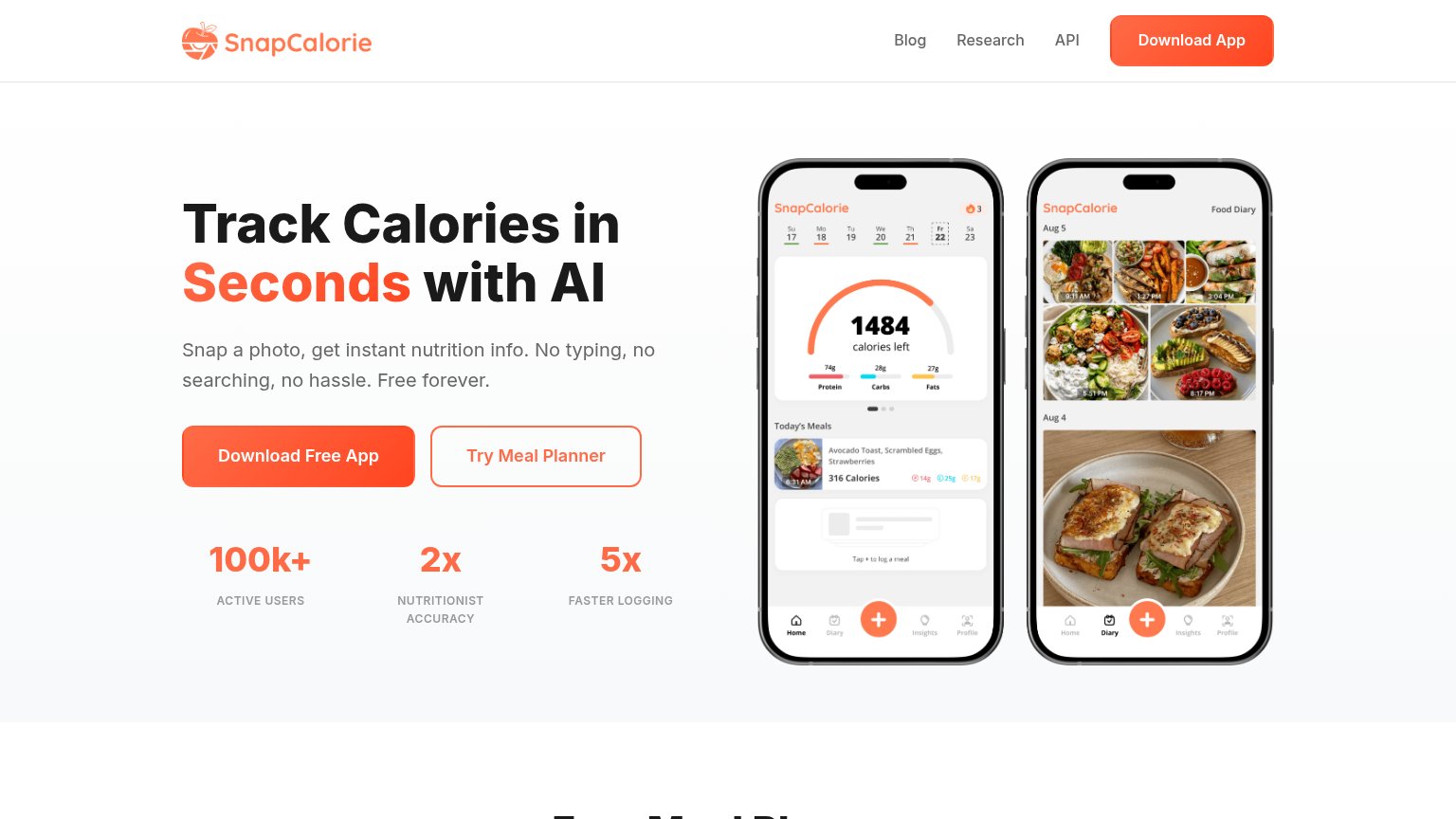
| "100k+ ACTIVE USERS" stat row beneath the CTA | |
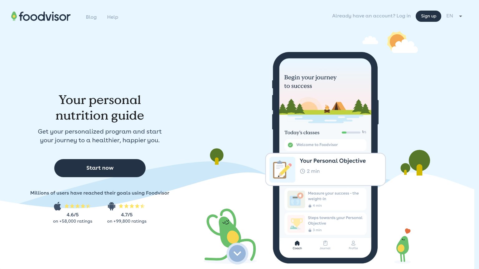
| "4.6/5 on +58,000 ratings" (Apple) and "4.7/5 on +99,800 ratings" (Android) app store rating block | |
| Join over 280 million people on their journey to eat better, building lasting habits, and reach their goals. |
CTA
72FairCopy, size, verb, cost-feel — does the primary CTA earn the click?
Problems
- generic label, no payoff named
- no echo of photo-snap promise
- header Sign In shares same gradient
Information hierarchy
78FairDoes the design help or inhibit what the page is trying to say?
What works
What to improve
Value props
78FairTitle, subtitle, hero — do they sell the product's true value?
MealSnap’s headline
Nutrition Tracking Made Super Simple
Just snap a photo of your meal and you're done! MealSnap instantly identifies your food, calculates nutrition facts, and tracks your daily goals, all in seconds.
Working
Could improve
Mobile web
78FairThe phone experience as a first-class citizen.
What works
What to improve