
Your landing page’s weakest score is Mobile web.
How SmaXtec ranks
38Growth scoreupdated
category scores
category scoresShowHide
Mobile web
28PoorThe phone experience as a first-class citizen.
 123
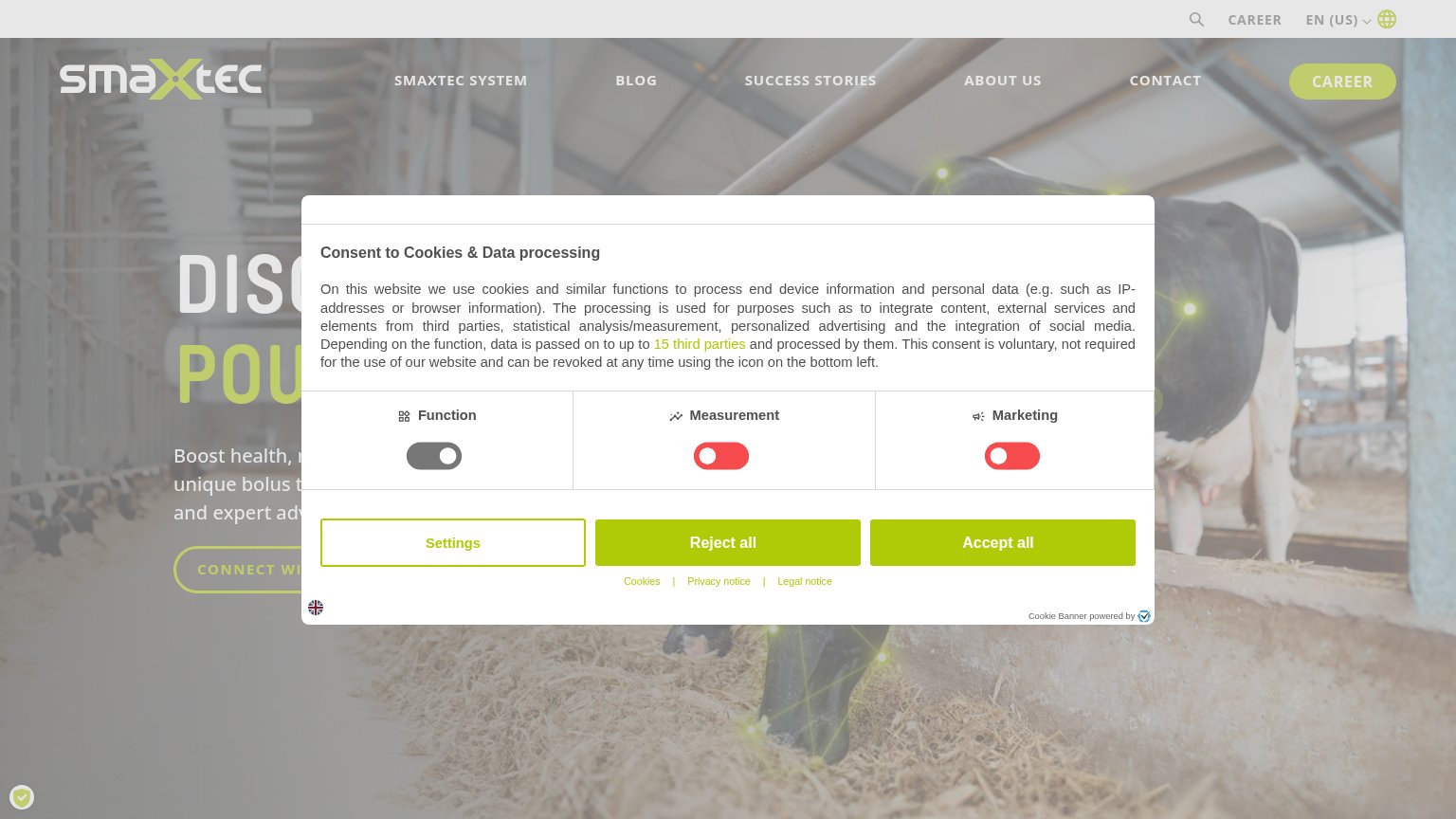
- Toggle grid layout — Three desktop consent columns crammed side-by-side squeeze 'Measurement' and 'Marketing' labels against tiny toggles.
- Reject/Accept same styling — 'Reject all' and 'Accept all' share identical solid green styling, giving equal weight to the anti-conversion choice.
- Double-decker sticky header — A utility bar with search, CAREER and language selector eats the top of the phone viewport before any brand content.
Information hierarchy
38PoorDoes the design help or inhibit what the page is trying to say?
 1234
- Cookie consent modal — Full-width dialog covers the headline, subtext, and CTA, blocking the entire value proposition at first paint.
- Hidden hero CTA — "CONNECT WI..." button sits behind the modal and is an outlined ghost style even when visible — too weak for the primary action.
- Truncated headline — "DISC..." / "POU..." is cut off by the modal, so the core message never lands in the first viewport.
- Nav plus career button — Six nav items plus a pill-styled CAREER button outrank the buried hero CTA and offer seven exits before the promise is read.
Trust
38PoorProof that the product is real, competent, and safe to try.
How SmaXtec compares
Trust read
Value props
42PoorTitle, subtitle, hero — do they sell the product's true value?
SmaXtec’s headline
DISC… / POU… (obscured by cookie consent modal)
Boost health, r… unique bolus t… and expert adv… (partially obscured)
Working
Could improve
CTA
44PoorCopy, size, verb, cost-feel — does the primary CTA earn the click?
How SmaXtec compares
Recommended rewrites