
Your landing page’s weakest score is Mobile web.
How Moocall ranks
75Growth scoreupdated
category scores
category scoresShowHide
Mobile web
58FairThe phone experience as a first-class citizen.
 1234
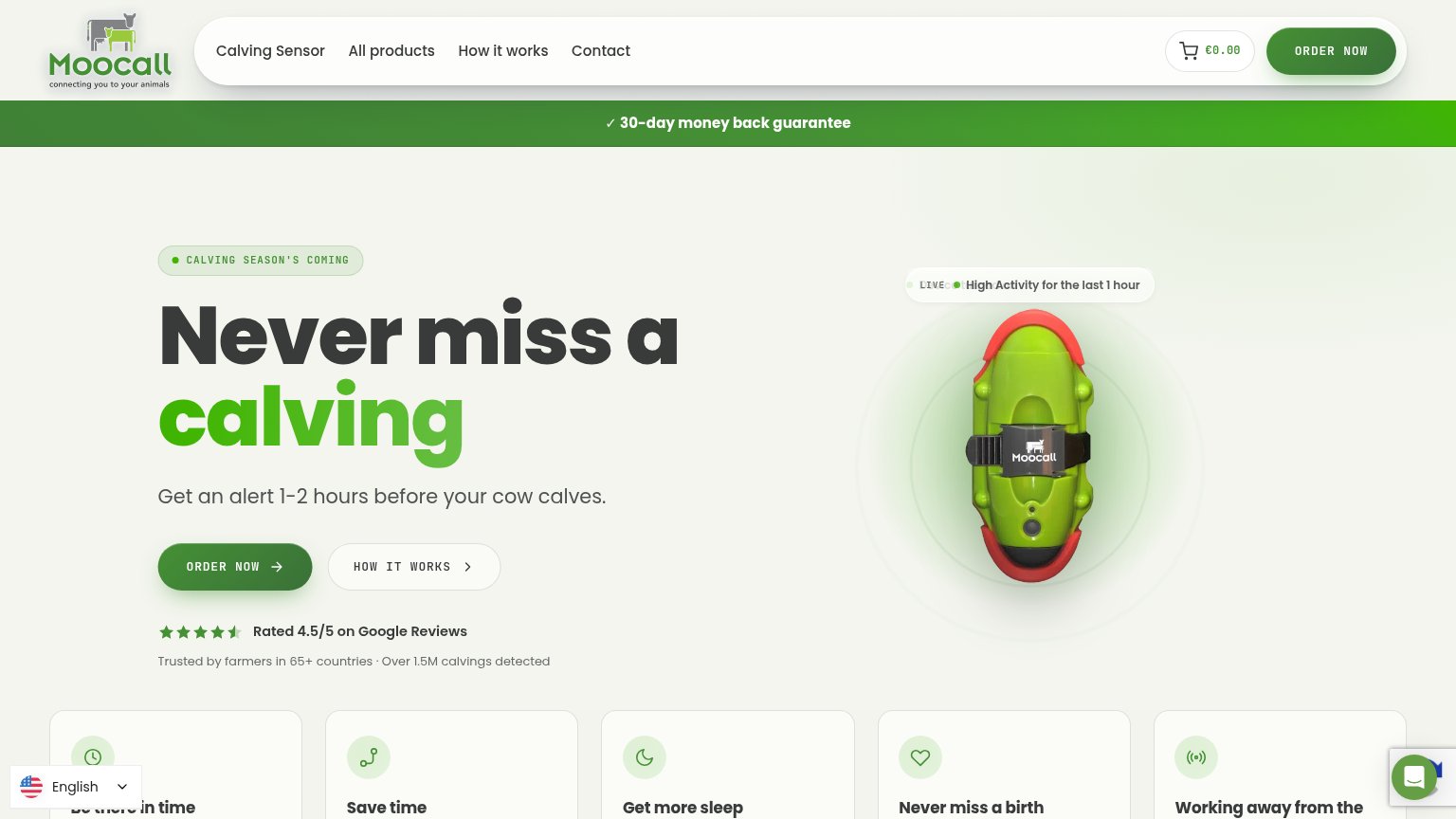
- Product image height — The device render occupies ~550px of the first viewport, pushing the headline and ORDER NOW CTA below the fold.
- Chat bubble overlap — The chat widget sits on top of the reviews line and a stray blue element, obscuring social proof text.
- Language picker overlap — The English selector overlays and truncates the 'Rated 4.5/5 on Google Reviews' proof line.
- Duplicate cart icons — Two adjacent circular buttons (bag and cart) in the header duplicate one function and add tap ambiguity.
Information hierarchy
74FairDoes the design help or inhibit what the page is trying to say?
 1234
- Duplicate ORDER NOW buttons — Nav and hero both carry identical dark-green ORDER NOW pills, splitting the scan path between two same-weight primaries.
- LIVE badge overlap — The 'LIVE' tag collides with 'High Activity' text, rendering as garbled overlapping type on the product card.
- Five-card benefit row — Five equal-weight cards crest the fold with titles cut off mid-line, adding density without a readable payoff.
- Language picker widget — Floating English selector sits bottom-left inside the fold, competing with content and clipping the benefit card beneath it.
CTA
76FairCopy, size, verb, cost-feel — does the primary CTA earn the click?
How Moocall compares
Recommended rewrites
Trust
78FairProof that the product is real, competent, and safe to try.
How Moocall compares
Trust read
Value props
88StrongTitle, subtitle, hero — do they sell the product's true value?
Moocall’s headline
Never miss a calving
Get an alert 1-2 hours before your cow calves.
Working
Could improve