
Your landing page’s weakest score is Value props.
How CowManager ranks
43Growth scoreupdated
category scores
category scoresShowHide
Value props
34PoorTitle, subtitle, hero — do they sell the product's true value?
CowManager’s headline vague
St… S…
Working
- Feature list names real hardware (Ear Sensor)
- Nav labels hint at farmer-focused proof stories
Could improve
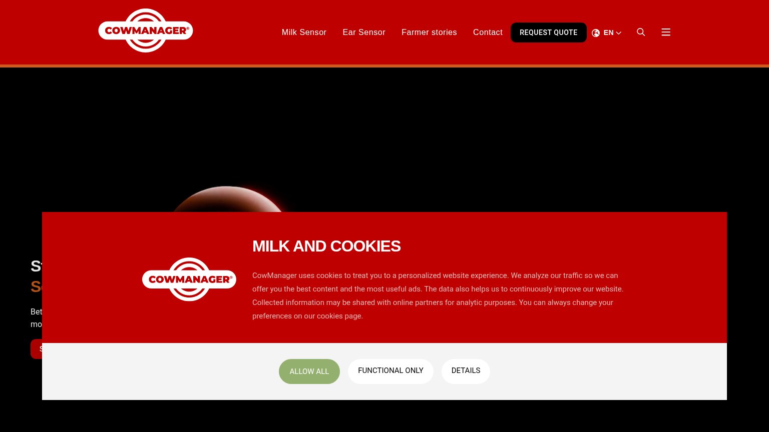
- Cookie modal fully blocks the hero pitch
- No visible outcome or numbers
- Hero image too dark to show the product
Information hierarchy
42PoorDoes the design help or inhibit what the page is trying to say?
 123
- Cookie consent modal — Covers the entire center of the fold, hiding the headline and value proposition on first paint.
- Truncated hero CTA — The hero's own action button is cut off by the modal, leaving no findable primary action in the fold.
- Hamburger menu icon — Duplicates the already-visible nav and adds a second exit control competing with REQUEST QUOTE.
Trust
42PoorProof that the product is real, competent, and safe to try.
How CowManager compares
Trust read
Mobile web
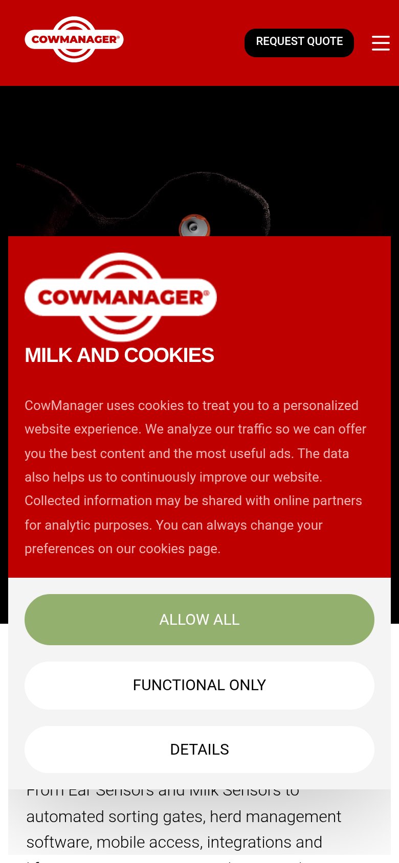
42PoorThe phone experience as a first-class citizen.
What works
What to improve
CTA
56FairCopy, size, verb, cost-feel — does the primary CTA earn the click?
How CowManager compares
Recommended rewrites