
Your landing page’s weakest score is CTA.
How Connecterra ranks
CTA
48PoorCopy, size, verb, cost-feel — does the primary CTA earn the click?
Problems
- 'Register interest' feels costly
- no CTA in hero section
- mobile fold has no CTA at all
- nav-sized button, weak footprint
Trust
56FairProof that the product is real, competent, and safe to try.
| Trust read | |
|---|---|
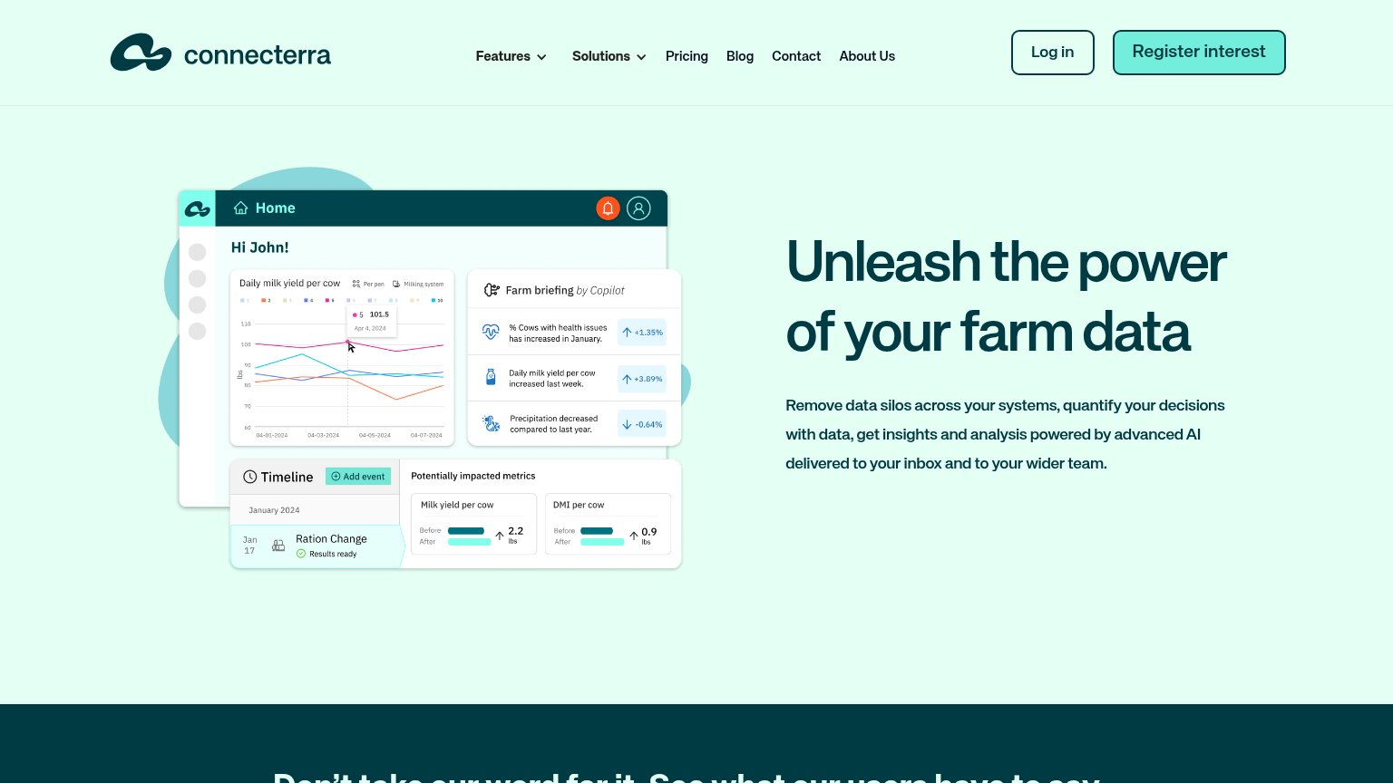
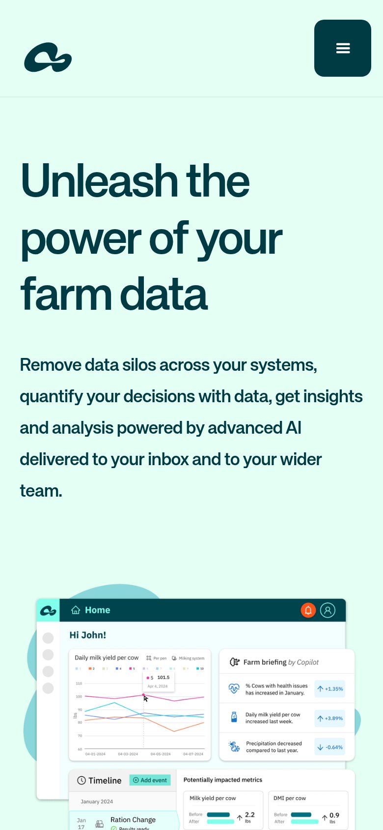
| Connecterra | Product UI mock with "Farm briefing by Copilot" panel showing specific metrics like "Daily milk yield per cow increased |
| No visible trust signal identified. | |
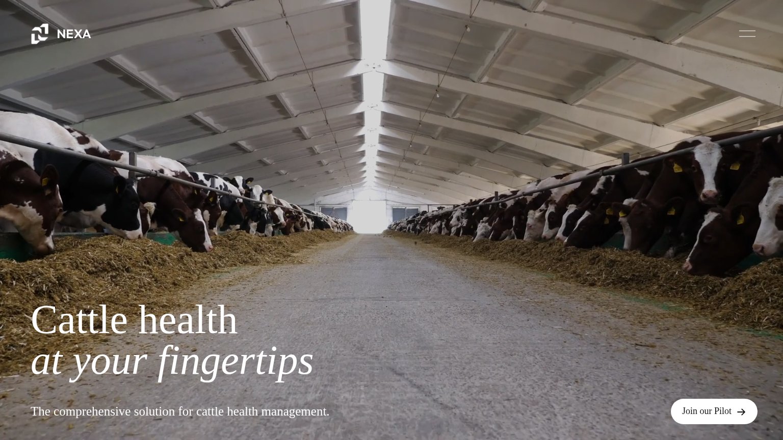
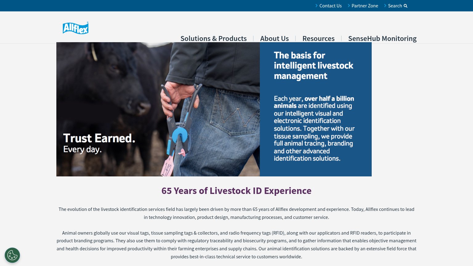
| "SUCCESS STORIES" navigation link paired with an authentic dairy-barn hero photo | |
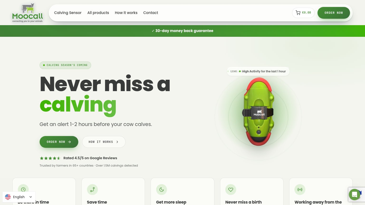
| Trusted by farmers in 65+ countries · Over 1.5M calvings detected | |
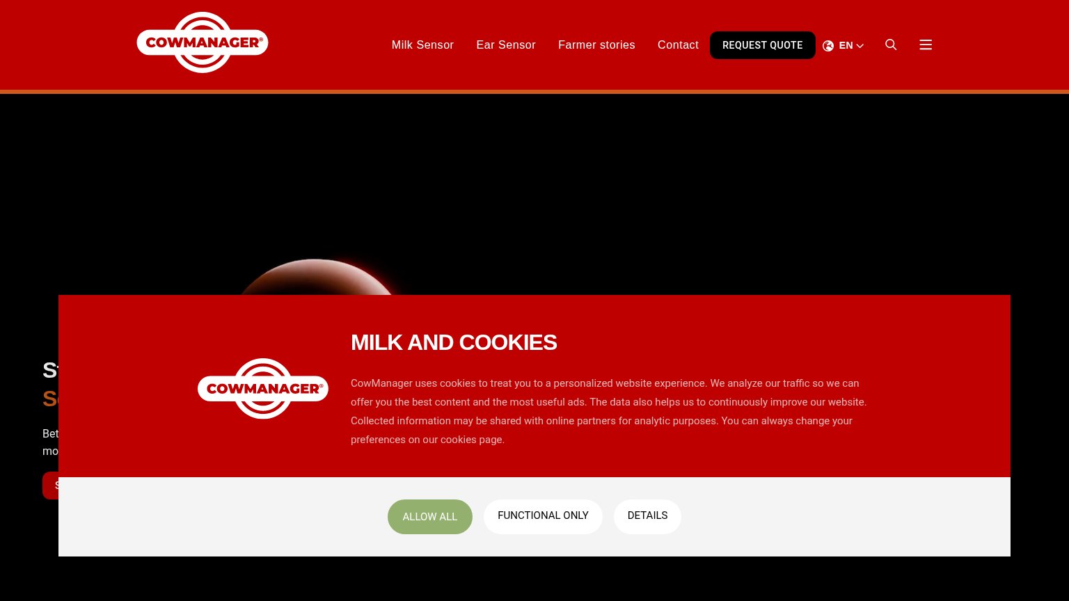
| Partially visible ear sensor product photo behind the cookie banner on mobile | |
| "Each year, over half a billion animals are identified using our intelligent visual and electronic identification soluti |
Mobile web
58FairThe phone experience as a first-class citizen.
What works
What to improve
Value props
62FairTitle, subtitle, hero — do they sell the product's true value?
Connecterra’s headline
Unleash the power of your farm data
Remove data silos across your systems, quantify your decisions with data, get insights and analysis powered by advanced AI delivered to your inbox and to your wider team.
Working
Could improve
Information hierarchy
64FairDoes the design help or inhibit what the page is trying to say?
What works
What to improve