
Your landing page’s weakest score is Mobile web.
How SimplePractice ranks
- 1.
Practice Better77
- 2.
malla.co72
- 3.
Jane71
- 4.
SimplePractice68
- 5.
OptiMantra64
- 6.
Healthie62
68Growth scoreupdated
category scores
category scoresShowHide
Mobile web
56FairThe phone experience as a first-class citizen.
 12
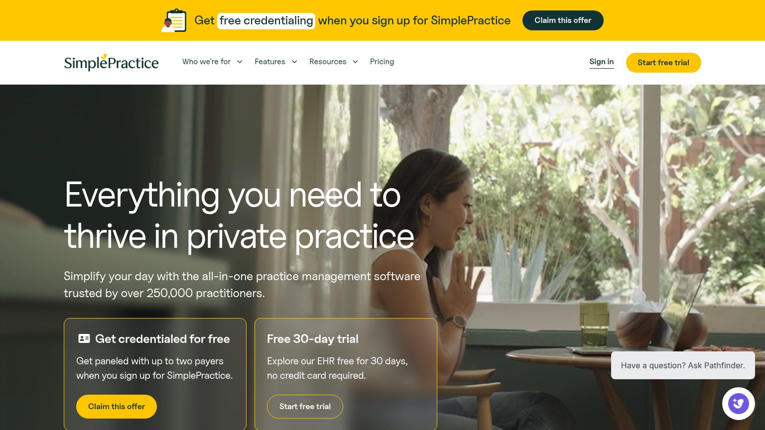
- Chat bubble overlaps card — The "Have a question? Ask Pathfinder" prompt and chat launcher sit on top of the credentialing card, obscuring its copy and crowding the "Claim this offer" tap target.
- Headline wraps three lines — The desktop-sized headline wraps into three long lines, pushing body copy and both CTA cards deep down the viewport.
Information hierarchy
64FairDoes the design help or inhibit what the page is trying to say?
 1234
- Duplicate CTA cards — Two same-weight offer cards ('Claim this offer' vs 'Start free trial') split the fold's primary action into a coin flip.
- Yellow promo banner — The highest-contrast band on the page carries a third CTA ('Claim this offer'), pulling attention above the hero before the value prop is read.
- Ghost trial button — 'Start free trial' in the trial card is an outline button on a busy photo — the weakest-styled action is arguably the main conversion.
- Pathfinder chat widget — The chat prompt overlaps the credential card's copy on mobile and adds a fourth interactive focal point in the lower-right.
Trust
64FairProof that the product is real, competent, and safe to try.
How SimplePractice compares
Trust read
CTA
78FairCopy, size, verb, cost-feel — does the primary CTA earn the click?
How SimplePractice compares
Recommended rewrites
Value props
78FairTitle, subtitle, hero — do they sell the product's true value?
SimplePractice’s headline
Everything you need to thrive in private practice
Simplify your day with the all-in-one practice management software trusted by over 250,000 practitioners.
Working
Could improve