
Your landing page’s weakest score is Information hierarchy.
How Healthie ranks
62Growth scoreupdated
category scores
category scoresShowHide
Information hierarchy
58FairDoes the design help or inhibit what the page is trying to say?
 123
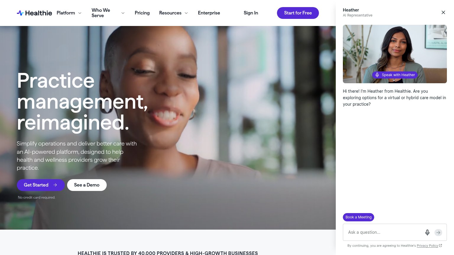
- Heather AI panel — A full-height side panel with its own "Book a Meeting" CTA and input field competes directly with the hero's "Get Started" action and covers a quarter of the fold.
- Dual hero CTAs — "Get Started" and "See a Demo" sit side by side at near-equal weight, splitting the one decision the fold should drive.
- Nav exit links — Six nav items plus "Sign In" and "Start for Free" offer eight exits before the hero CTA, with "Start for Free" duplicating the hero's action under a different label.
Trust
58FairProof that the product is real, competent, and safe to try.
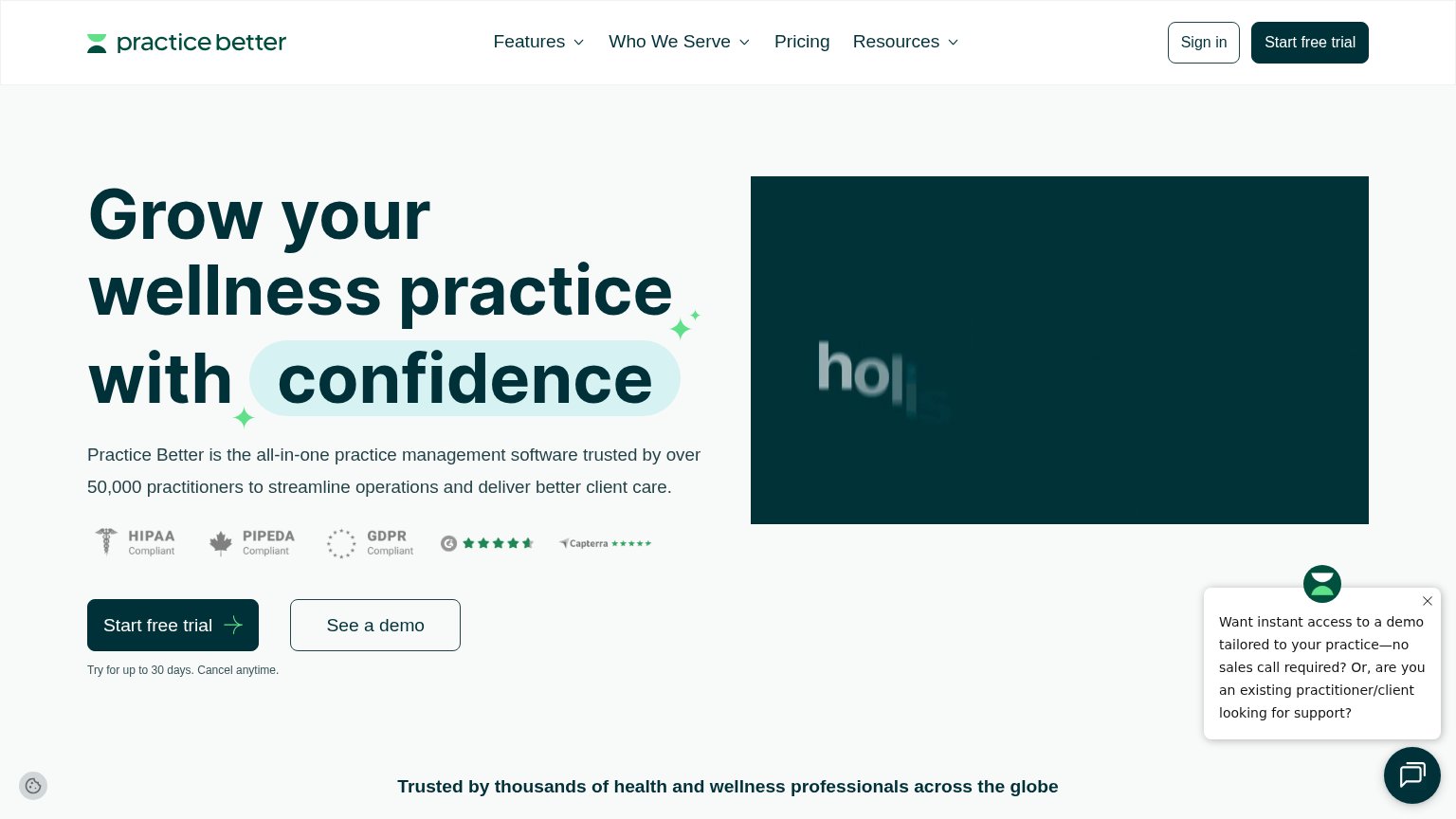
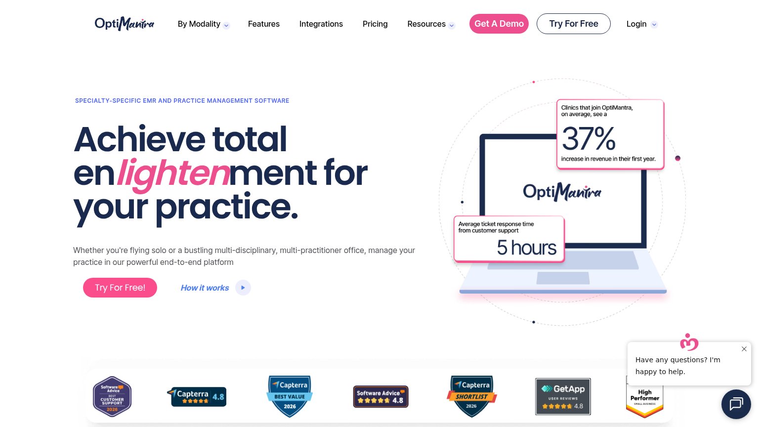
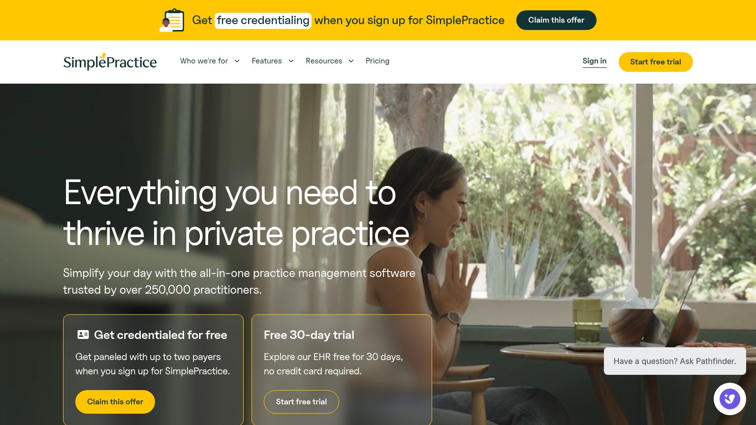
| Trust read | |
|---|---|
| Healthie | "HEALTHIE IS TRUSTED BY 40,000 PROVIDERS & HIGH-GROWTH BUSINESSES" |
| "No payment today · Set up in minutes · HIPAA compliant" checklist under the hero CTA | |
| HIPAA / PIPEDA / GDPR compliance badges with G2 and Capterra star ratings above the CTA | |
| Row of review badges: Capterra 4.8, Software Advice 4.8, GetApp 4.8, Capterra Shortlist 2026, Best Value 2026, High Perf | |
| "trusted by over 250,000 practitioners" usage claim in the hero subhead | |
| Detailed product UI screenshot showing a real scheduling calendar with named staff, timed appointments, and an appointme |
Mobile web
58FairThe phone experience as a first-class citizen.
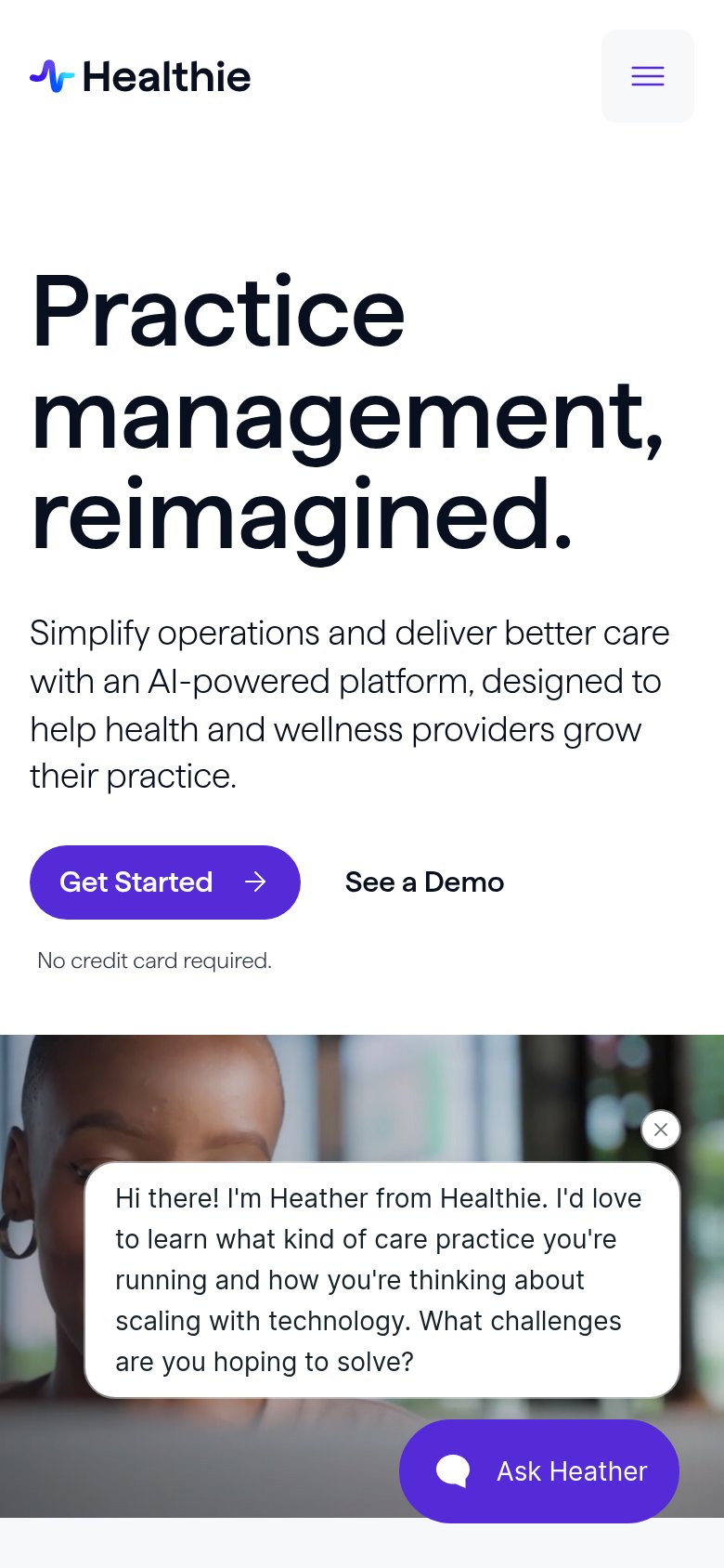
What works
What to improve
Value props
64FairTitle, subtitle, hero — do they sell the product's true value?
Healthie’s headline
Practice management, reimagined.
Simplify operations and deliver better care with an AI-powered platform, designed to help health and wellness providers grow their practice.
Working
Could improve
CTA
74FairCopy, size, verb, cost-feel — does the primary CTA earn the click?
How Healthie compares
Recommended rewrites