
Your landing page’s weakest score is Value props.
How Practice Better ranks
- 1.
Practice Better77
- 2.
malla.co72
- 3.
Jane71
- 4.
SimplePractice68
- 5.
OptiMantra64
- 6.
Healthie62
77Growth scoreupdated
category scores
category scoresShowHide
Value props
72FairTitle, subtitle, hero — do they sell the product's true value?
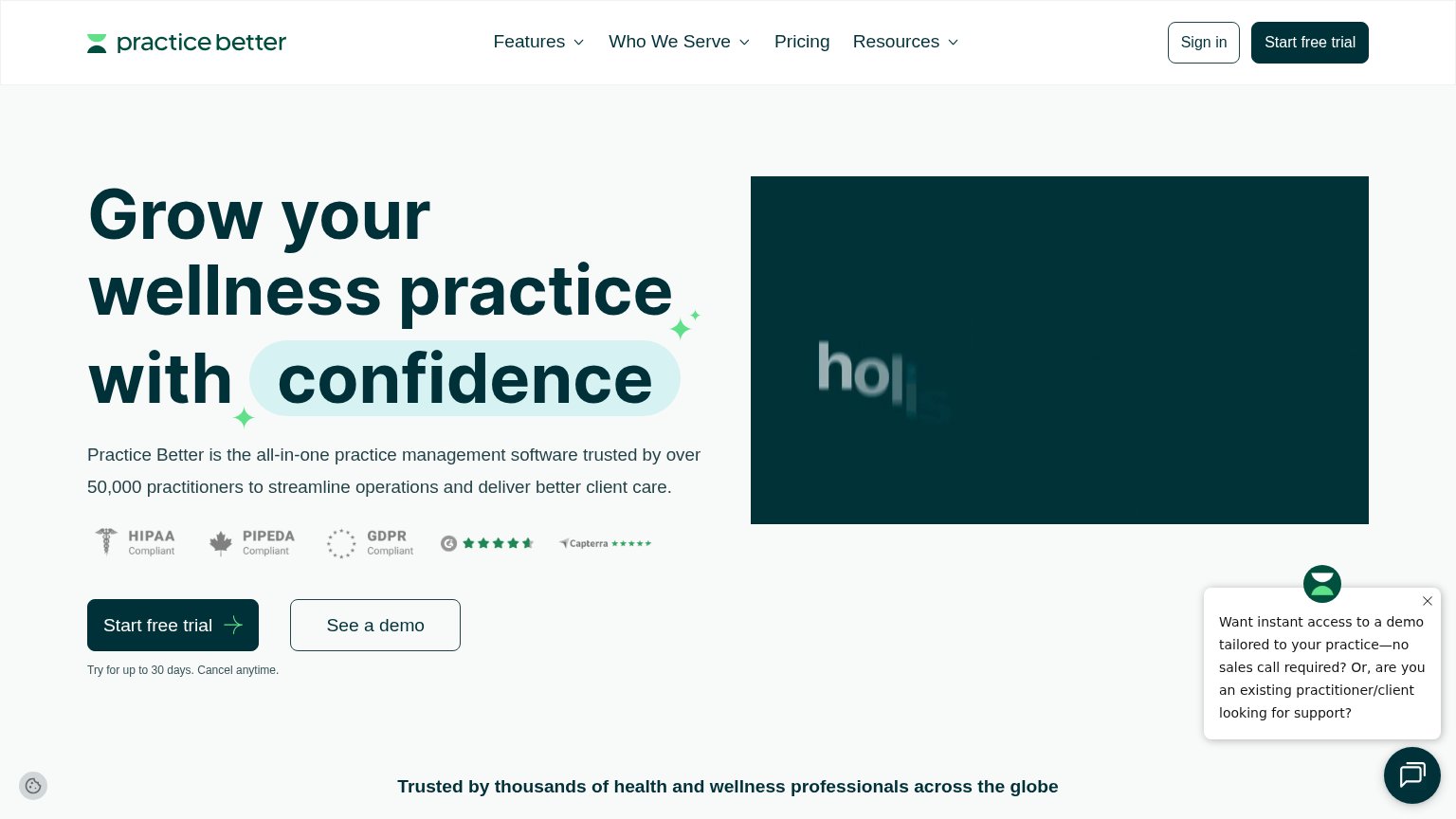
Practice Better’s headline undersells
Grow your wellness practice with confidence
Practice Better is the all-in-one practice management software trusted by over 50,000 practitioners to streamline operations and deliver better client care.
Working
- Names the wellness audience directly
- 50,000 practitioners is hard proof
- Compliance badges de-risk the claim
Could improve
- "Grow" is generic growth-speak
- Hero video shows nothing of the product
- No concrete outcome (time saved, revenue)
Mobile web
72FairThe phone experience as a first-class citizen.
 1234
- Start free trial button — Pushed to the bottom edge of the first viewport by the badge row and long paragraph, and only spans half the column instead of full-bleed.
- Compliance badge row — Five badges wrap onto a ragged second line and push the primary CTA down; the Capterra orphan looks broken.
- Chat bubble — Floating chat launcher overlaps the video block corner, covering content and inviting an off-funnel tap.
- See a demo button — Stranded far below the trial CTA with a large gap, so the two actions read as disconnected choices.
Information hierarchy
76FairDoes the design help or inhibit what the page is trying to say?
What works
What to improve
Trust
76FairProof that the product is real, competent, and safe to try.
How Practice Better compares
Trust read
CTA
88StrongCopy, size, verb, cost-feel — does the primary CTA earn the click?
How Practice Better compares
Recommended rewrites