
Your landing page’s weakest score is Mobile web.
How OptiMantra ranks
64Growth scoreupdated
category scores
category scoresShowHide
Mobile web
52FairThe phone experience as a first-class citizen.
 12
- Hero illustration first — Laptop graphic with stat callouts fills the first viewport, pushing headline and CTA below the fold.
- Obscured pink CTA — The primary button's label is hidden beneath the chat overlay, leaving an unreadable pink blob.
Value props
62FairTitle, subtitle, hero — do they sell the product's true value?
OptiMantra’s headline undersells
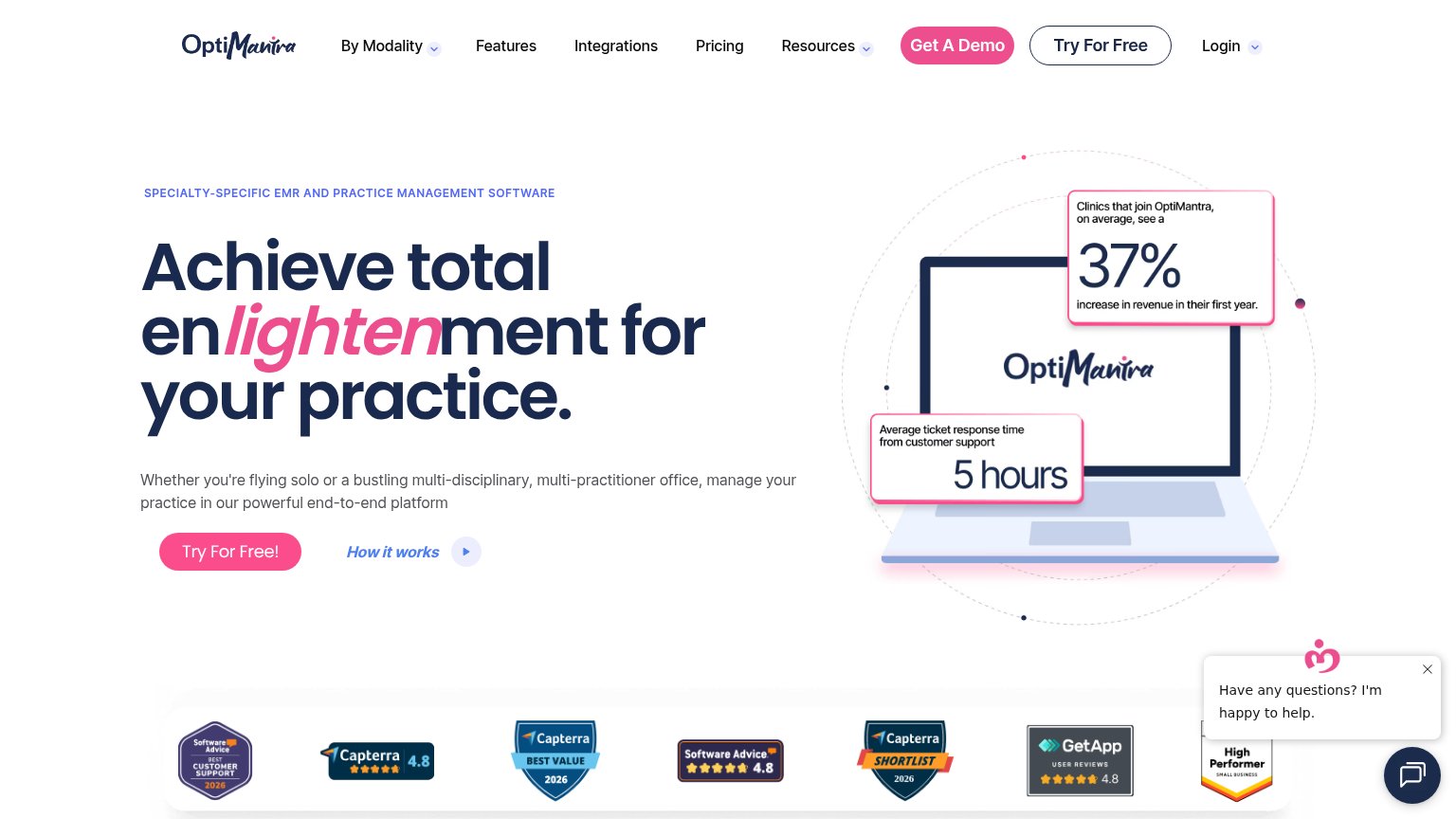
Achieve total enlightenment for your practice.
Whether you're flying solo or a bustling multi-disciplinary, multi-practitioner office, manage your practice in our powerful end-to-end platform
Working
- 37% revenue stat shown in hero image
- Eyebrow names the exact category
- Subhead targets solo and multi-practitioner clinics
Could improve
- Headline is a pun, claims nothing
- 'End-to-end platform' is generic
- Best numbers buried in image, not copy
Information hierarchy
64FairDoes the design help or inhibit what the page is trying to say?
What works
What to improve
Trust
68FairProof that the product is real, competent, and safe to try.
How OptiMantra compares
Trust read
CTA
76FairCopy, size, verb, cost-feel — does the primary CTA earn the click?
How OptiMantra compares
Recommended rewrites