
Your landing page’s weakest score is Trust.
How Ruvo ranks
70Growth scoreupdated
category scores
category scoresShowHide
Trust
58FairProof that the product is real, competent, and safe to try.

| Trust read | |
|---|---|
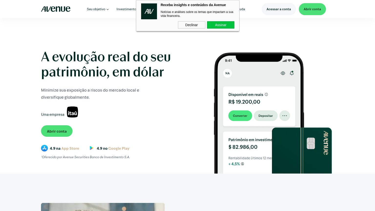
| Ruvo | "Backed by leading global investors" strip with Y Combinator and Coinbase Ventures logos |
| implicit context Nomad may benefit from pre-existing familiarity among its target audience. | |
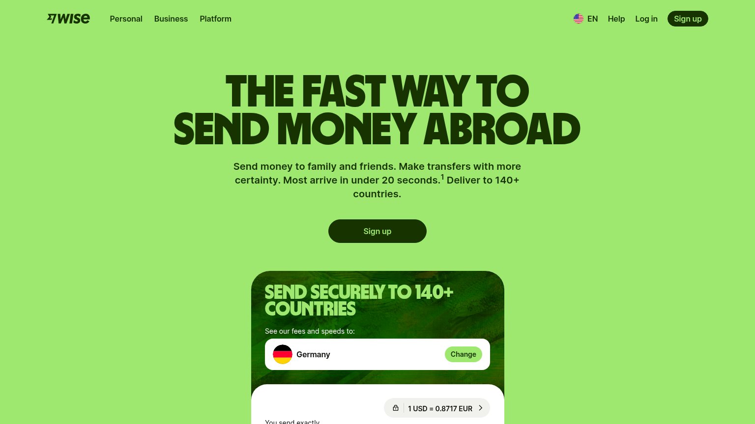
| Live transfer calculator showing "1 USD = 0.8717 EUR" with lock icon and USD currency selector | |
| "Husky is by NOMAD" parent-brand banner | |
| "Uma empresa itaú" ownership line with Itaú logo above the CTA | |
| In-app balance UI overlay showing "Personal £6,012" with an "Accounts" button |
Information hierarchy
72FairDoes the design help or inhibit what the page is trying to say?
12- Header Download button — Styled at identical weight and color to the hero's "Download Ruvo", creating two equal primary CTAs in the same fold.
- Nav link cluster — Six navigation exits (Personal, Business, Resources, Features, Help, EN) sit above the CTA and siphon attention before the pitch lands.
Value props
72FairTitle, subtitle, hero — do they sell the product's true value?
Ruvo’s headline
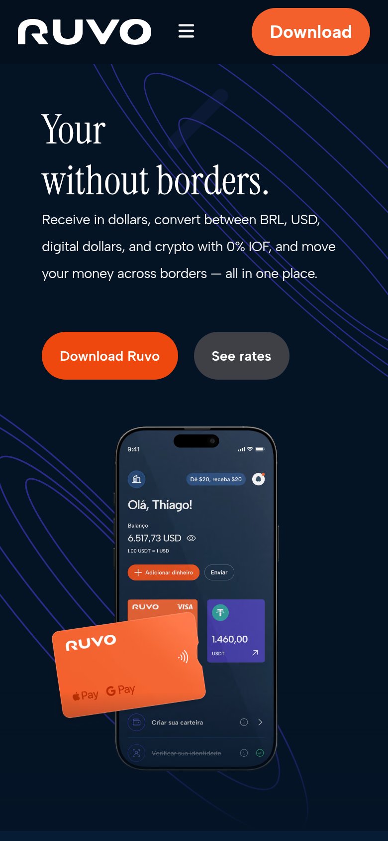
Your money without borders.
Receive in dollars, convert between BRL, USD, digital dollars, and crypto with 0% IOF, and move your money across borders — all in one place.
Working
Could improve
CTA
74FairCopy, size, verb, cost-feel — does the primary CTA earn the click?
How Ruvo compares
Recommended rewrites
Mobile web
76FairThe phone experience as a first-class citizen.
What works
What to improve