
Your landing page’s weakest score is Trust.
How Revolut ranks
Trust
48PoorProof that the product is real, competent, and safe to try.

| Trust read | |
|---|---|
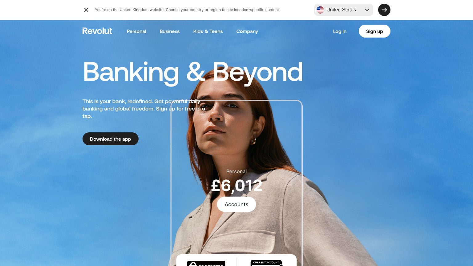
| Revolut | In-app balance UI overlay showing "Personal £6,012" with an "Accounts" button |
| No visible trust signal identified. | |
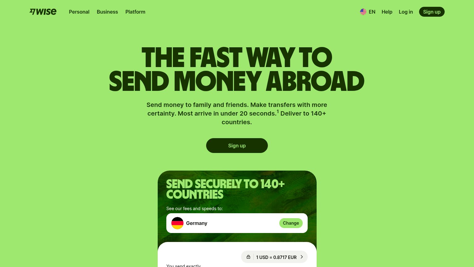
| Live transfer calculator showing "1 USD = 0.8717 EUR" with lock icon and USD currency selector | |
| App Store 4.9 stars 4.2M+ ratings | |
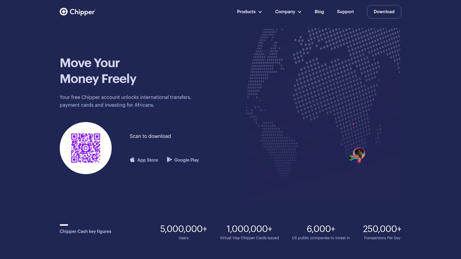
| "5,000,000+ Users" and "1,000,000+ Virtual Visa Chipper Cards Issued" in the Chipper Cash key figures strip | |
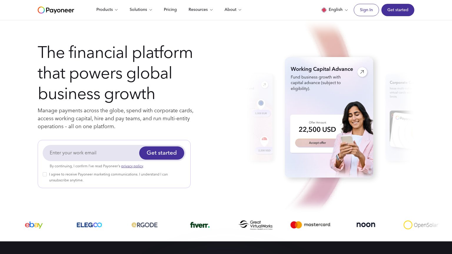
| Logo strip featuring eBay, Fiverr, Mastercard, Noon, Elegoo, and OpenSolar |
Mobile web
58FairThe phone experience as a first-class citizen.
The mobile capture is missing, so Revolut is graded from responsive signals in the desktop capture only and the score is capped per the missing-capture rule. The desktop fold is promising for mobile translation: one headline ("Banking & Beyond"), one short subhead, and a single primary CTA ("Download the app") in a clean column that should stack naturally on a phone. Two risks are visible: the country-selector banner ("Revolut is on the United Kingdom website...") is a sticky bar that would eat a meaningful slice of a phone's first viewport, and the "Download the app" button is desktop-proportioned, so it must go near-full-width on mobile to be thumb-friendly. The biggest lever is simply capturing and verifying the mobile viewport, then suppressing or shrinking the region banner on phones.
Value props
62FairTitle, subtitle, hero — do they sell the product's true value?
Banking & Beyond
This is your bank, redefined. Get powerful daily banking and global freedom. Sign up for free in a tap.
Working
Could improve
CTA
68FairCopy, size, verb, cost-feel — does the primary CTA earn the click?
How Revolut compares
Recommended rewrites
Information hierarchy
76FairDoes the design help or inhibit what the page is trying to say?
What works
What to improve