
Your landing page’s weakest score is Trust.
How Husky ranks
Trust
38PoorProof that the product is real, competent, and safe to try.

| Trust read | |
|---|---|
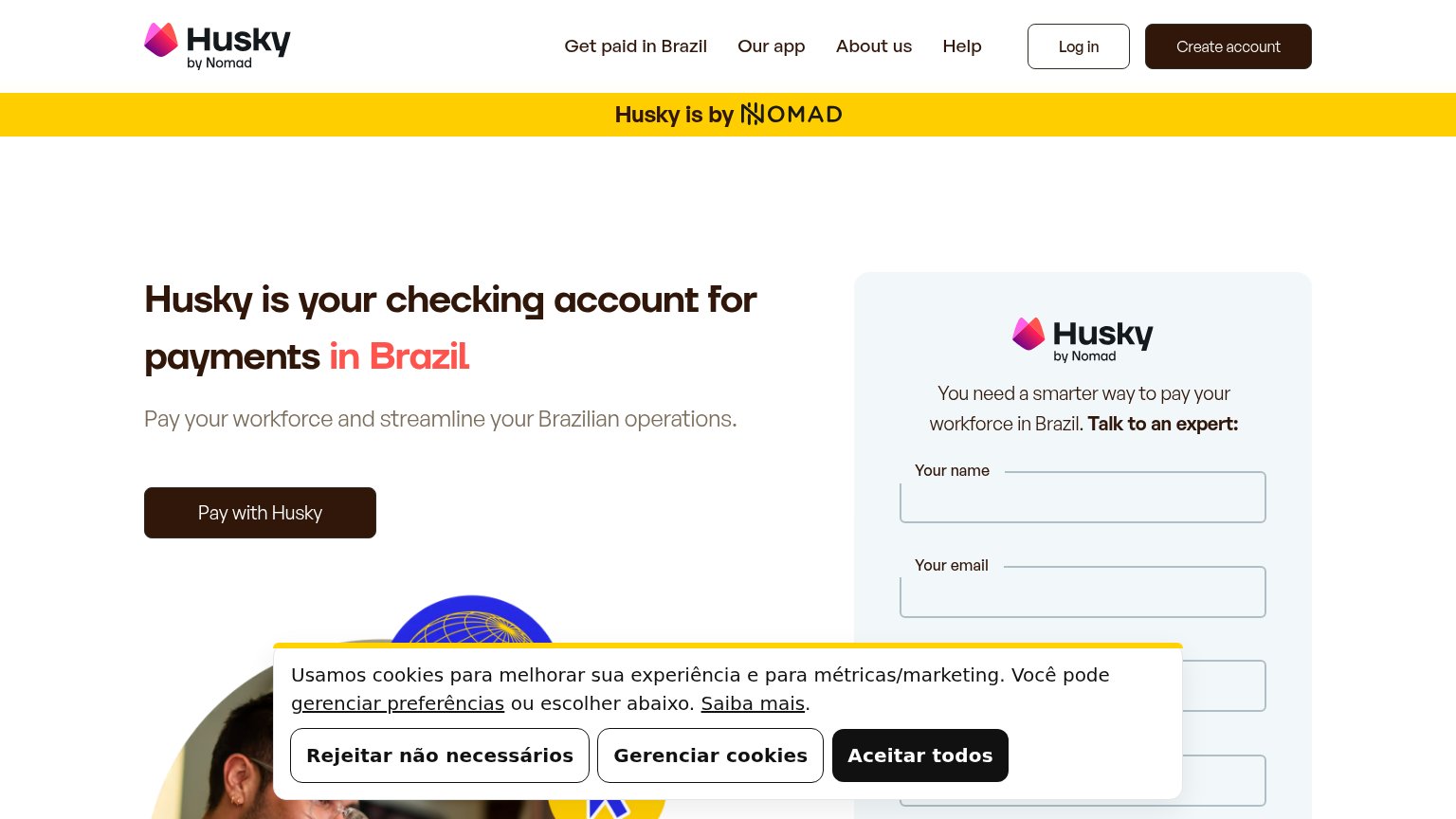
| Husky | "Husky is by NOMAD" parent-brand banner |
| "Backed by leading global investors" strip with Y Combinator and Coinbase Ventures logos | |
| implicit context Nomad may benefit from pre-existing familiarity among its target audience. | |
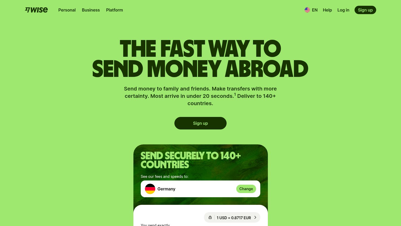
| Live transfer calculator showing "1 USD = 0.8717 EUR" with lock icon and USD currency selector | |
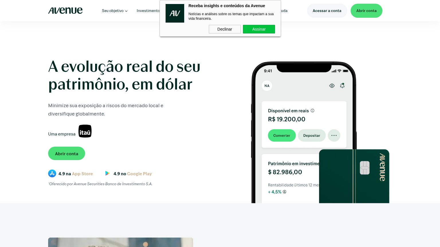
| "Uma empresa itaú" ownership line with Itaú logo above the CTA | |
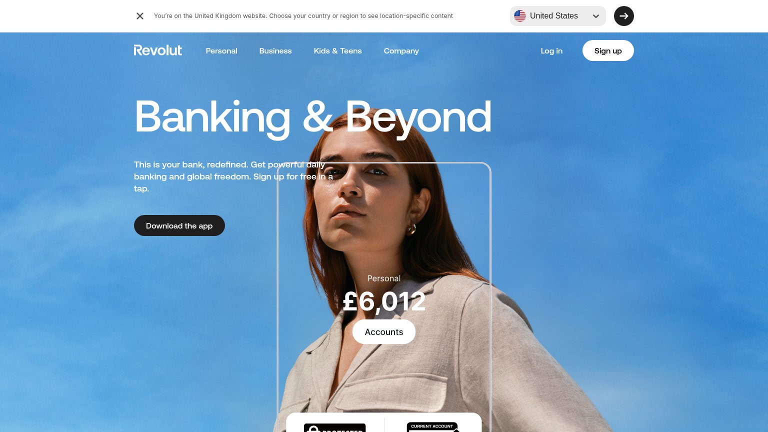
| In-app balance UI overlay showing "Personal £6,012" with an "Accounts" button |
Mobile web
62FairThe phone experience as a first-class citizen.
 123
- Cookie consent banner — Portuguese cookie wall with three stacked buttons covers half the viewport and sits directly under the primary CTA.
- Yellow Nomad banner — 'Husky is by Nomad' strip wraps to two lines on mobile and eats a tall slice of the first viewport before the headline.
- Cookie banner language — Consent copy is in Portuguese while the page sells in English, confusing non-Brazilian buyers at the decisive tap.
Information hierarchy
64FairDoes the design help or inhibit what the page is trying to say?
What works
What to improve
Value props
68FairTitle, subtitle, hero — do they sell the product's true value?
Husky’s headline
Husky is your checking account for payments in Brazil
Pay your workforce and streamline your Brazilian operations.
Working
Could improve
CTA
72FairCopy, size, verb, cost-feel — does the primary CTA earn the click?
How Husky compares
Recommended rewrites