
Your landing page’s weakest score is Information hierarchy.
How Avenue (Global Account) ranks
- 1.
Wise79
- 2.
Avenue (Global Account)73
- 3.
Ruvo70
- 4.
Nomad64
- 5.
Revolut62
- 6.
Husky61
73Growth scoreupdated
category scores
category scoresShowHide
Information hierarchy
72FairDoes the design help or inhibit what the page is trying to say?
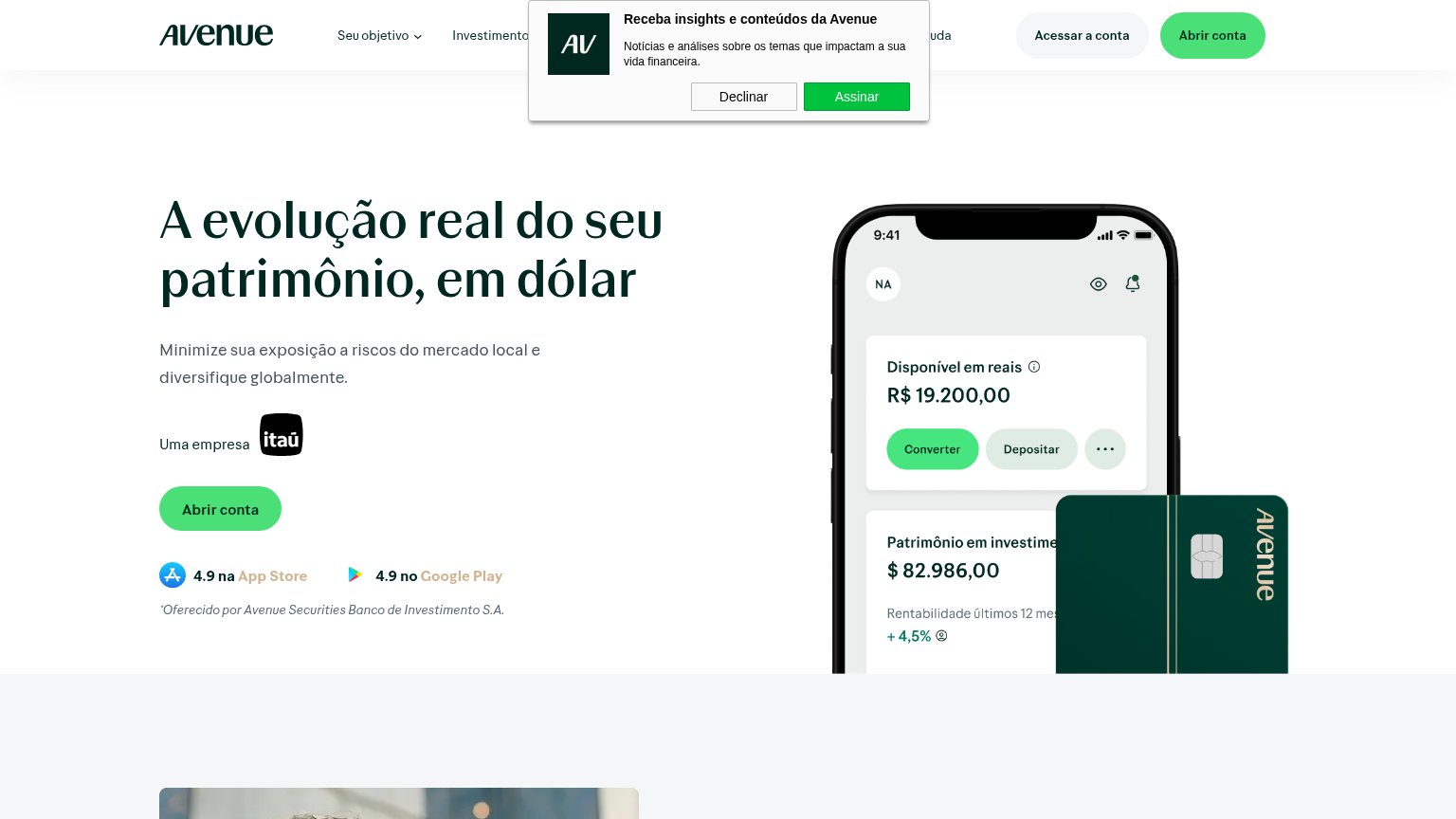 1234
- Newsletter signup popup — Overlays the nav with a competing green 'Assinar' button before the visitor has read the value prop.
- Dual header buttons — 'Acessar a conta' matches the weight of 'Abrir conta', splitting attention between login and conversion.
- Header 'Abrir conta' button — Duplicates the hero CTA at equal green weight, so no single button owns the fold.
- Truncated mockup text — 'Patrimônio em investime...' and the +4,5% figure are clipped by the card overlay, muddling the proof point.
CTA
72FairCopy, size, verb, cost-feel — does the primary CTA earn the click?
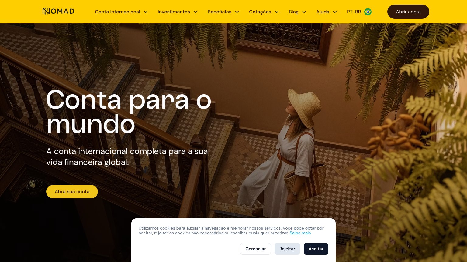

Problems
- 'open account' feels committal
- no payoff or headline echo
- hero button modest vs headline
Value props
72FairTitle, subtitle, hero — do they sell the product's true value?
Avenue (Global Account)’s headline
A evolução real do seu patrimônio, em dólar
Minimize sua exposição a riscos do mercado local e diversifique globalmente.
Working
Could improve
Trust
72FairProof that the product is real, competent, and safe to try.
How Avenue (Global Account) compares
Trust read
Mobile web
78FairThe phone experience as a first-class citizen.
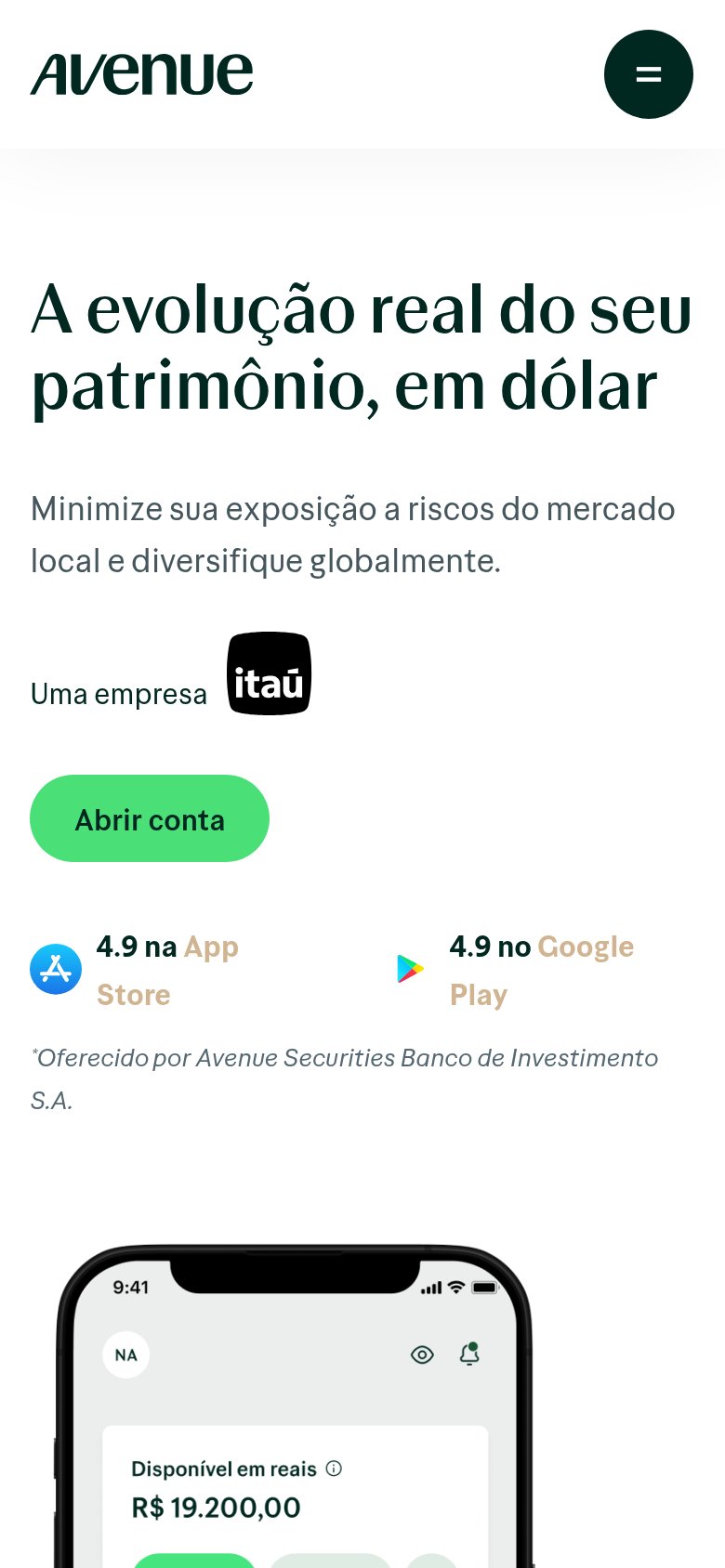
What works
What to improve