
Your landing page’s weakest score is Trust.
How Ruby ranks
Trust
42PoorProof that the product is real, competent, and safe to try.

| Trust read | |
|---|---|
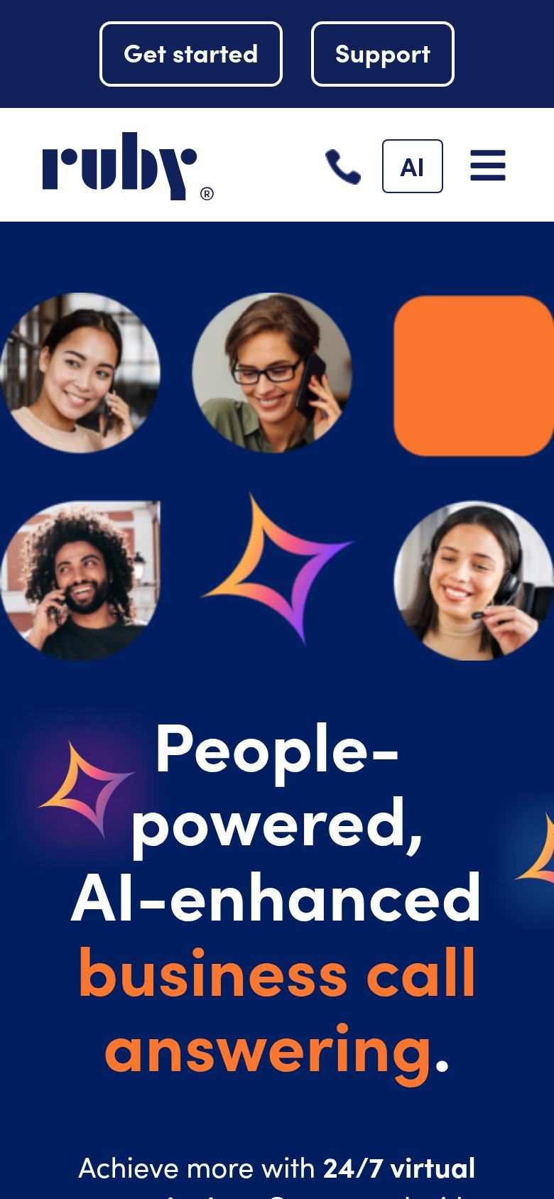
| Ruby | "Achieve more with 24/7 virtual receptionists" service claim in mobile hero copy |
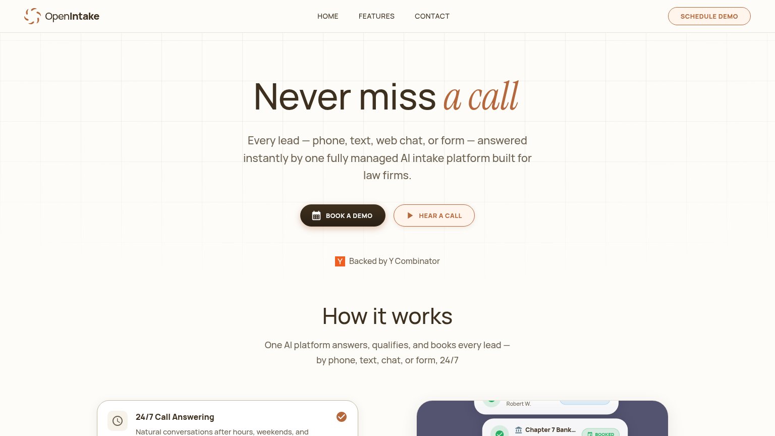
| "Backed by Y Combinator" badge beneath the hero CTAs | |
| Row of six G2 Summer 2026 badges (Leader, Best Est. ROI, Best Usability, Best Support, Easiest Setup, Best Results) | |
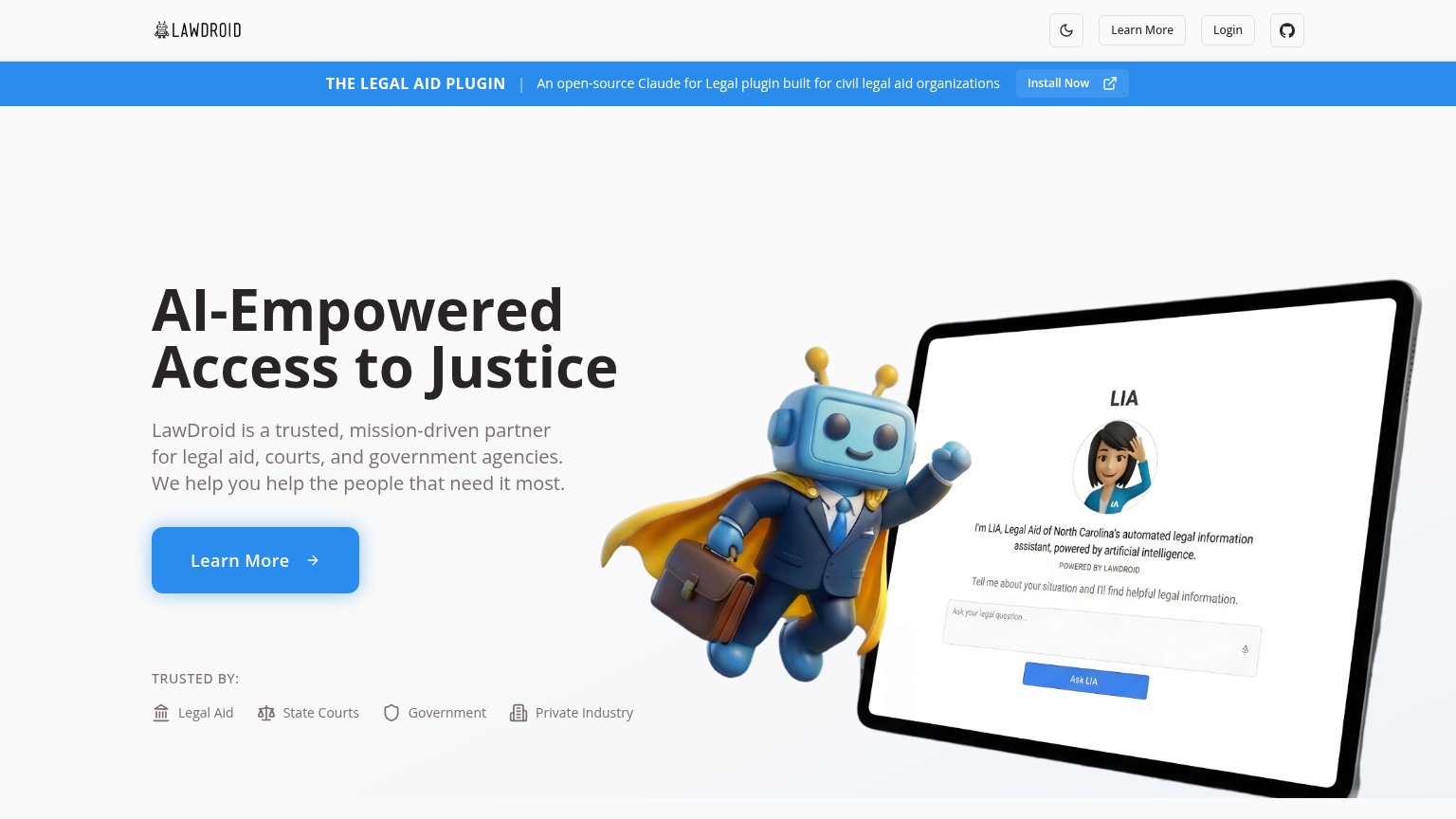
| Tablet screenshot of "LIA, Legal Aid of North Carolina's automated legal information assistant" — a named live deploymen | |
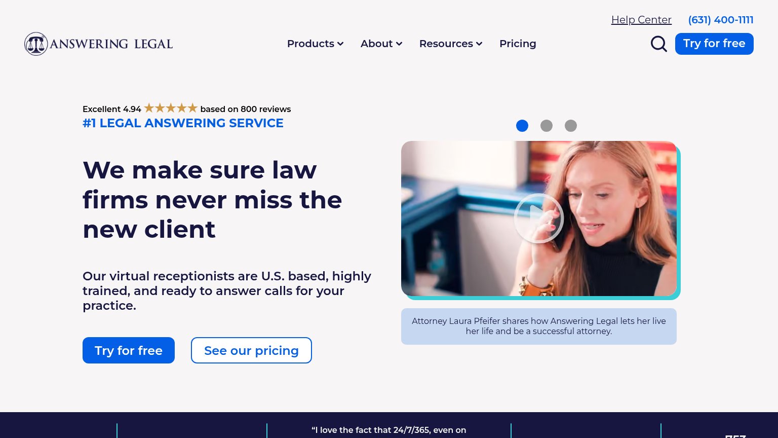
| Excellent 4.94 ★★★★★ based on 800 reviews | |
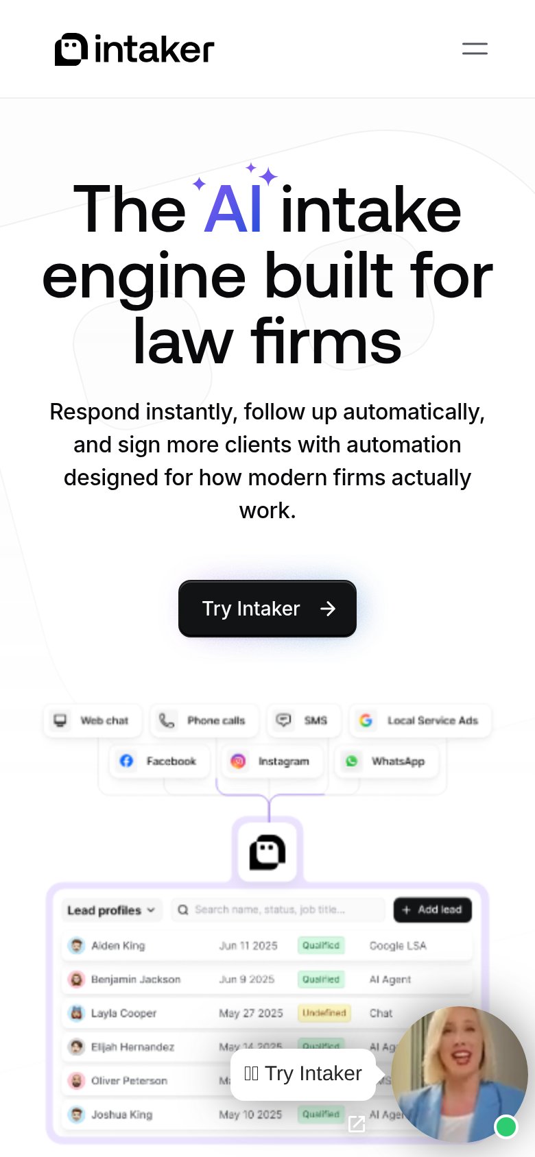
| "Lead profiles" product UI showing named leads with dates and "Qualified" status tags across channels like Google LSA, A |
Mobile web
48PoorThe phone experience as a first-class citizen.
123- Double-decker header bar — "Get started" and "Support" sit in a separate outlined-pill bar above the logo row, burying the primary CTA in low-contrast chrome instead of the fold.
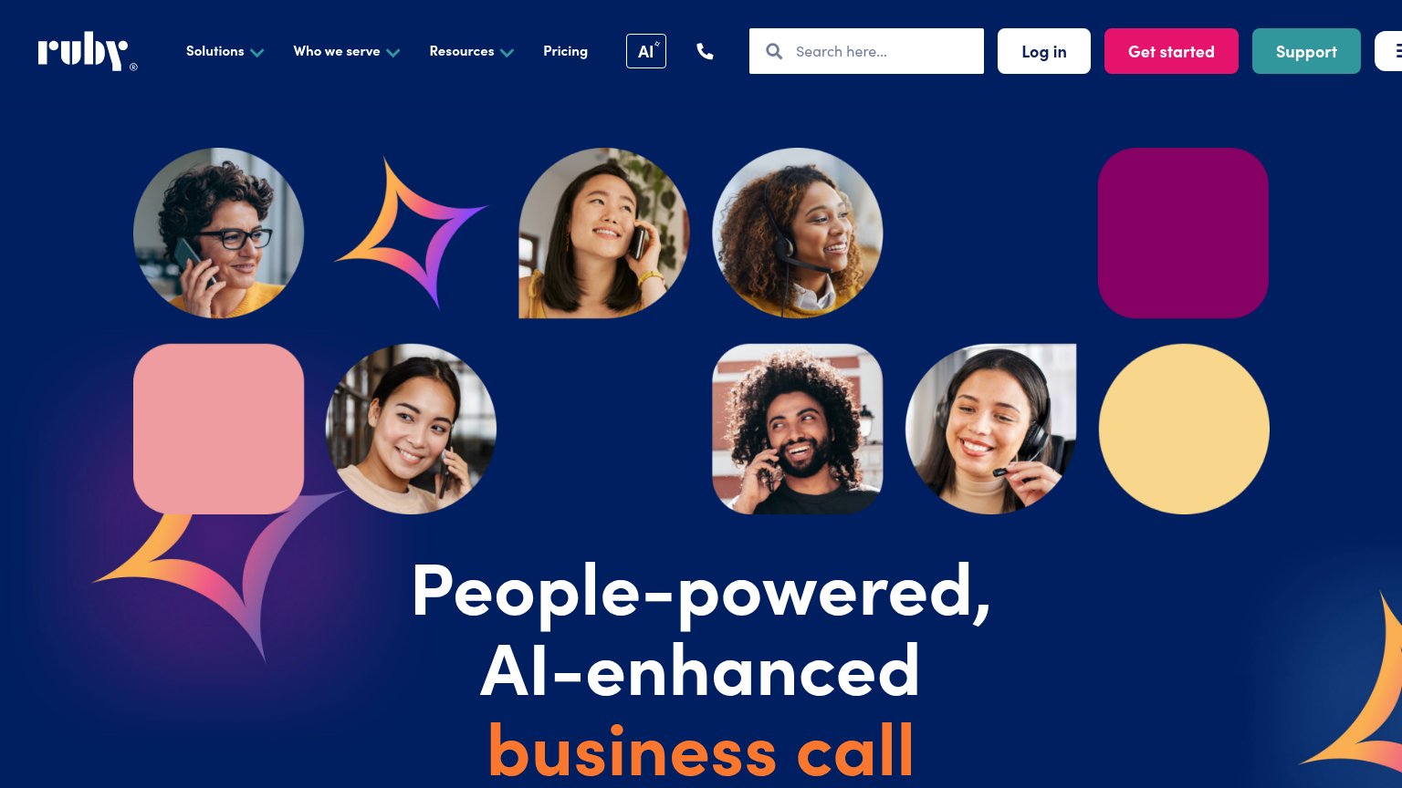
- Hero photo collage — Six portraits plus an orange block and sparkles consume the entire first viewport, pushing the headline and any CTA below the fold.
- Six-line hero headline — The headline wraps across six tall lines ("People-" breaks mid-word group), shoving the supporting copy off-screen.
Information hierarchy
58FairDoes the design help or inhibit what the page is trying to say?
What works
What to improve
CTA
62FairCopy, size, verb, cost-feel — does the primary CTA earn the click?
How Ruby compares
Recommended rewrites
Value props
68FairTitle, subtitle, hero — do they sell the product's true value?
Ruby’s headline
People-powered, AI-enhanced business call answering.
Achieve more with 24/7 virtual receptionists...
Working
Could improve