
Your landing page’s weakest score is Mobile web.
How Answering Legal ranks
Mobile web
72FairThe phone experience as a first-class citizen.
 1234
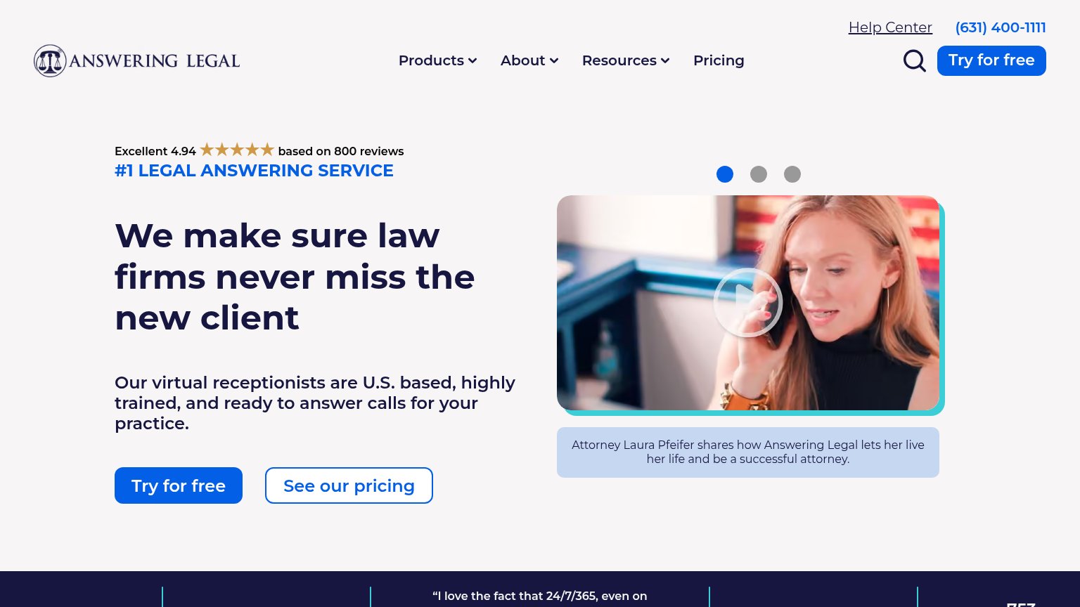
- Floating phone bubble — Blue call bubble overlaps the video thumbnail's lower-left corner, obscuring content and risking mis-taps.
- Headline wraps three lines — "We make sure law firms never miss the new client" runs large across three lines, pushing the CTA pair near the bottom of the viewport.
- Side-by-side CTA pair — "Try for free" shares the row with "See our pricing" at half-width instead of a full-bleed thumb target.
- Top promo bar — Sticky "Try for free here" banner duplicates the hero CTA and eats viewport height above the header.
Trust
74FairProof that the product is real, competent, and safe to try.

| Trust read | |
|---|---|
| Answering Legal | Excellent 4.94 ★★★★★ based on 800 reviews |
| "Backed by" Y Combinator and Acquisition.com investor logos | |
| Row of six G2 Summer 2026 badges (Leader, Best Est. ROI, Best Usability, Best Support, Easiest Setup, Best Results) | |
| Trustpilot widget: "TrustScore 4.9 | 1,340 reviews" | |
| "Lead profiles" product UI showing named leads with dates and "Qualified" status tags across channels like Google LSA, A | |
| "1,000+ Law Firms Trust Our Team" stat placed directly above the primary CTA |
Information hierarchy
76FairDoes the design help or inhibit what the page is trying to say?
What works
What to improve
Value props
82StrongTitle, subtitle, hero — do they sell the product's true value?
Answering Legal’s headline
We make sure law firms never miss the new client
Our virtual receptionists are U.S. based, highly trained, and ready to answer calls for your practice.
Working
Could improve
CTA
86StrongCopy, size, verb, cost-feel — does the primary CTA earn the click?
How Answering Legal compares
Recommended rewrites