
Your landing page’s weakest score is Trust.
How Intaker ranks
70Growth scoreupdated
category scores
category scoresShowHide
Trust
54FairProof that the product is real, competent, and safe to try.
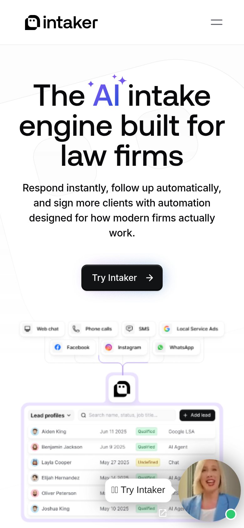

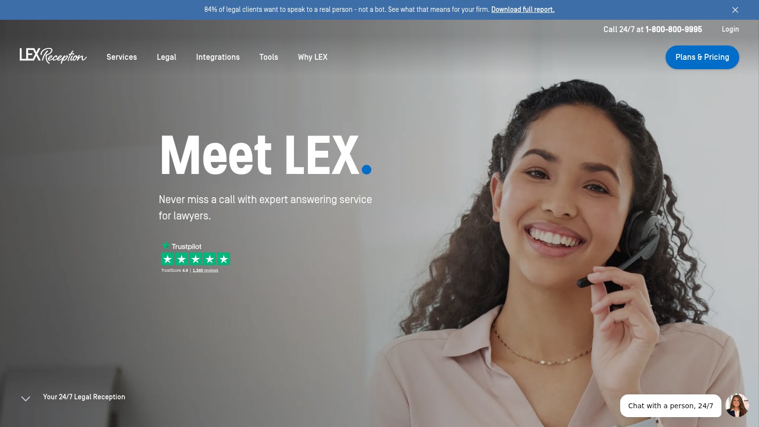
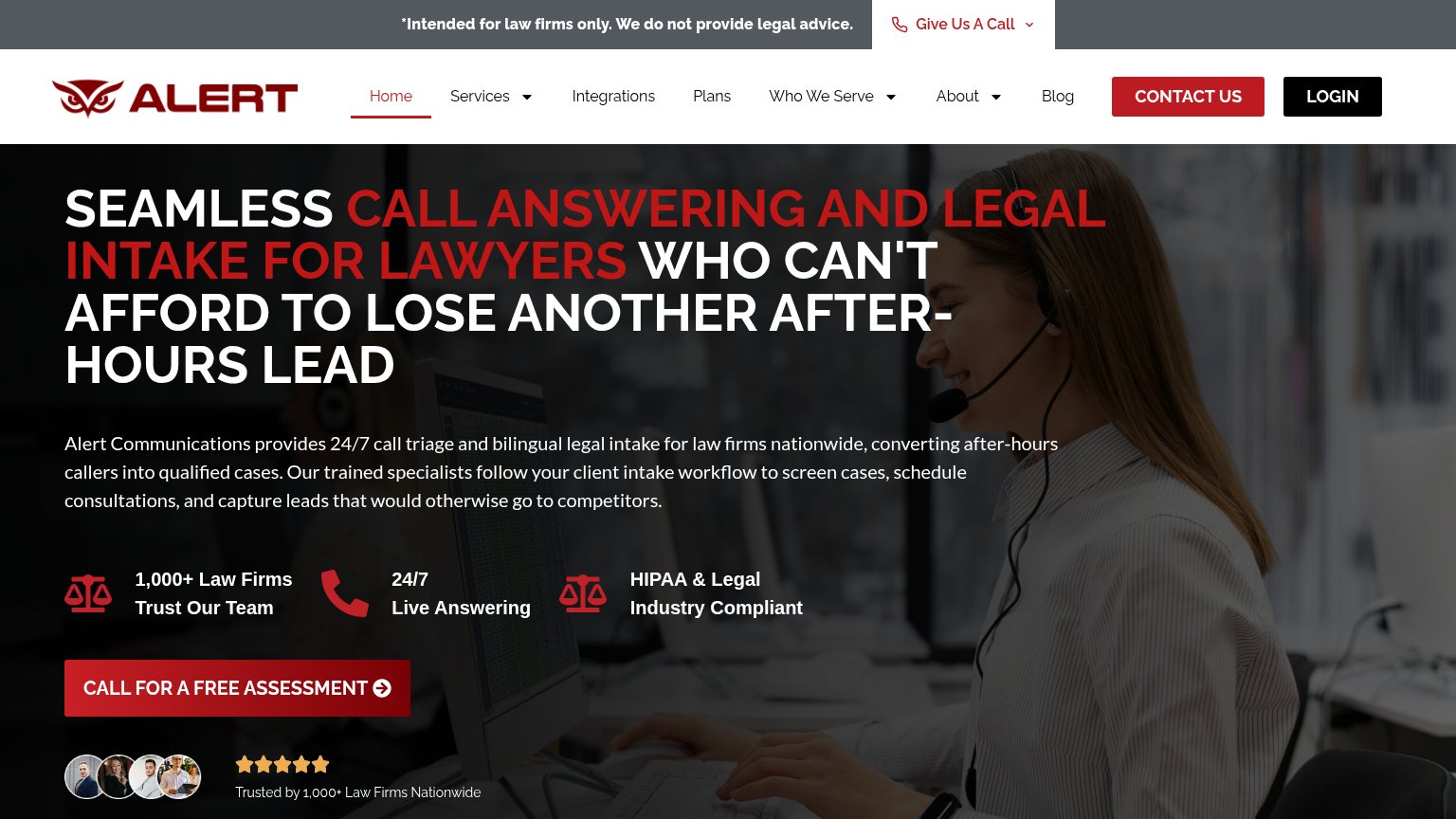
| Trust read | |
|---|---|
| Intaker | "Lead profiles" product UI showing named leads with dates and "Qualified" status tags across channels like Google LSA, A |
| No visible trust signal identified. | |
| Row of six G2 Summer 2026 badges (Leader, Best Est. ROI, Best Usability, Best Support, Easiest Setup, Best Results) | |
| Trustpilot widget: "TrustScore 4.9 | 1,340 reviews" | |
| "1,000+ Law Firms Trust Our Team" stat placed directly above the primary CTA | |
| "Intake Dashboard" product screenshot showing intakes by contact source (SMS, Phone, Lead, Web) and intake status charts |
Information hierarchy
72FairDoes the design help or inhibit what the page is trying to say?
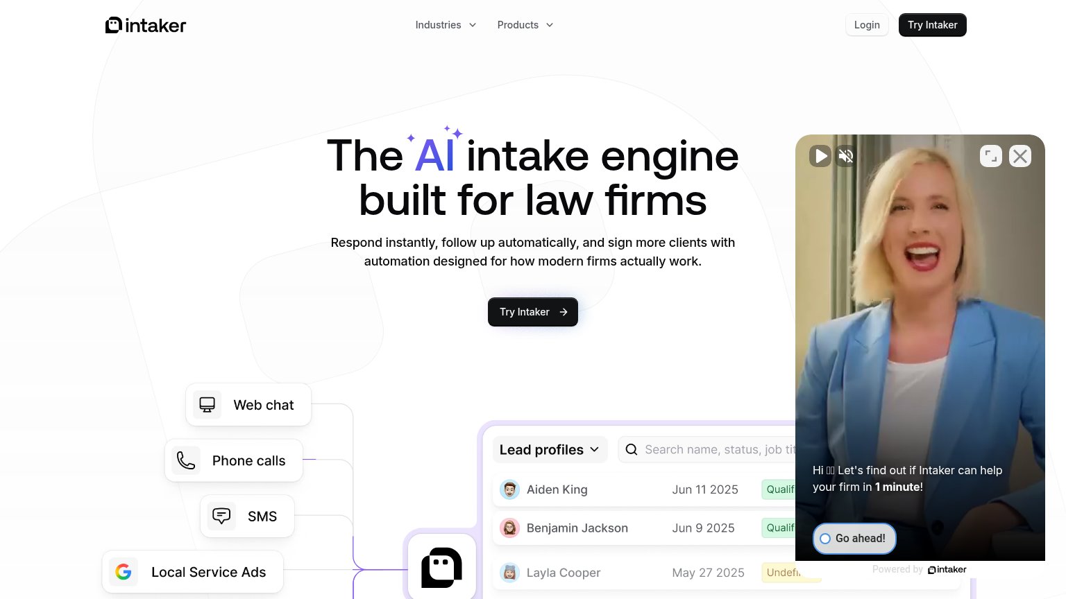 1234
- Video widget popup — Auto-playing talking-head panel occupies the right third of the fold, outweighing the headline and pulling attention from the primary CTA.
- Go ahead! button — Outlined widget CTA sits in the scan path and competes with the black 'Try Intaker' hero button for the click.
- Header Try Intaker — Duplicate primary-styled black button in the nav splits CTA weight with the identical hero button below.
- Login button — Extra exit path in the header styled at near-button weight beside the primary CTA.
Mobile web
72FairThe phone experience as a first-class citizen.
What works
What to improve
CTA
76FairCopy, size, verb, cost-feel — does the primary CTA earn the click?
How Intaker compares
Recommended rewrites
Value props
76FairTitle, subtitle, hero — do they sell the product's true value?
Intaker’s headline
The AI intake engine built for law firms
Respond instantly, follow up automatically, and sign more clients with automation designed for how modern firms actually work.
Working
Could improve