
Your landing page’s weakest score is Trust.
How Revision Dojo ranks
74Growth scoreupdated
category scores
category scoresShowHide
Trust
44PoorProof that the product is real, competent, and safe to try.
| Trust read | |
|---|---|
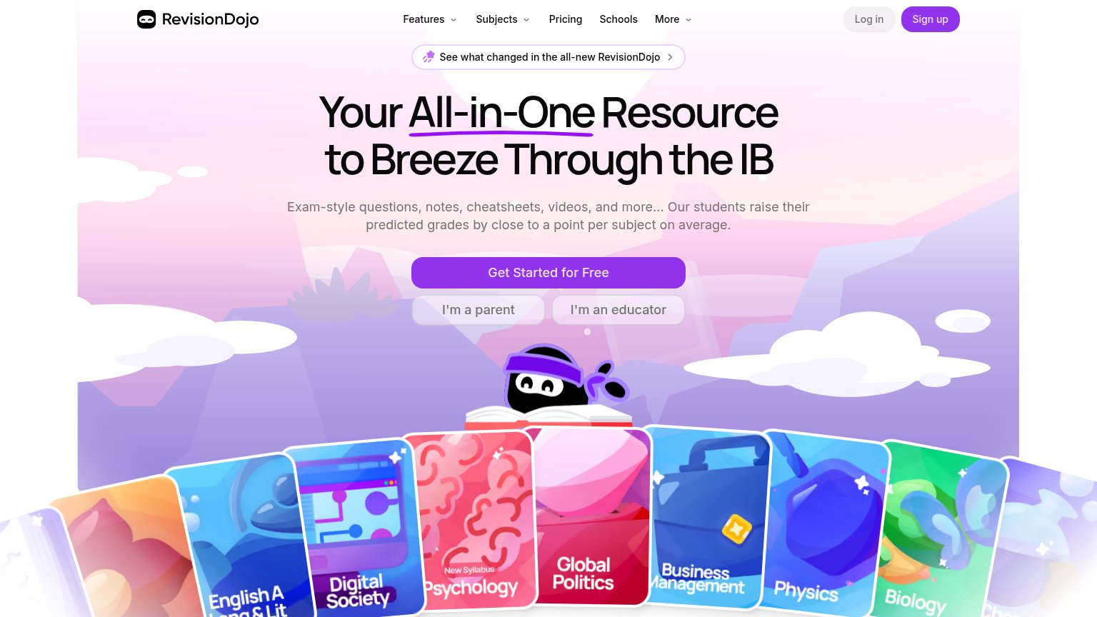
| Revision Dojo | "Our students raise their predicted grades by close to a point per subject on average." |
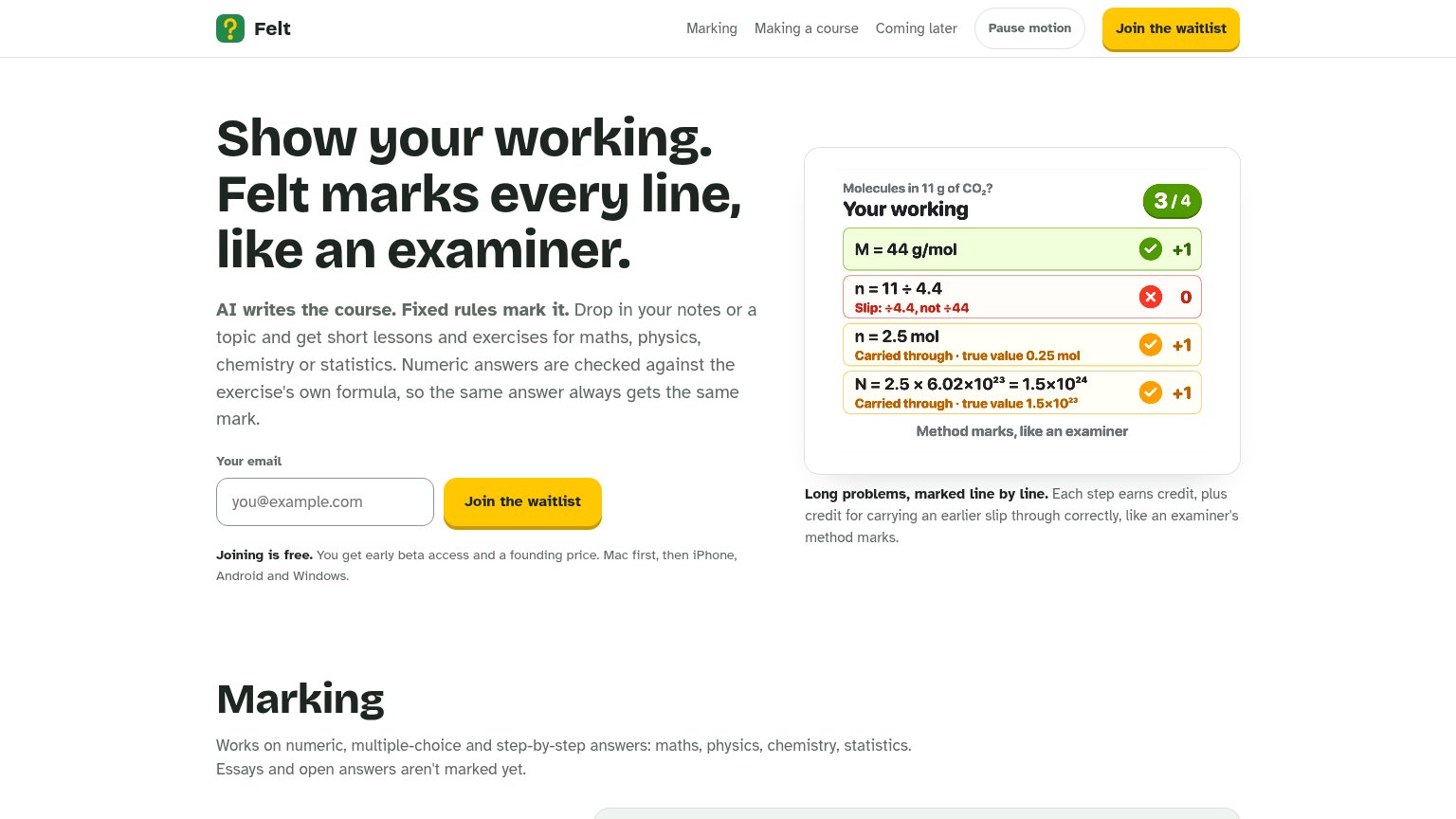
| Line-by-line marking demo showing "Slip: ÷4.4, not ÷44" and carried-through credit on the CO₂ problem | |
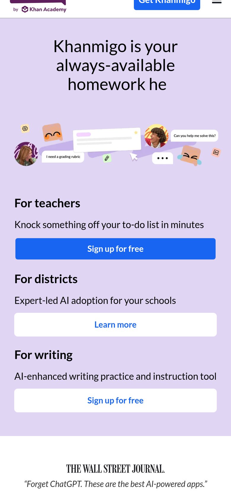
| Wall Street Journal quote: "Forget ChatGPT. These are the best AI-powered apps." | |
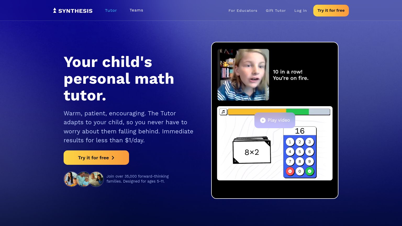
| "Join over 35,000 forward-thinking families. Designed for ages 5-11." beneath the hero CTA | |
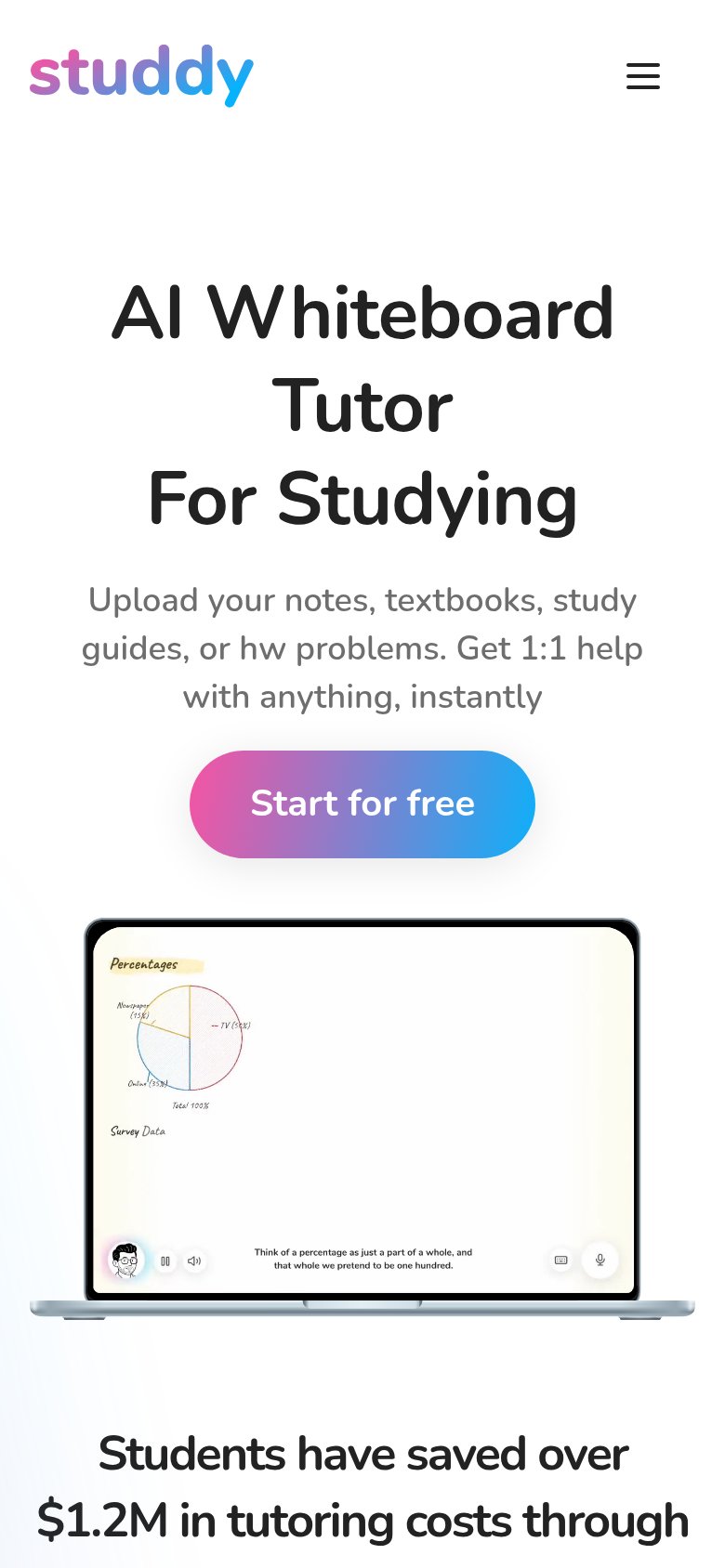
| "Students have saved over $1.2M in tutoring costs through" headline (mobile capture) | |
| Interactive solver input showing "Solve ∫ x² dx step b" with a math-token chip (mobile capture) |
Information hierarchy
76FairDoes the design help or inhibit what the page is trying to say?
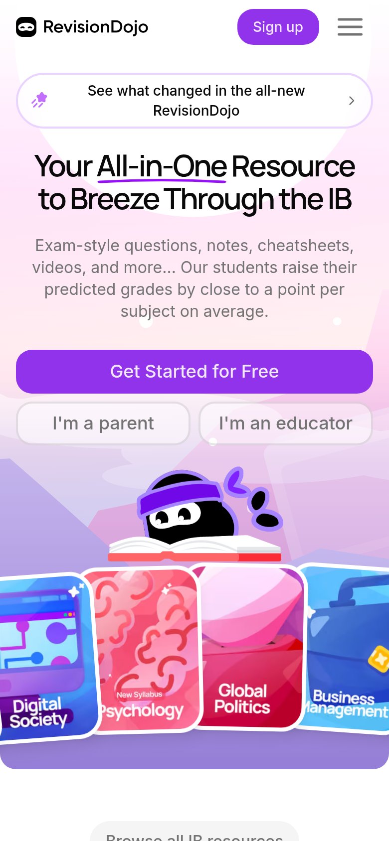
123- Parent and educator buttons — Two same-weight secondary buttons sit directly below the primary CTA, splitting the click decision three ways.
- Announcement banner pill — The 'See what changed' banner sits above the headline and is the first clickable exit in the scan path.
- Top navigation row — Seven nav targets plus Log in offer exits before the visitor reaches 'Get Started for Free'.
Value props
78FairTitle, subtitle, hero — do they sell the product's true value?
Revision Dojo’s headline
Your All-in-One Resource to Breeze Through the IB
Exam-style questions, notes, cheatsheets, videos, and more... Our students raise their predicted grades by close to a point per subject on average.
Working
Could improve
CTA
86StrongCopy, size, verb, cost-feel — does the primary CTA earn the click?
How Revision Dojo compares
Recommended rewrites
Mobile web
86StrongThe phone experience as a first-class citizen.
What works
What to improve