
Your landing page’s weakest score is CTA.
How Props.Cash ranks
- 1.
betalyze.io72
- 2.
Outlier70
- 3.
Props.Cash63
- 4.
Linemate62
- 5.
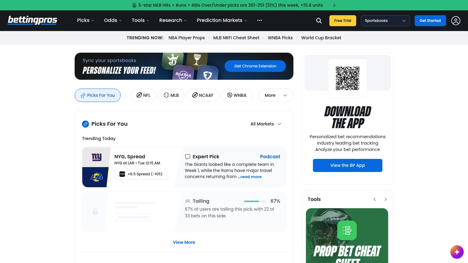
BettingPros55
CTA
48PoorCopy, size, verb, cost-feel — does the primary CTA earn the click?
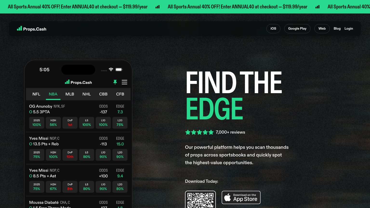
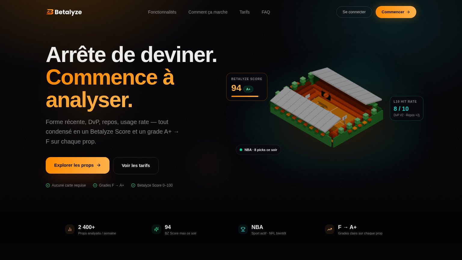
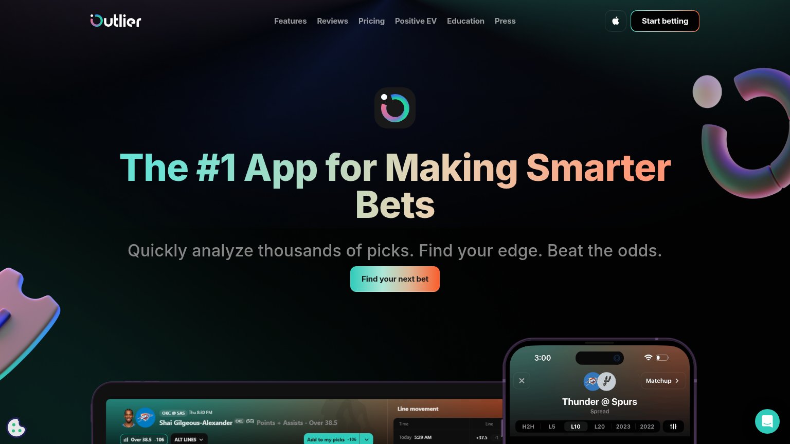
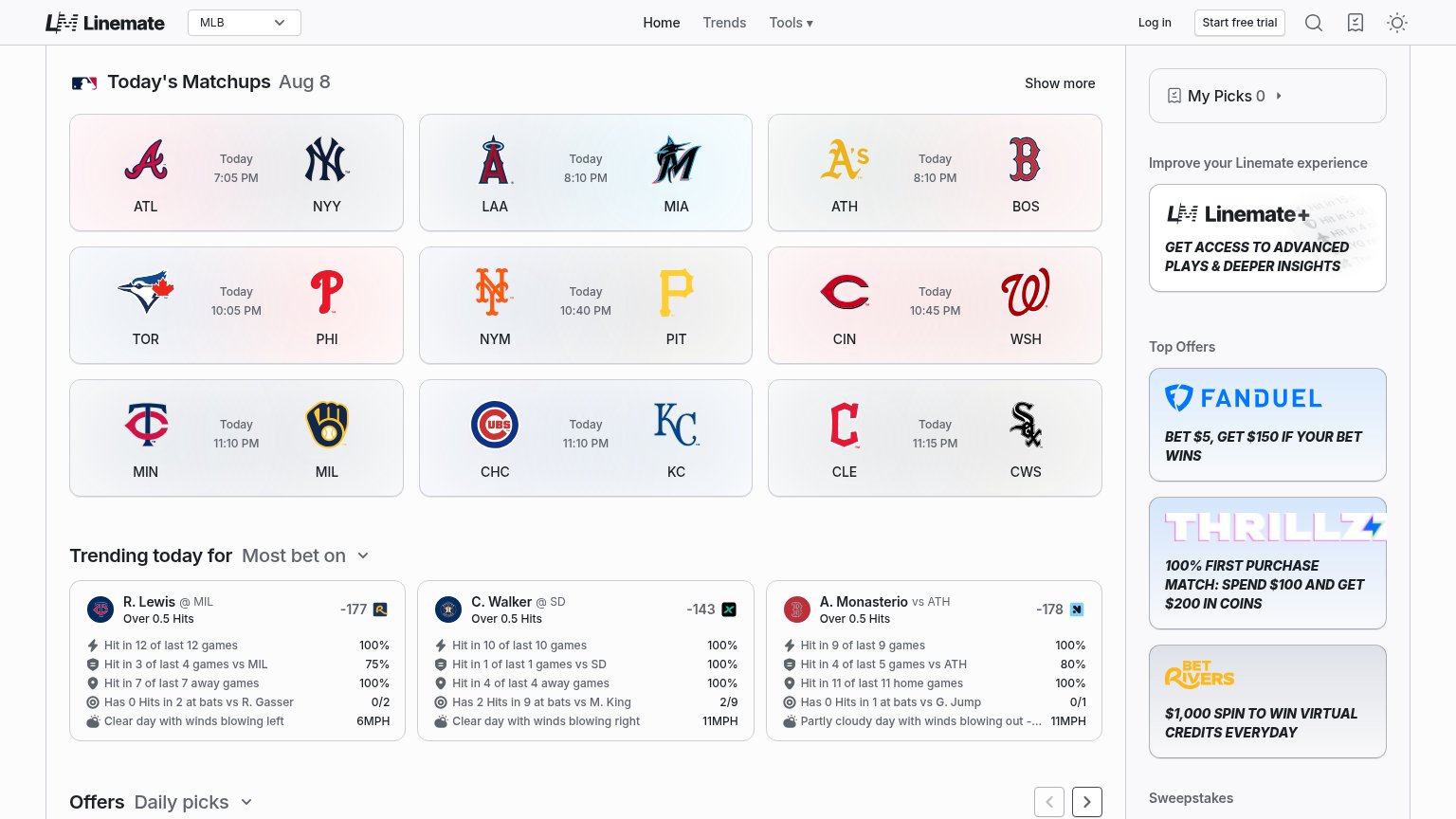
Problems
- no CTA on mobile fold
- generic store badge, tiny footprint
- no 'free' despite free trial
- 5 words, reads as a chore
Mobile web
52FairThe phone experience as a first-class citizen.
 123
- Phone mockup — Fills the bottom of the fold while the 'Download Today' CTA sits off-screen below it, leaving no tappable action in the first viewport.
- Green promo bar — Marquee copy is truncated to '99/year' and 'Ente' at the edges, making the 40% offer unreadable while it eats header space.
- Smart app banner — Stacks a third header layer on top of the promo bar and nav, pushing the hero and any CTA further down the page.
Information hierarchy
63FairDoes the design help or inhibit what the page is trying to say?
What works
What to improve
Trust
74FairProof that the product is real, competent, and safe to try.
How Props.Cash compares
Trust read
Value props
78FairTitle, subtitle, hero — do they sell the product's true value?
Props.Cash’s headline
FIND THE EDGE
Our powerful platform helps you scan thousands of props across sportsbooks and quickly spot the highest-value opportunities.
Working
Could improve