
Your landing page’s weakest score is Information hierarchy.
How Linemate ranks
62Growth scoreupdated
category scores
category scoresShowHide
Information hierarchy
48PoorDoes the design help or inhibit what the page is trying to say?
 1234
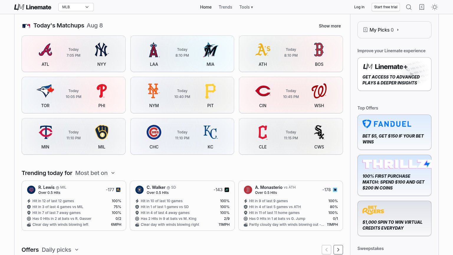
- Sportsbook offer stack — Three bold affiliate cards outweigh the trial CTA and pull visitors off-site before any conversion.
- Start free trial button — The primary CTA is a small outlined nav pill, visually weaker than the ad cards it competes with.
- Today's Matchups grid — Nine equal-weight cards open the fold with no headline, so the page reads as a data index instead of a pitch.
- Trending props odds — Sportsbook-branded odds badges (-177, -143, -178) add three more exits inside the content itself.
Trust
60FairProof that the product is real, competent, and safe to try.
| Trust read | |
|---|---|
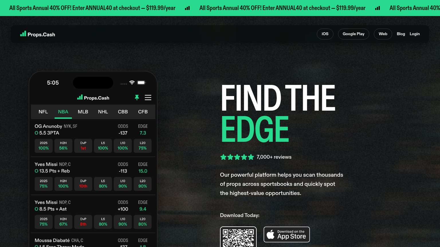
| Linemate | Live trending-picks UI: "R. Lewis @ MIL, Over 0.5 Hits — Hit in 12 of last 12 games 100%" |
| "2 400+ Props analysés / semaine" stat in the metrics bar | |
| Detailed real product UI screenshots showing 'Thunder @ Spurs' matchup stats and player prop charts | |
| Five-star rating with "7,000+ reviews" above the App Store download CTA | |
| "67% of users are tailing this pick, with 22 of 33 bets on this side" — live pick-tailing stat in the feed |
Mobile web
64FairThe phone experience as a first-class citizen.
What works
What to improve
CTA
68FairCopy, size, verb, cost-feel — does the primary CTA earn the click?
How Linemate compares
Recommended rewrites
Value props
70FairTitle, subtitle, hero — do they sell the product's true value?
Linemate’s headline
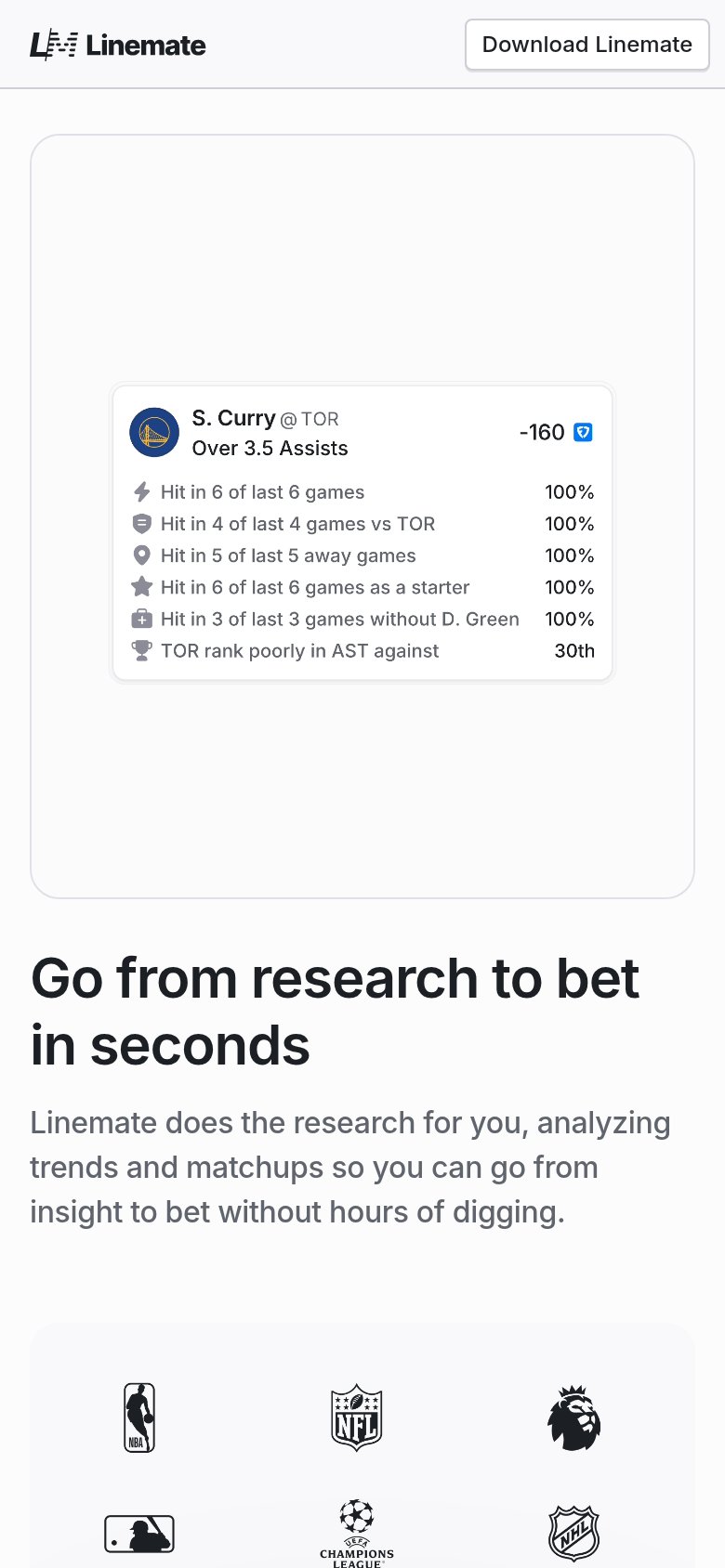
Go from research to bet in seconds
Linemate does the research for you, analyzing trends and matchups so you can go from insight to bet without hours of digging.
Working
Could improve