
Your landing page’s weakest score is CTA.
How Portcast ranks
73Growth scoreupdated
category scores
category scoresShowHide
CTA
68FairCopy, size, verb, cost-feel — does the primary CTA earn the click?
Problems
- click feels like a sales meeting
- no value payoff in the label
- nav says 'Contact Us', label split
- single CTA, no low-commitment path
Information hierarchy
72FairDoes the design help or inhibit what the page is trying to say?
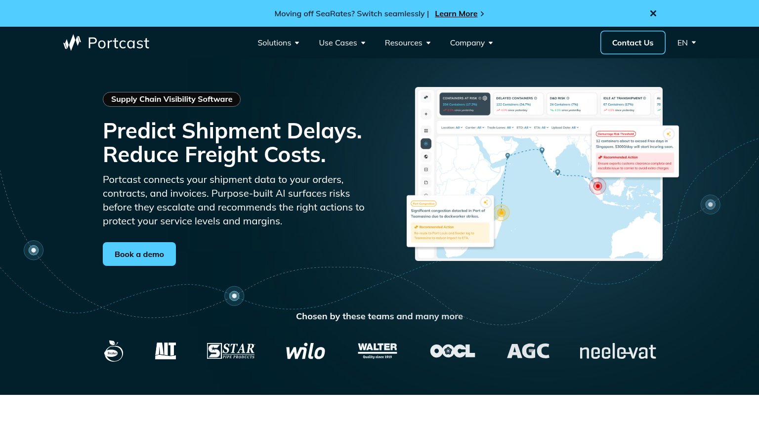
1234- Contact Us button — White-outlined button matches the primary CTA's weight and sits top-right in the scan path, splitting attention from 'Book a demo'.
- SeaRates announcement banner — Bright cyan bar with 'Learn More' link is the highest-contrast element on the page, pulling first attention away from the hero and adding an exit.
- Nav dropdown row — Four dropdown menus (Solutions, Use Cases, Resources, Company) expose dozens of exit paths before the visitor reaches the hero argument.
- Dashboard screenshot detail — Dense product UI with small metric cards and tooltips is unreadable at this size, competing with the headline without communicating clearly.
Trust
72FairProof that the product is real, competent, and safe to try.
How Portcast compares
Trust read
Mobile web
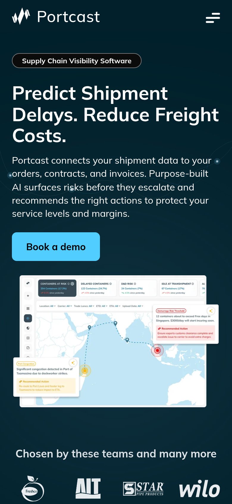
72FairThe phone experience as a first-class citizen.
What works
What to improve
Value props
80StrongTitle, subtitle, hero — do they sell the product's true value?
Portcast’s headline
Predict Shipment Delays. Reduce Freight Costs.
Portcast connects your shipment data to your orders, contracts, and invoices. Purpose-built AI surfaces risks before they escalate and recommends the right actions to protect your service levels and margins.
Working
Could improve