
Your landing page’s weakest score is Information hierarchy.
How Polimorphic ranks
70Growth scoreupdated
category scores
category scoresShowHide
Information hierarchy
68FairDoes the design help or inhibit what the page is trying to say?
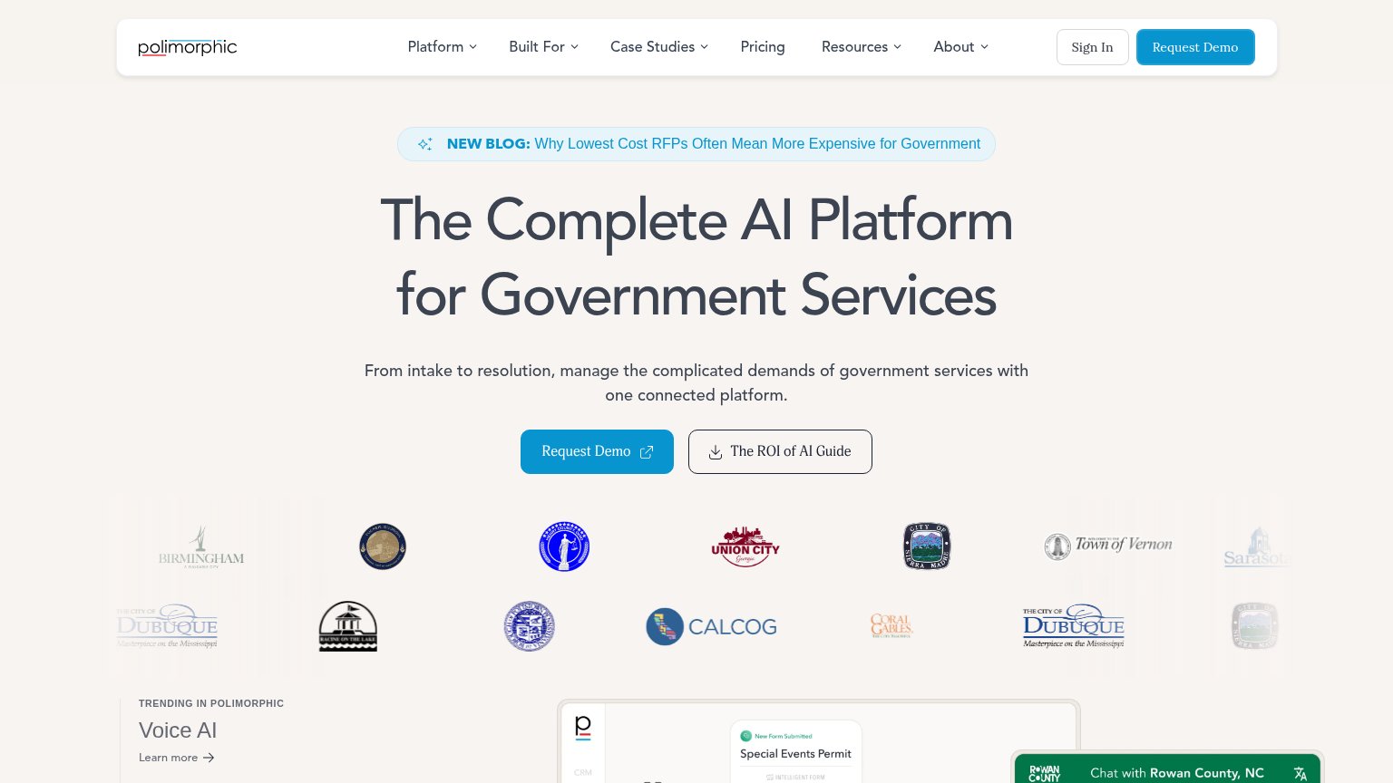 1234
- Blog announcement banner — First element in the scan path pulls attention to a blog post before the headline or CTA registers.
- ROI guide button — Secondary CTA at near-equal weight beside Request Demo splits the fold's single action.
- Navigation bar — Six nav items plus Sign In create eight-plus exit paths before the hero CTA.
- Government logo grid — Fourteen mixed-color, mixed-size seals form a visually noisy band with no shared treatment.
CTA
68FairCopy, size, verb, cost-feel — does the primary CTA earn the click?
Problems
- 'Request' feels costly, sales-gated
- external-link icon adds friction
- secondary CTA lacks action verb
Value props
68FairTitle, subtitle, hero — do they sell the product's true value?
Polimorphic’s headline
The Complete AI Platform for Government Services
From intake to resolution, manage the complicated demands of government services with one connected platform.
Working
Could improve
Mobile web
72FairThe phone experience as a first-class citizen.
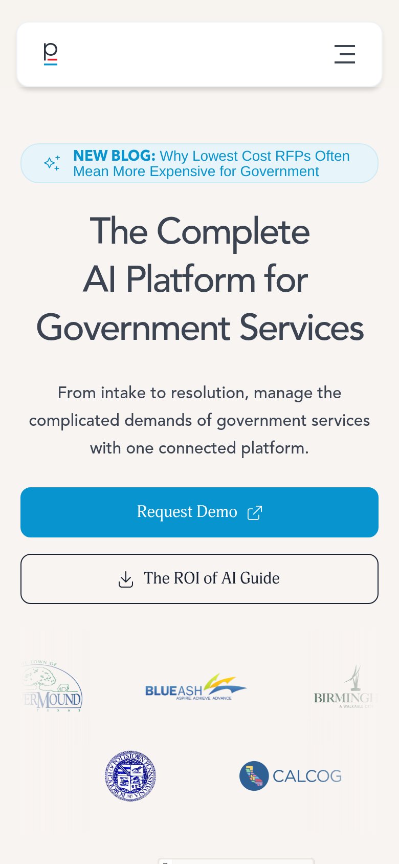
What works
What to improve
Trust
76FairProof that the product is real, competent, and safe to try.
How Polimorphic compares
Trust read