
Your landing page’s weakest score is Trust.
How Perceptyx ranks
Trust
52FairProof that the product is real, competent, and safe to try.


| Trust read | |
|---|---|
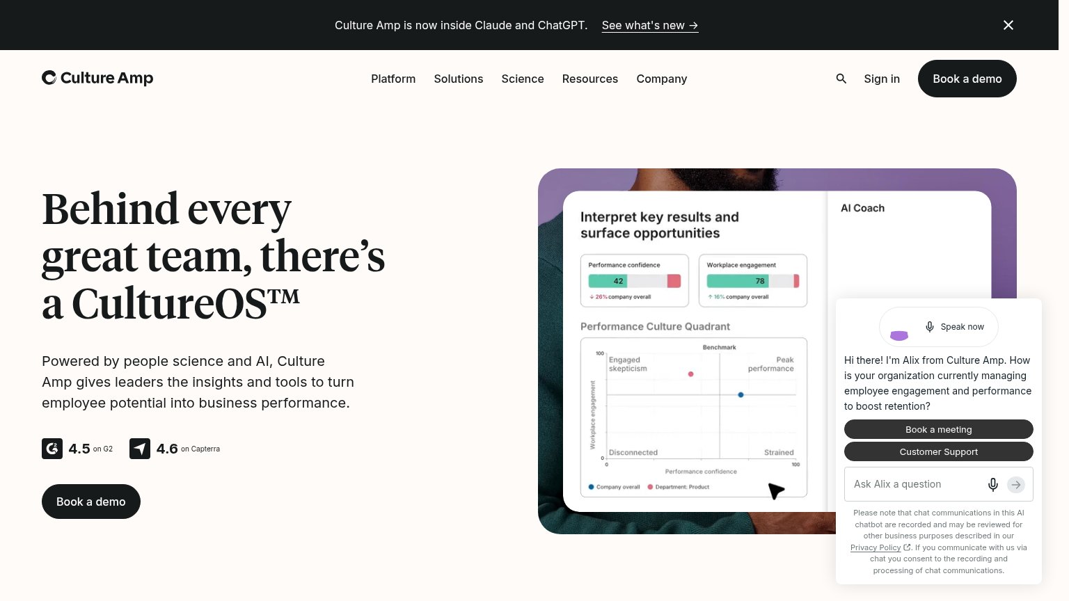
| Perceptyx | "Trusted by the Fortune 1000" heading visible at the bottom edge of the desktop fold |
| "Backed by Y Combinator" badge | |
| "4.5 on G2" and "4.6 on Capterra" review badges above the Book a demo CTA | |
| implicit context Qualtrics EmployeeXM may benefit from pre-existing familiarity among its target audience. | |
| Real product photo of Surface device and headphones | |
| "built on 9 years of People Science research" subhead claim |
CTA
62FairCopy, size, verb, cost-feel — does the primary CTA earn the click?

Problems
- click feels like a sales call
- cheaper assessment CTA buried in banner
- 4 words, over the 3-word ideal
- no value promised for the click
Mobile web
62FairThe phone experience as a first-class citizen.
What works
What to improve
Information hierarchy
68FairDoes the design help or inhibit what the page is trying to say?
What works
What to improve
Value props
68FairTitle, subtitle, hero — do they sell the product's true value?
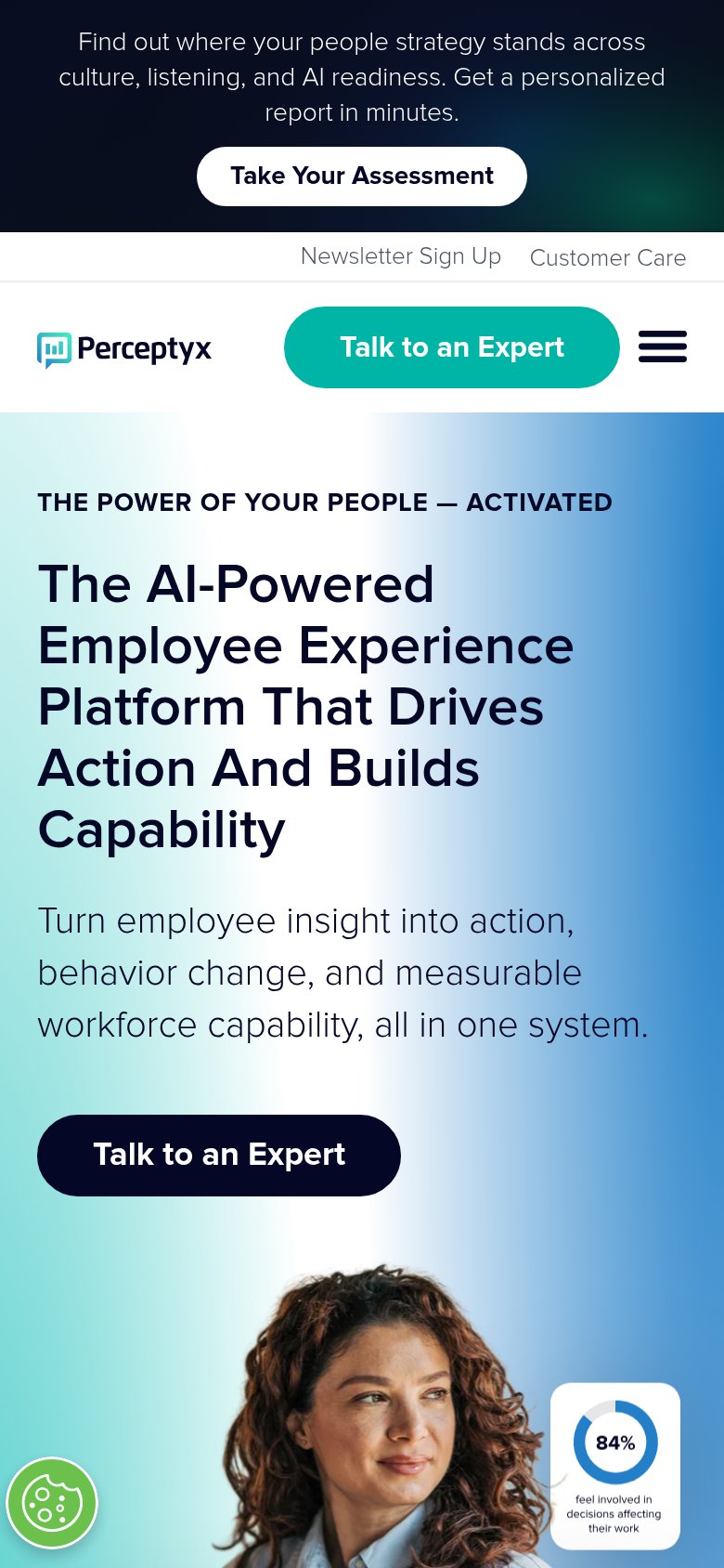
Perceptyx’s headline
The AI-Powered Employee Experience Platform That Drives Action And Builds Capability
Turn employee insight into action, behavior change, and measurable workforce capability, all in one system.
Working
Could improve