
Your landing page’s weakest score is Information hierarchy.
How CultureAmp ranks
72Growth scoreupdated
category scores
category scoresShowHide
Information hierarchy
68FairDoes the design help or inhibit what the page is trying to say?
 1234
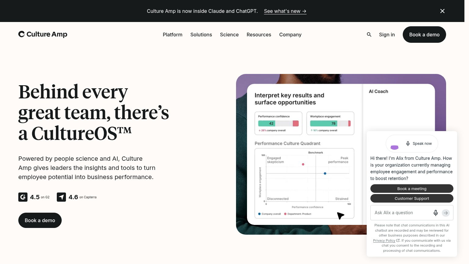
- Auto-opened Alix chatbot — Uninvited panel with its own 'Book a meeting' and 'Customer Support' buttons splits the demo path and covers the product screenshot.
- Announcement banner — 'See what's new →' is the first link in the scan path and exits the fold before the value prop is read.
- Nav Sign in cluster — Five dropdowns plus search and Sign in add seven leaks styled near the weight of the hero CTA.
- Header Book a demo — Duplicates the hero 'Book a demo' at identical weight, giving the fold two equal primary buttons.
CTA
72FairCopy, size, verb, cost-feel — does the primary CTA earn the click?

Problems
- 'demo' implies sales-call commitment
- no self-serve or low-cost alternative
- chatbot CTAs compete for attention
Value props
72FairTitle, subtitle, hero — do they sell the product's true value?
CultureAmp’s headline
Behind every great team, there's a CultureOS™
Powered by people science and AI, Culture Amp gives leaders the insights and tools to turn employee potential into business performance.
Working
Could improve
Mobile web
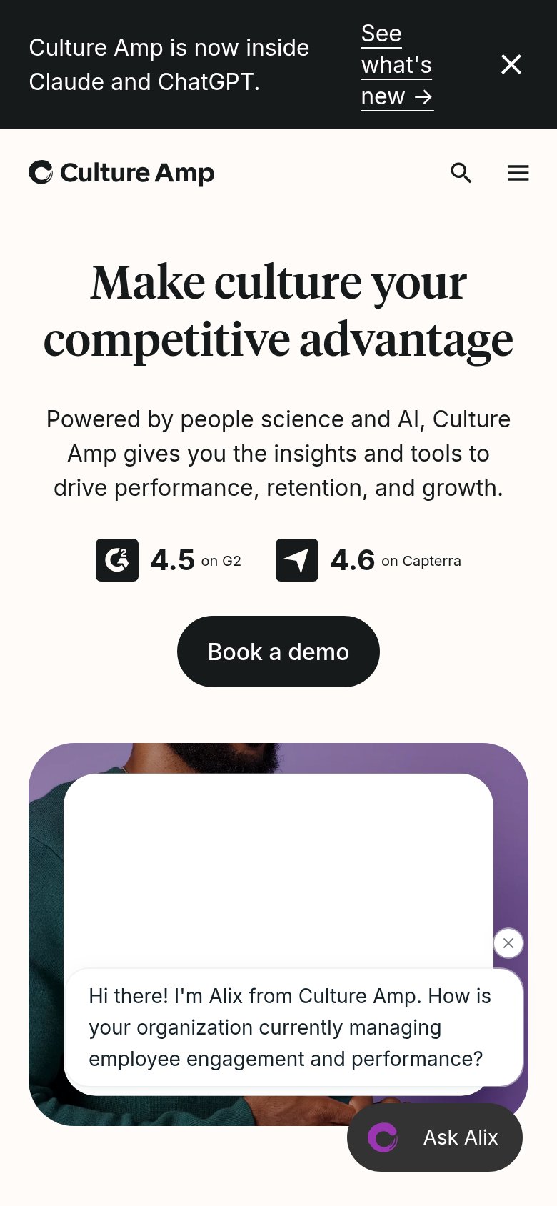
72FairThe phone experience as a first-class citizen.
What works
What to improve
Trust
74FairProof that the product is real, competent, and safe to try.
How CultureAmp compares
Trust read