
Your landing page’s weakest score is Trust.
How Peec AI ranks
77Growth scoreupdated
category scores
category scoresShowHide
Trust
66FairProof that the product is real, competent, and safe to try.
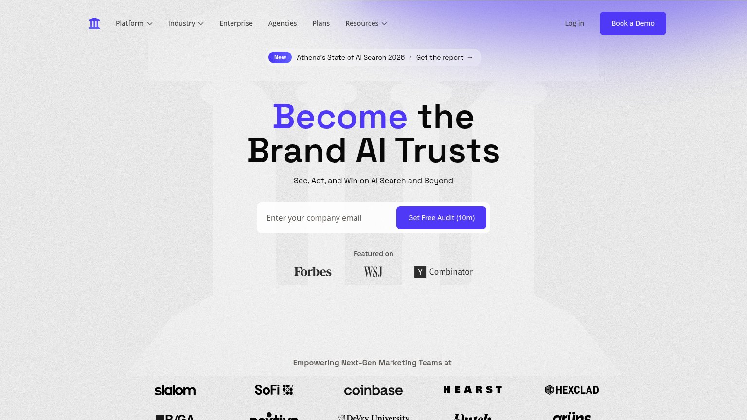
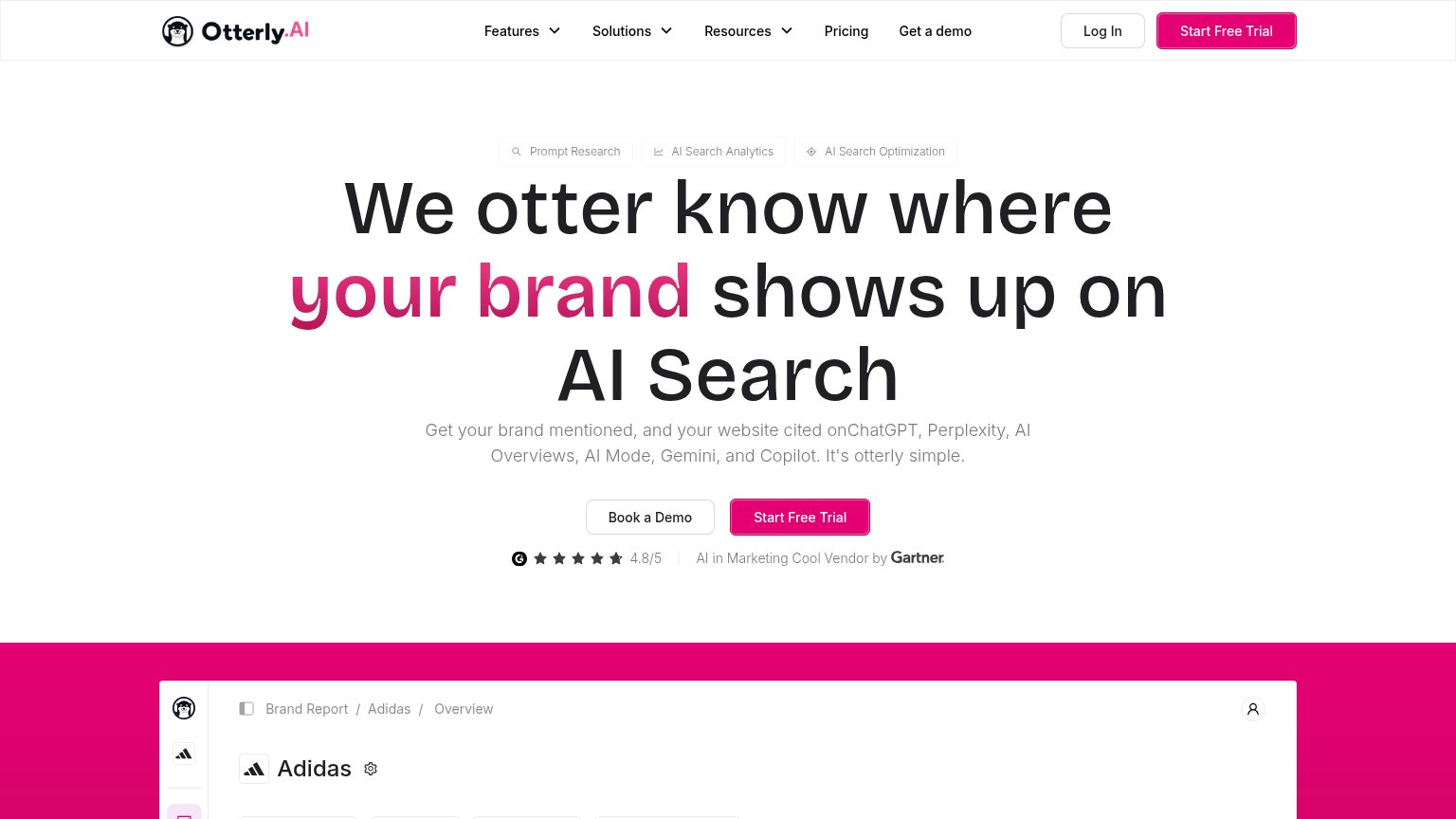
| Trust read | |
|---|---|
| Peec AI | No visible trust signal identified. |
| [ Backed by Y Combinator ] badge next to the Get started CTA | |
| Real product workflow UI titled "AEO-Optimized FAQ Generator" showing nodes like "Web Page Scrape" with a Succeeded stat | |
| Customer logo wall under 'Empowering Next-Gen Marketing Teams at' featuring SoFi, Coinbase, Hearst, and Hexclad | |
| "AI in Marketing Cool Vendor by Gartner" alongside a G2 4.8/5 star rating under the hero CTA |
Information hierarchy
76FairDoes the design help or inhibit what the page is trying to say?
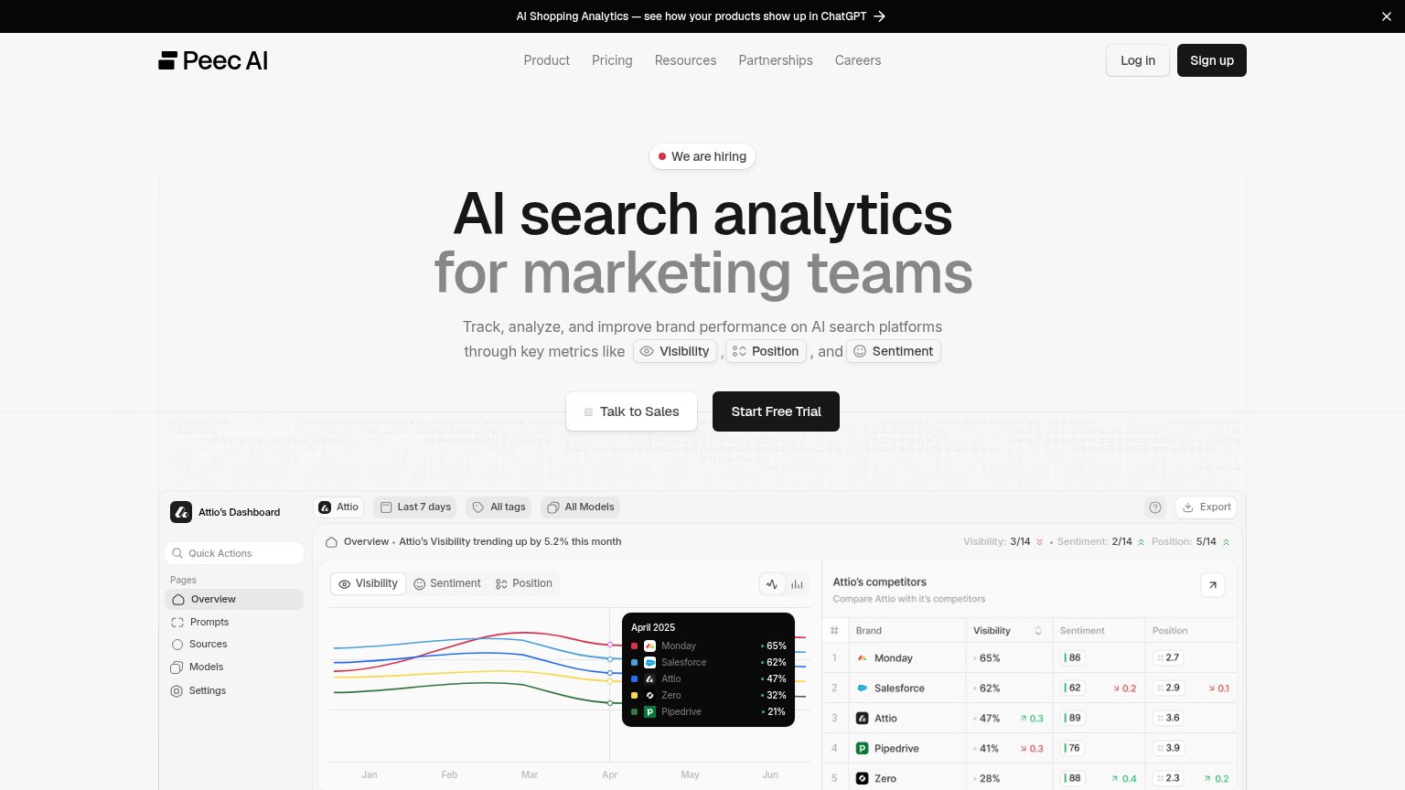 1234
- We are hiring badge — Occupies the prime slot above the headline and routes first attention to a careers page instead of the value prop.
- Sign up button — Same dark-fill weight as Start Free Trial, creating a second primary CTA in the opposite corner of the fold.
- Announcement banner — Top-of-page link to Shopping Analytics pulls visitors away before the headline is even read.
- Talk to Sales button — Sits left of Start Free Trial at near-equal size, forcing a choice before the primary action.
Value props
80StrongTitle, subtitle, hero — do they sell the product's true value?
Peec AI’s headline
AI search analytics for marketing teams
Track, analyze, and improve brand performance on AI search platforms through key metrics like Visibility, Position, and Sentiment
Working
Could improve
Mobile web
80StrongThe phone experience as a first-class citizen.
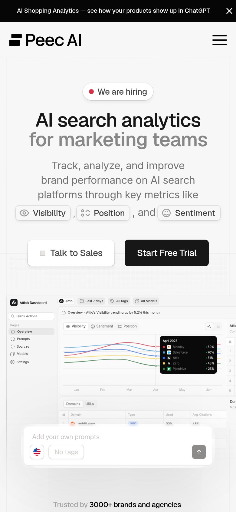
What works
What to improve
CTA
85StrongCopy, size, verb, cost-feel — does the primary CTA earn the click?
How Peec AI compares
Recommended rewrites