
Your landing page’s weakest score is Mobile web.
How Otterly.AI ranks
- 1.
Athena80
- 2.
Peec AI77
- 3.
Otterly.AI74
- 4.
Profound70
- 5.
Sitefire68
74Growth scoreupdated
category scores
category scoresShowHide
Mobile web
64FairThe phone experience as a first-class citizen.
 123
- Oversized hero headline — Headline barely scales down from desktop, wrapping into six tall lines that push the CTA to the bottom edge of the viewport.
- Feature pill row — Three feature pills sit above the headline and compete with the value statement before it is read.
- Side-by-side CTA pair — 'Book a Demo' and 'Start Free Trial' split the column into two half-width buttons instead of a stacked full-bleed primary.
Information hierarchy
72FairDoes the design help or inhibit what the page is trying to say?
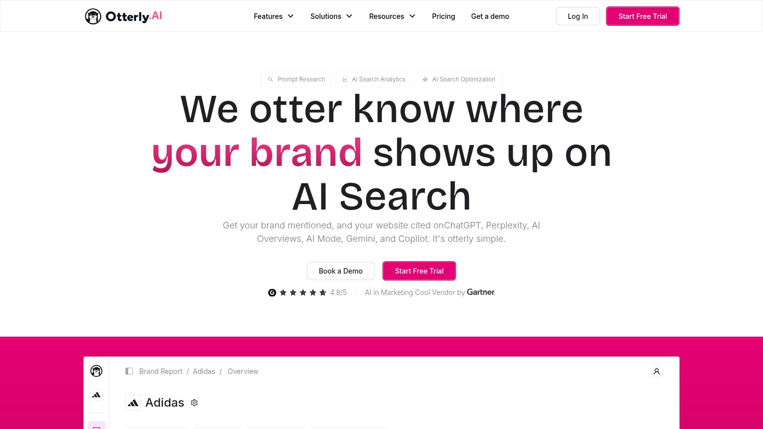 1234
- Book a Demo button — Secondary CTA sits left of the primary in the scan path at near-equal size, splitting the fold's one action into two.
- Three feature pills — Same-weight capsule trio above the headline adds a competing scan layer before the value prop lands.
- Header nav row — Six nav items plus Log In and a duplicate 'Get a demo' give eight exit paths before the hero CTA.
- Product screenshot cutoff — The Adidas dashboard peeks in with only a header row visible, showing no data that proves the promise at the fold line.
Trust
72FairProof that the product is real, competent, and safe to try.
How Otterly.AI compares
Trust read
Value props
76FairTitle, subtitle, hero — do they sell the product's true value?
Otterly.AI’s headline
We otter know where your brand shows up on AI Search
Get your brand mentioned, and your website cited onChatGPT, Perplexity, AI Overviews, AI Mode, Gemini, and Copilot. It's otterly simple.
Working
Could improve
CTA
84StrongCopy, size, verb, cost-feel — does the primary CTA earn the click?
How Otterly.AI compares
Recommended rewrites