
Your landing page’s weakest score is Information hierarchy.
How Sponge ranks
66Growth scoreupdated
category scores
category scoresShowHide
Information hierarchy
62FairDoes the design help or inhibit what the page is trying to say?
 123
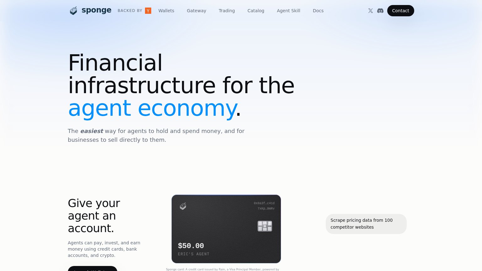
- Six nav links — Wallets, Gateway, Trading, Catalog, Agent Skill, and Docs sit at equal weight beside the Contact button, offering six exits before any value is delivered.
- Floating pricing tooltip — 'Scrape pricing data from 100 competitor websites' hangs disconnected in the right margin with no visible anchor, reading as a stray UI fragment.
- Truncated wallet button — The 'Launch Wallet' CTA is sliced by the viewport edge, so the strongest action on the page is invisible at first glance.
Trust
62FairProof that the product is real, competent, and safe to try.
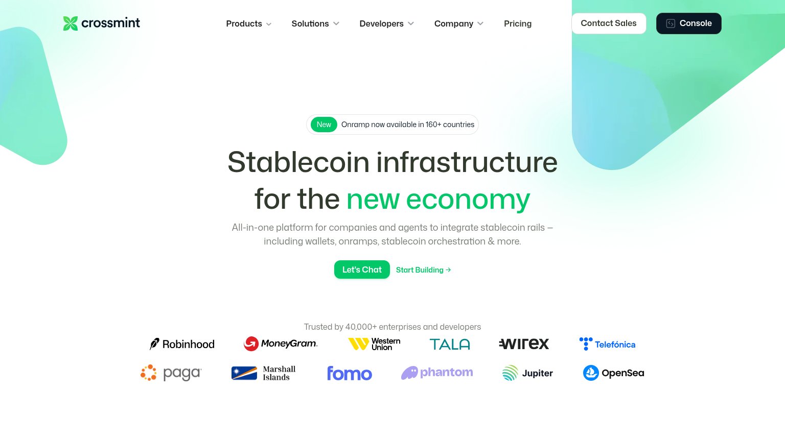
| Trust read | |
|---|---|
| Sponge | No visible trust signal identified. |
| No visible trust signal identified. | |
| Security stack diagram naming Okta, Auth0, Cequence, Imperva, and Datadog | |
| "Trusted by 40,000+ enterprises and developers" logo wall with Robinhood, MoneyGram, Western Union, Telefónica | |
| Interactive "Scan path" card with live "Scan my site" input and "~3 minutes to first tools / Free to try / Easy start" c | |
| Product UI showing "Trending crypto" with live prices ("Bitcoin $90,238.11") |
Mobile web
64FairThe phone experience as a first-class citizen.
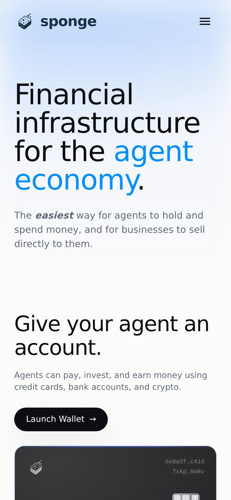
What works
What to improve
CTA
66FairCopy, size, verb, cost-feel — does the primary CTA earn the click?
How Sponge compares
Recommended rewrites
Value props
76FairTitle, subtitle, hero — do they sell the product's true value?
Sponge’s headline
Financial infrastructure for the agent economy.
The easiest way for agents to hold and spend money, and for businesses to sell directly to them.
Working
Could improve