
Your landing page’s weakest score is Trust.
How Payman ranks
Trust
32PoorProof that the product is real, competent, and safe to try.
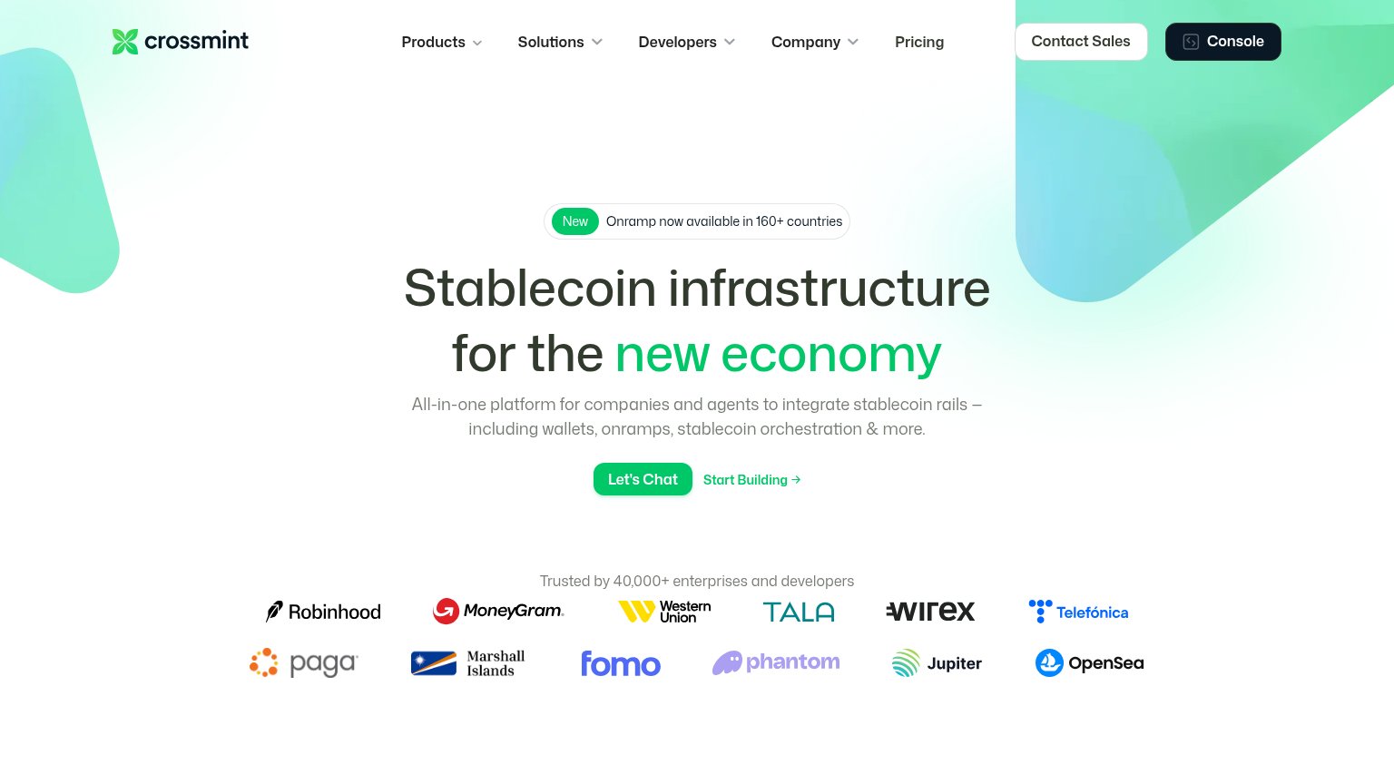
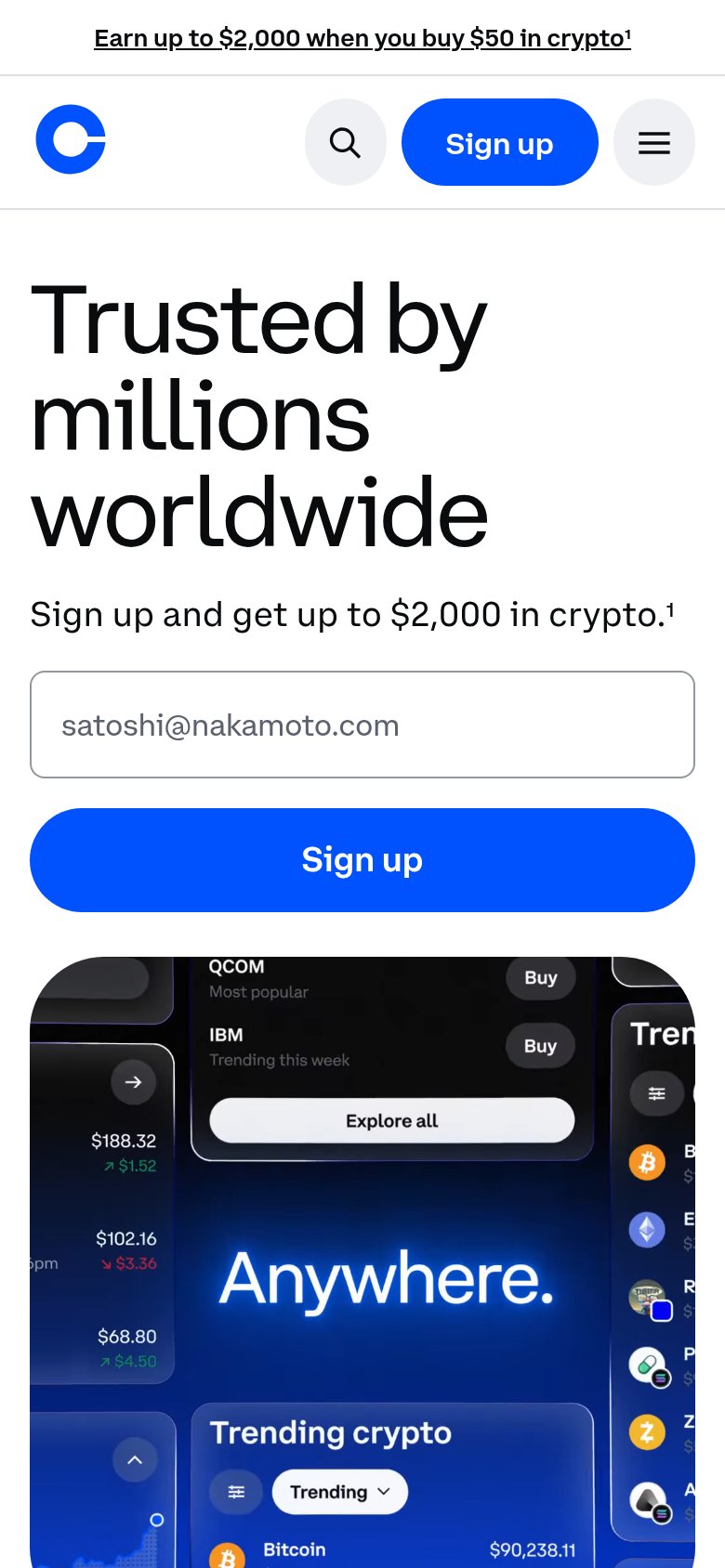
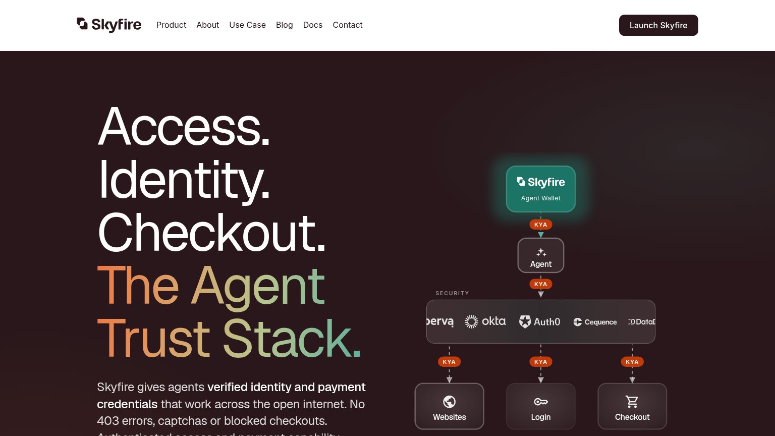
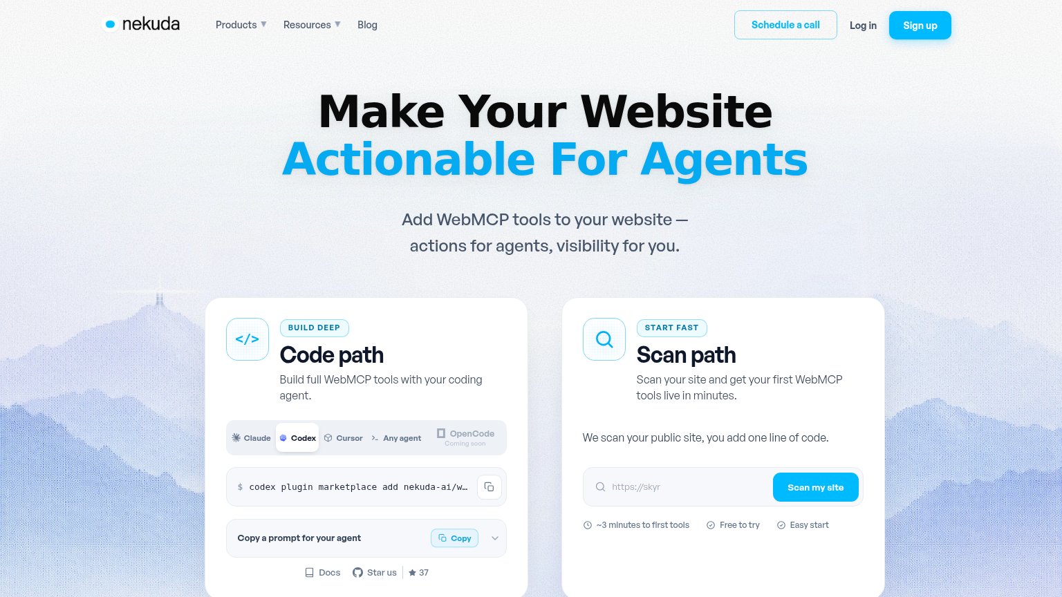
| Trust read | |
|---|---|
| Payman | No visible trust signal identified. |
| No visible trust signal identified. | |
| Security stack diagram naming Okta, Auth0, Cequence, Imperva, and Datadog | |
| "Trusted by 40,000+ enterprises and developers" logo wall with Robinhood, MoneyGram, Western Union, Telefónica | |
| Interactive "Scan path" card with live "Scan my site" input and "~3 minutes to first tools / Free to try / Easy start" c | |
| Product UI showing "Trending crypto" with live prices ("Bitcoin $90,238.11") |
CTA
48PoorCopy, size, verb, cost-feel — does the primary CTA earn the click?
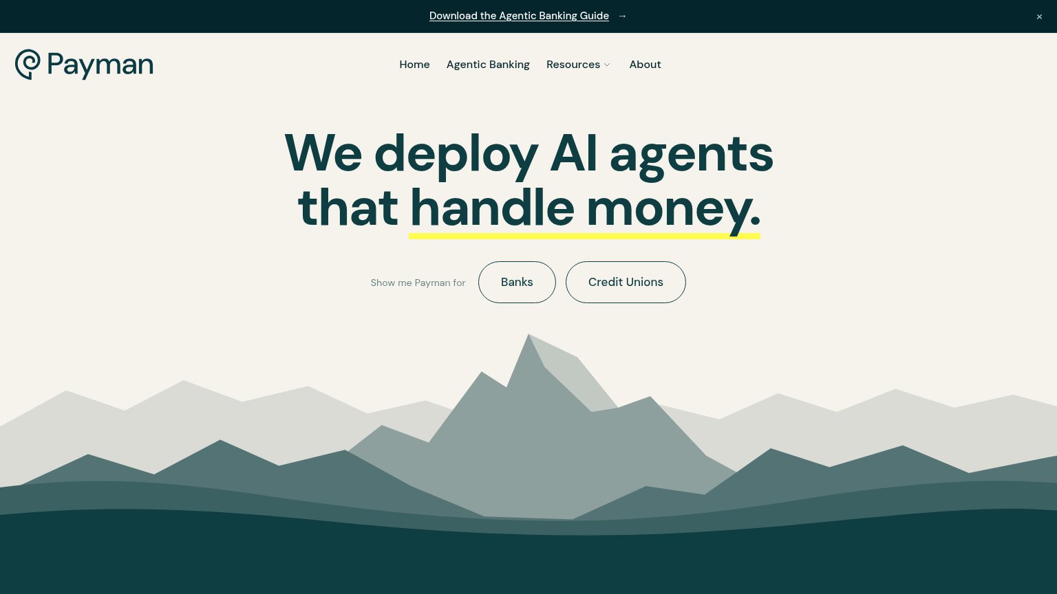
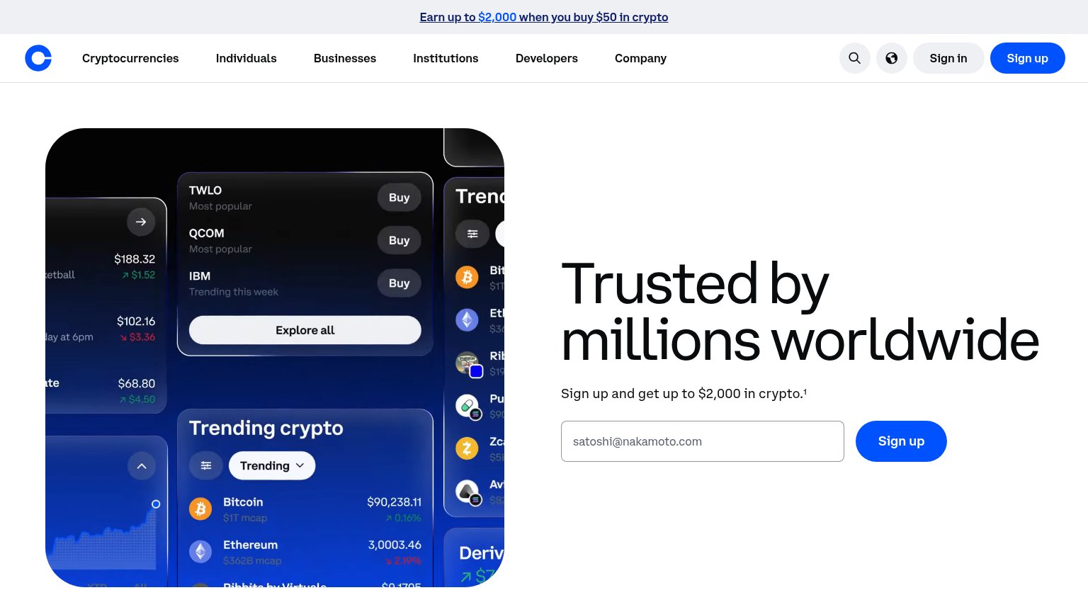
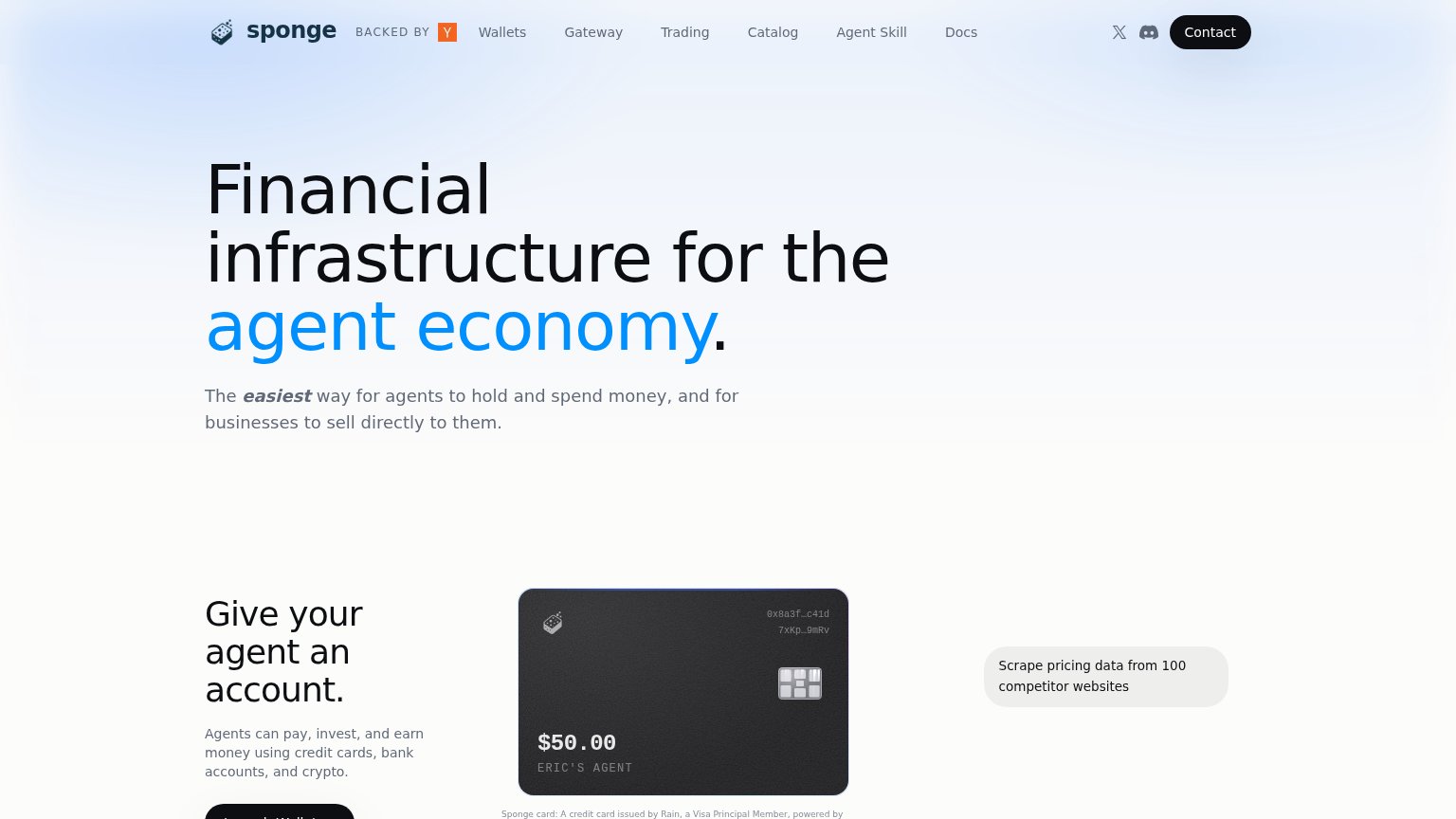
Problems
- noun label, no action verb
- segmentation pill, not a real CTA
- outcome of click is unclear
- only verb CTA is a banner download
Value props
62FairTitle, subtitle, hero — do they sell the product's true value?
Payman’s headline
We deploy AI agents that handle money.
Working
Could improve
Mobile web
68FairThe phone experience as a first-class citizen.
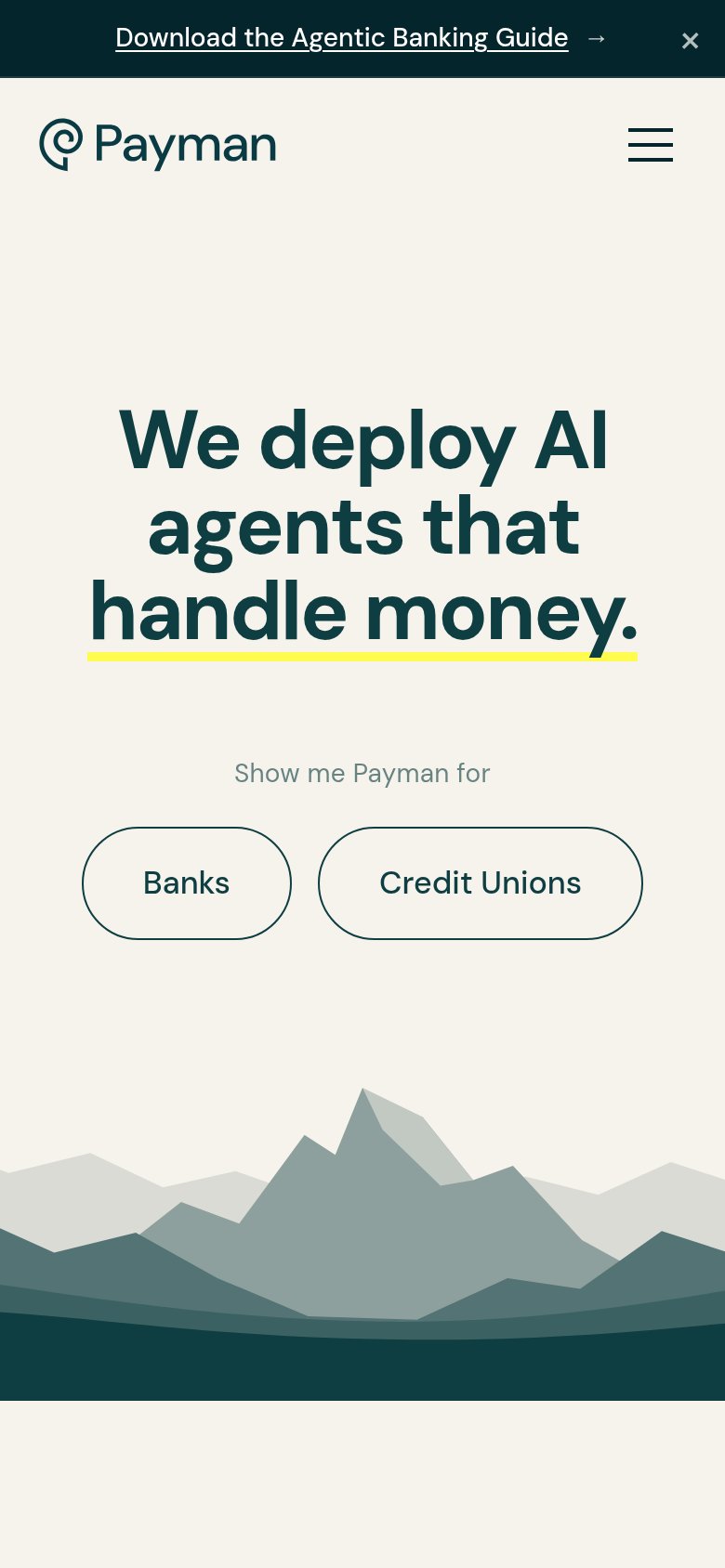
What works
What to improve
Information hierarchy
72FairDoes the design help or inhibit what the page is trying to say?
What works
What to improve