
Your landing page’s weakest score is Trust.
How Nekuda ranks
Trust
48PoorProof that the product is real, competent, and safe to try.
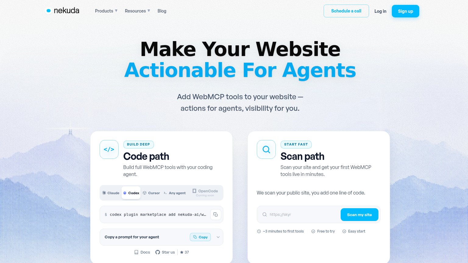
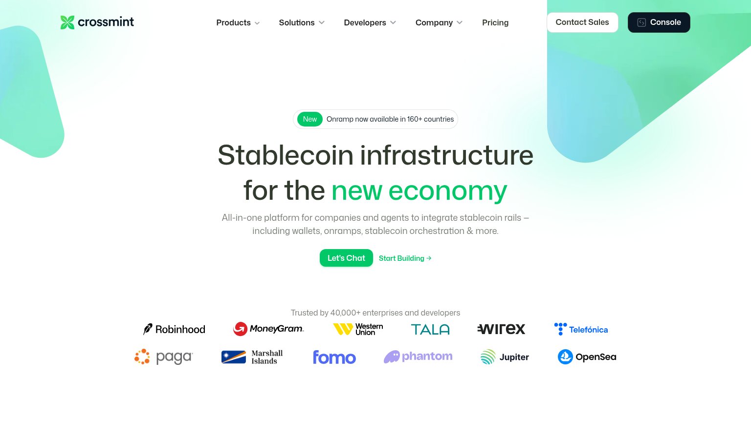
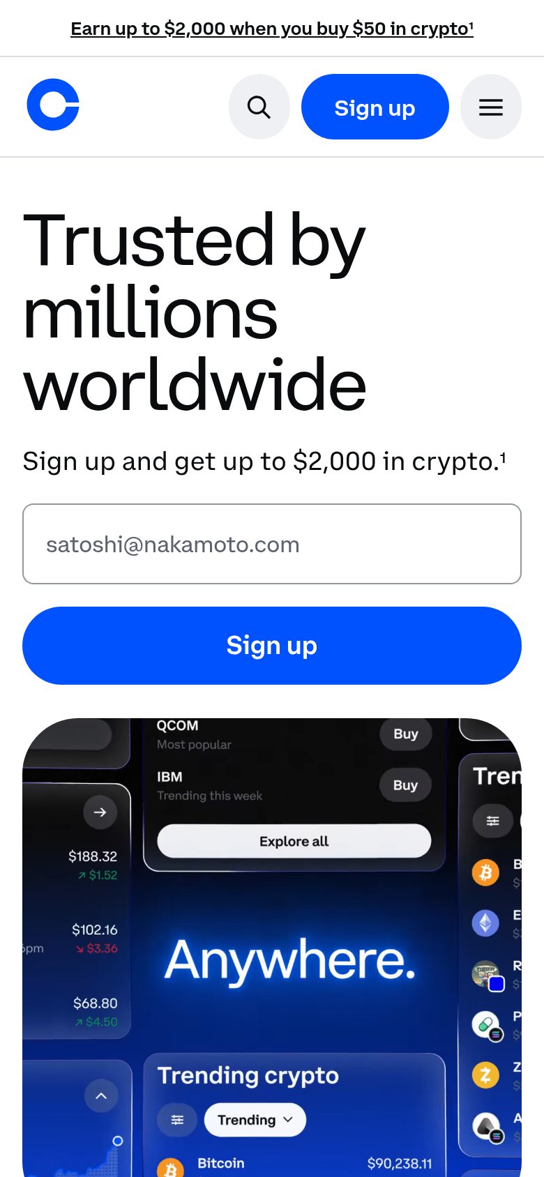
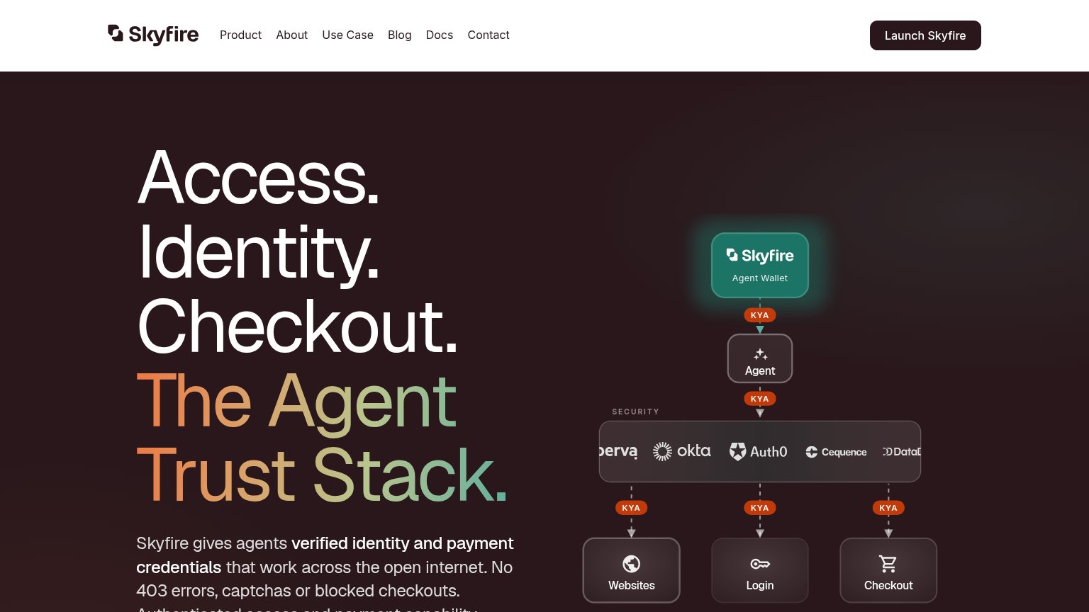
| Trust read | |
|---|---|
| Nekuda | Interactive "Scan path" card with live "Scan my site" input and "~3 minutes to first tools / Free to try / Easy start" c |
| No visible trust signal identified. | |
| No visible trust signal identified. | |
| Security stack diagram naming Okta, Auth0, Cequence, Imperva, and Datadog | |
| "Trusted by 40,000+ enterprises and developers" logo wall with Robinhood, MoneyGram, Western Union, Telefónica | |
| Product UI showing "Trending crypto" with live prices ("Bitcoin $90,238.11") |
Mobile web
58FairThe phone experience as a first-class citizen.
 123
- Hero without CTA — First viewport ends at the subhead with no tappable action — every conversion path is below the fold.
- Truncated command snippet — The terminal box shows only 'np', so the copy target is unreadable and looks broken on mobile.
- Copy prompt row — The only visible action deep in the scroll is a small 'Copy' button — a utility control, not a conversion CTA.
Information hierarchy
72FairDoes the design help or inhibit what the page is trying to say?
What works
What to improve
Value props
72FairTitle, subtitle, hero — do they sell the product's true value?
Nekuda’s headline
Make Your Website Actionable For Agents
Add WebMCP tools to your website — actions for agents, visibility for you.
Working
Could improve
CTA
78FairCopy, size, verb, cost-feel — does the primary CTA earn the click?
How Nekuda compares
Recommended rewrites