
Your landing page’s weakest score is Mobile web.
How Ori (Oriserve) ranks
78Growth scoreupdated
category scores
category scoresShowHide
Mobile web
68FairThe phone experience as a first-class citizen.
 12
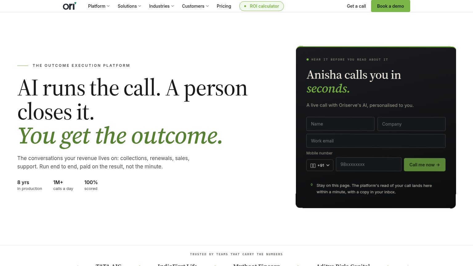
- Trusted-by logo row — Logos are clipped mid-word ("IG", "IndiaFirst Life" cut at edge), reading as a rendering bug.
- Hero headline block — Three-line headline plus green subhead plus paragraph plus stat row stack into one dense text column that fills the fold.
Information hierarchy
72FairDoes the design help or inhibit what the page is trying to say?
 1234
- Book a demo button — Green primary-weight nav CTA competes directly with the fold's 'Call me now' action, splitting the conversion path.
- Call me now button — The actual primary action is a small dark button buried inside the panel's bottom row, easy to miss on first scan.
- ROI calculator pill — Green-outlined pill draws primary-CTA-level attention mid-nav yet routes visitors away from the live demo.
- Nav dropdown row — Five dropdown/link items plus three CTAs give eight exit paths before the visitor reaches the demo form.
CTA
82StrongCopy, size, verb, cost-feel — does the primary CTA earn the click?
How Ori (Oriserve) compares
Recommended rewrites
Trust
82StrongProof that the product is real, competent, and safe to try.
How Ori (Oriserve) compares
Trust read
Value props
86StrongTitle, subtitle, hero — do they sell the product's true value?
Ori (Oriserve)’s headline
AI runs the call. A person closes it. You get the outcome.
The conversations your revenue lives on: collections, renewals, sales, support. Run end to end, paid on the result, not the minute.
Working
Could improve