
Your landing page’s weakest score is Information hierarchy.
How Retell AI ranks
74Growth scoreupdated
category scores
category scoresShowHide
Information hierarchy
72FairDoes the design help or inhibit what the page is trying to say?
 1234
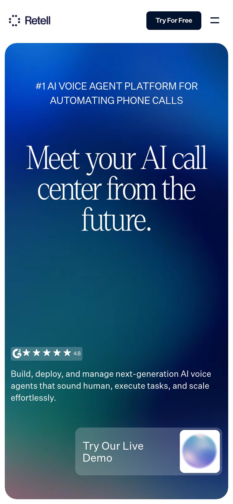
- Try For Free button — Primary CTA is a small nav pill far from the headline, outside the natural scan path.
- Cookie consent banner — Covers the G2 badge and hides the subtitle that mobile shows, blocking proof at decision time.
- Try Our Live Demo — Second action anchored bottom-right competes with Try For Free, splitting attention across corners.
- Nav menu row — Five dropdowns plus Login and Contact Sales create seven exits before the conversion action.
Value props
72FairTitle, subtitle, hero — do they sell the product's true value?
Retell AI’s headline undersells
Meet your AI call center from the future.
Build, deploy, and manage next-generation AI voice agents that sound human, execute tasks, and scale effortlessly.
Working
- Eyebrow states the category plainly
- Live demo widget proves the product
- G2 4.8 + big-brand logos add trust
Could improve
- No numbers or concrete outcomes
- 'From the future' is a vibe, not value
- Subhead hidden below desktop fold
Mobile web
72FairThe phone experience as a first-class citizen.
What works
What to improve
Trust
74FairProof that the product is real, competent, and safe to try.
How Retell AI compares
Trust read
CTA
80StrongCopy, size, verb, cost-feel — does the primary CTA earn the click?
How Retell AI compares
Recommended rewrites