
Your landing page’s weakest score is Information hierarchy.
How Bolna AI ranks
73Growth scoreupdated
category scores
category scoresShowHide
Information hierarchy
68FairDoes the design help or inhibit what the page is trying to say?
 1234
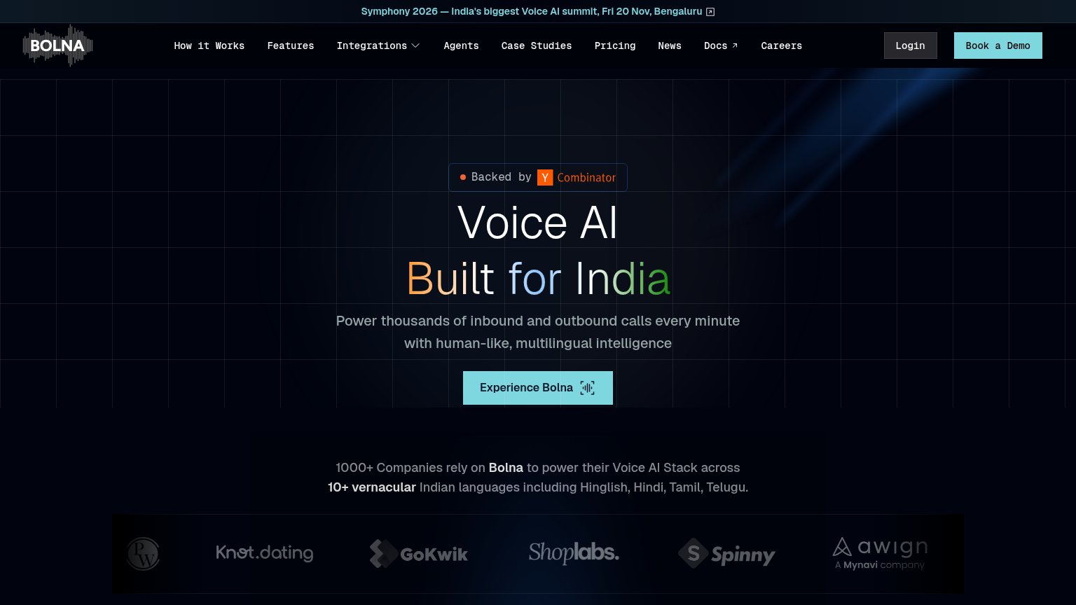
- Ten-item nav row — Ten equal-weight links plus Login and Docs (external) compete with 'Book a Demo' before the visitor reaches the hero.
- Dual competing CTAs — 'Book a Demo' in the nav and 'Experience Bolna' in the hero split the primary action into two similarly styled teal-adjacent buttons.
- Symphony summit banner — Top banner links away to an event page — the first clickable element on the page is an exit path.
- 'Experience Bolna' label — The hero CTA label is ambiguous about what happens next (demo? call? signup?), weakening the scan-path payoff.
CTA
68FairCopy, size, verb, cost-feel — does the primary CTA earn the click?

Problems
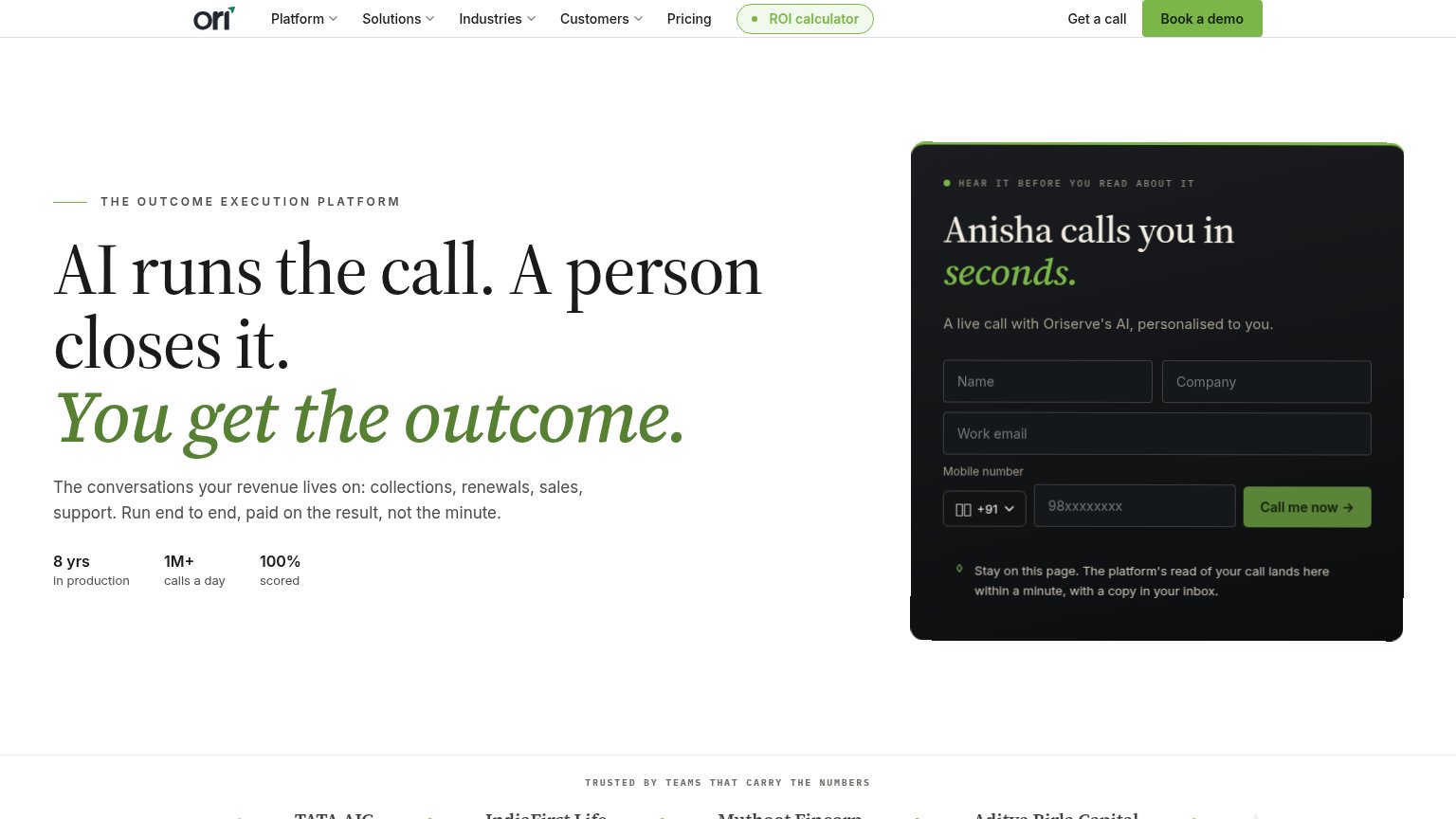
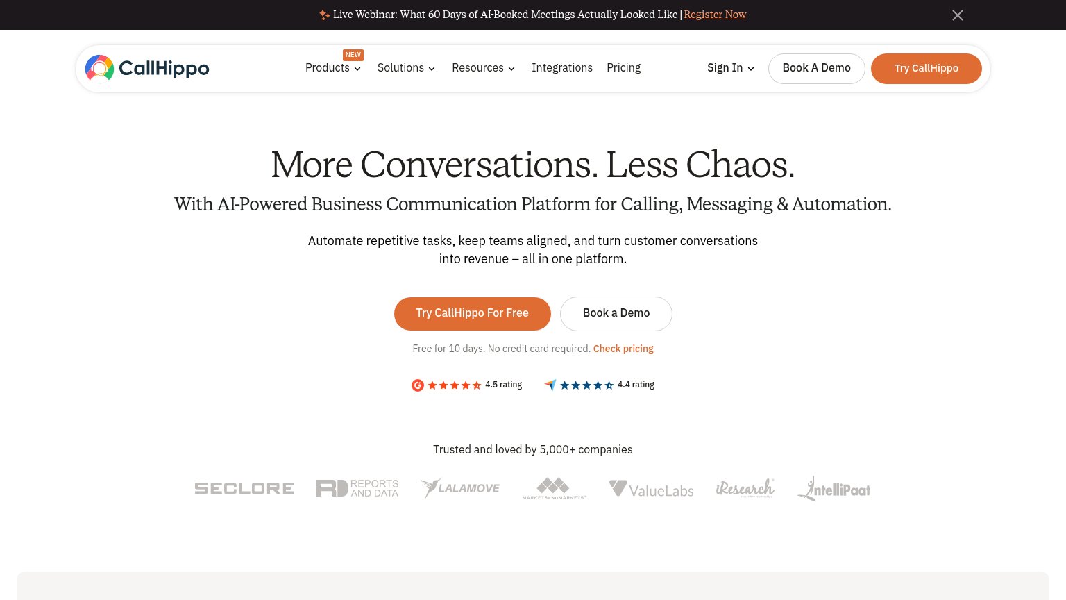
- vague payoff — 'Experience' what?
- competes with nav's 'Book a Demo'
- no zero-commitment signal visible
Value props
76FairTitle, subtitle, hero — do they sell the product's true value?
Bolna AI’s headline
Voice AI Built for India
Power thousands of inbound and outbound calls every minute with human-like, multilingual intelligence
Working
Could improve
Mobile web
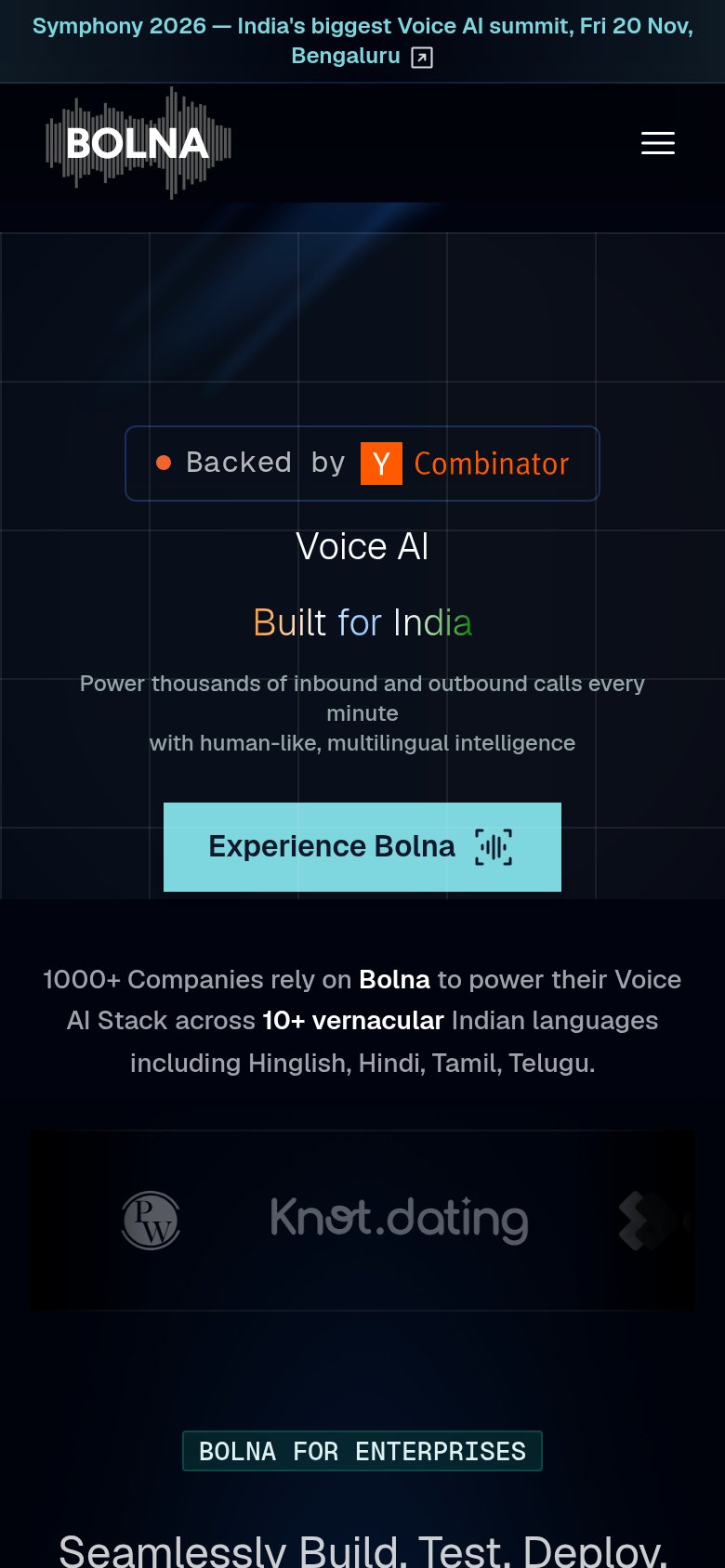
76FairThe phone experience as a first-class citizen.
What works
What to improve
Trust
78FairProof that the product is real, competent, and safe to try.
How Bolna AI compares
Trust read