
Your landing page’s weakest score is Information hierarchy.
How NetBird ranks
77Growth scoreupdated
category scores
category scoresShowHide
Information hierarchy
72FairDoes the design help or inhibit what the page is trying to say?
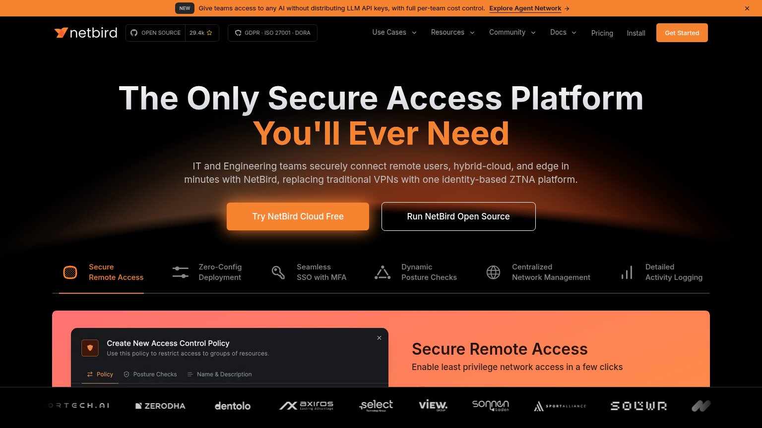 1234
- Announcement banner link — Off-topic "Explore Agent Network" banner is the first clickable thing and pulls visitors away before the headline.
- Run Open Source button — Same size and position weight as "Try NetBird Cloud Free", forcing a fork in the primary action.
- Get Started nav button — Second orange CTA duplicates the hero's intent from another corner, splitting the scan path.
- Six feature tabs — Six equal-weight tab labels directly under the CTAs read as a feature index competing with the single argument above.
Value props
72FairTitle, subtitle, hero — do they sell the product's true value?
NetBird’s headline vague
The Only Secure Access Platform You'll Ever Need
IT and Engineering teams securely connect remote users, hybrid-cloud, and edge in minutes with NetBird, replacing traditional VPNs with one identity-based ZTNA platform.
Working
- Subhead names audience and VPN enemy
- Real product UI demonstrates the claim
- 'In minutes' promises speed outcome
Could improve
- H1 is a generic category superlative
- No hard numbers beyond GitHub stars
- True value buried in the subhead
Mobile web
72FairThe phone experience as a first-class citizen.
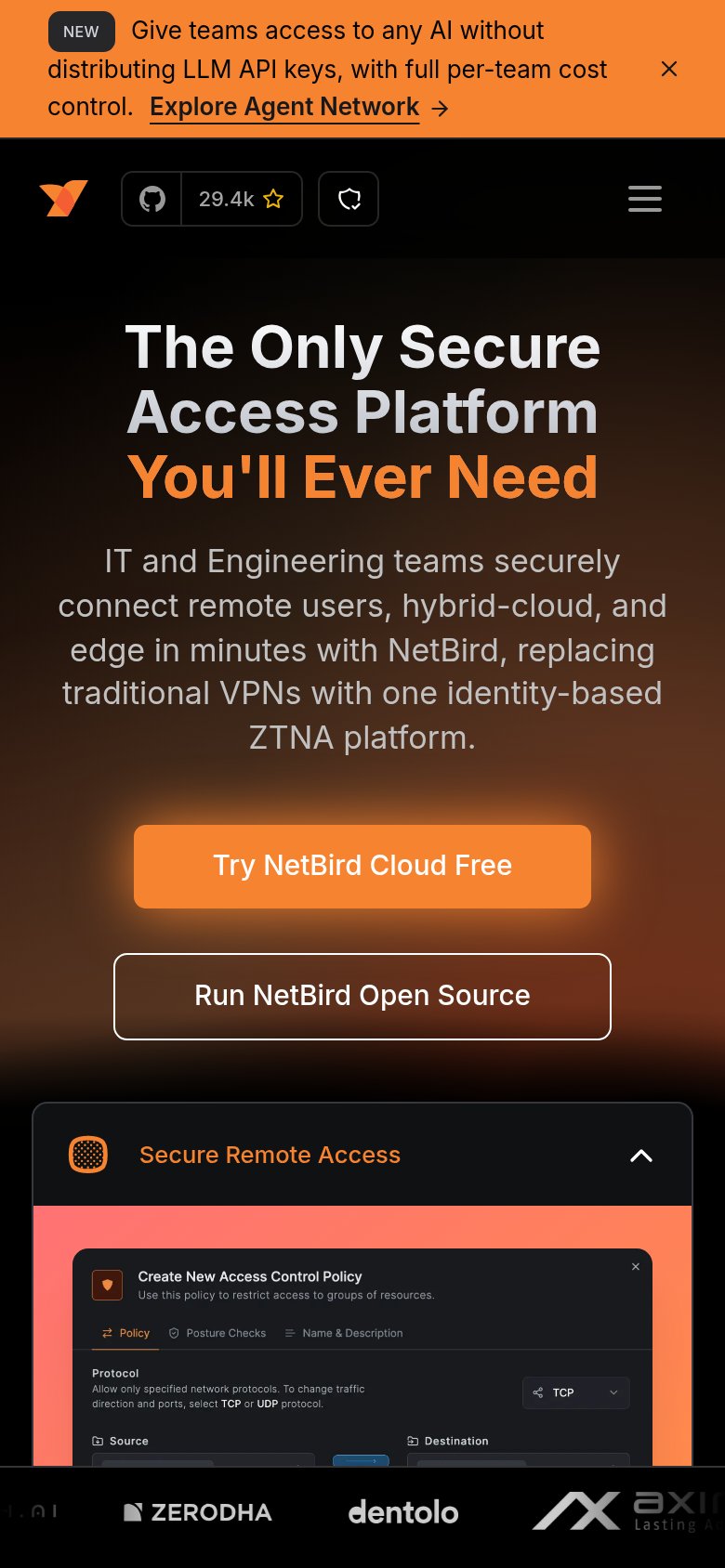
What works
What to improve
Trust
82StrongProof that the product is real, competent, and safe to try.
How NetBird compares
Trust read
CTA
86StrongCopy, size, verb, cost-feel — does the primary CTA earn the click?
How NetBird compares
Recommended rewrites