
Your landing page’s weakest score is Information hierarchy.
How Morph ranks
23Growth scoreupdated
category scores
category scoresShowHide
Information hierarchy
18PoorDoes the design help or inhibit what the page is trying to say?
 123
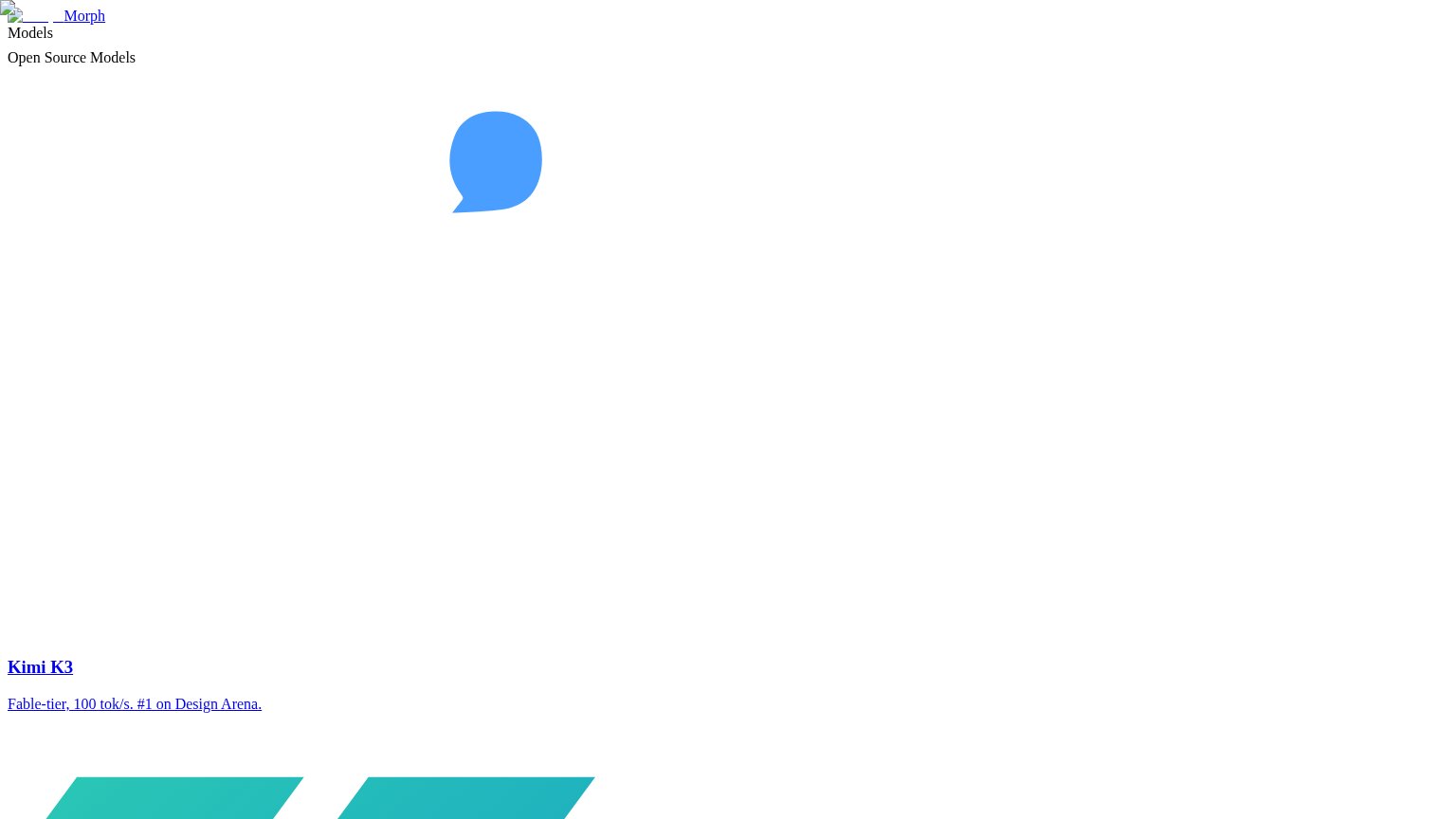
- Unstyled model links — "Kimi K3" and the Design Arena claim render as default blue underlined links with no hierarchy or context.
- Broken logo image — The header shows a broken-image placeholder icon beside the Morph wordmark, signaling a failed page load.
- Detached speech-bubble graphic — The blue blob floats mid-page with no accompanying text, outranking a value prop that never appears.
Trust
18PoorProof that the product is real, competent, and safe to try.
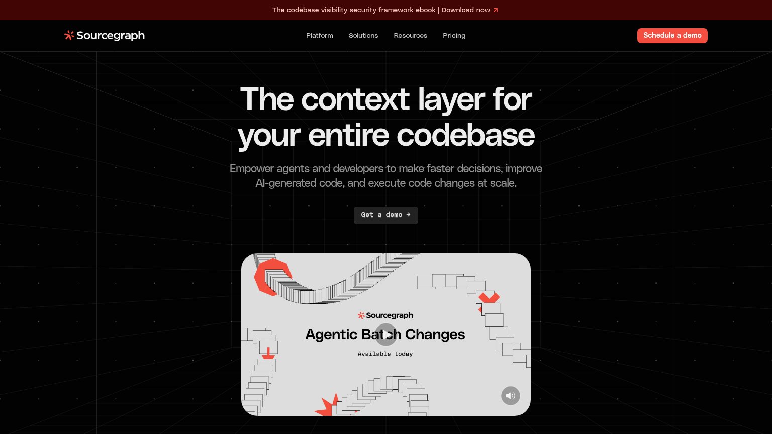
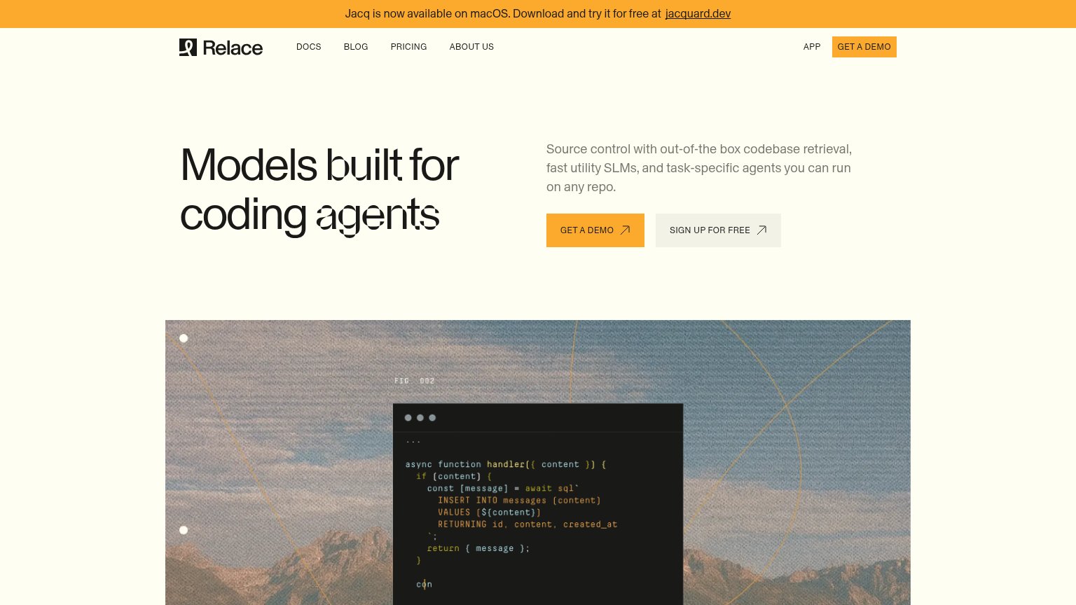
| Trust read | |
|---|---|
| Morph | "#1 on Design Arena" claim in the Kimi K3 link |
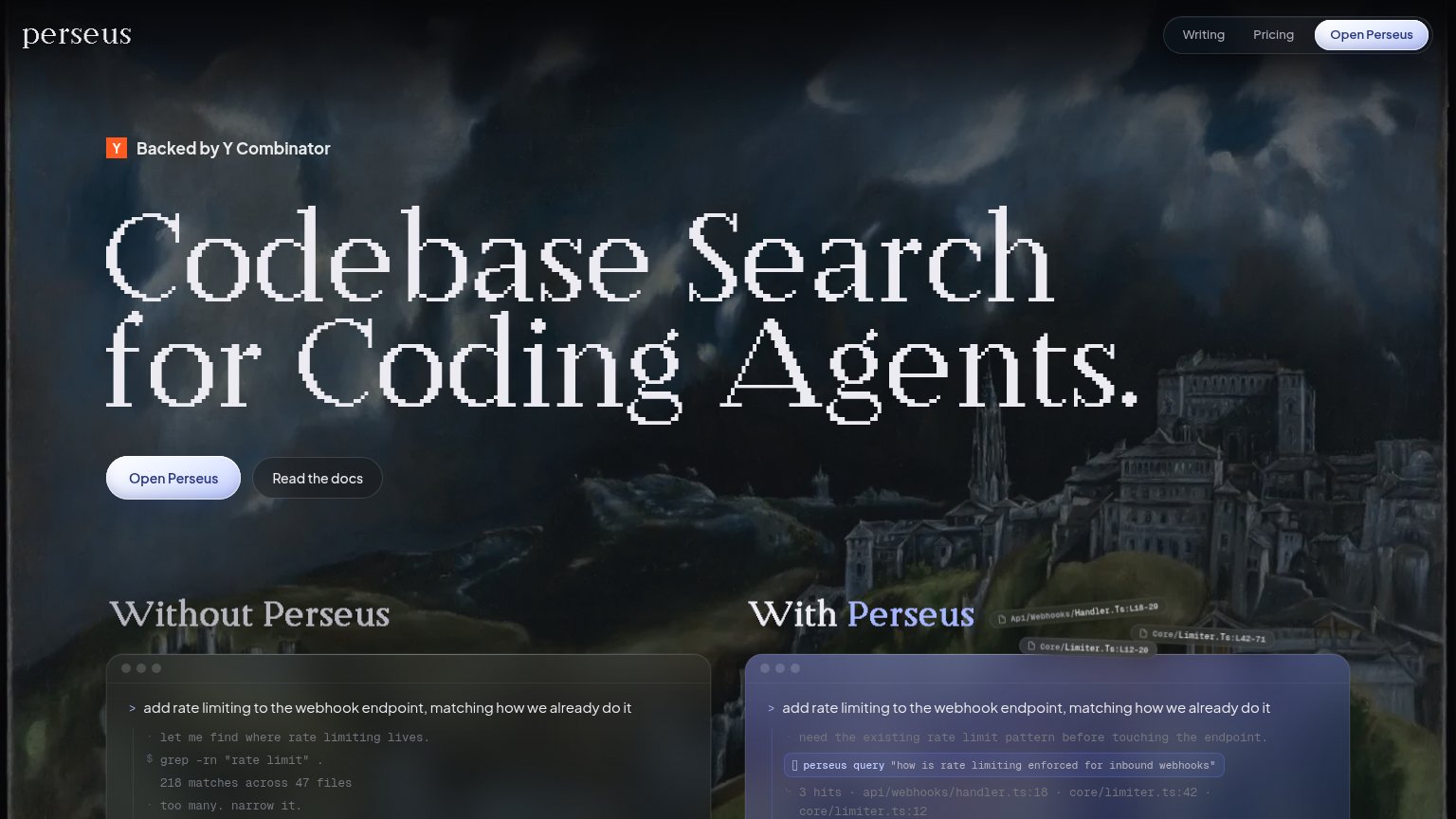
| "Backed by Y Combinator" badge above the hero headline | |
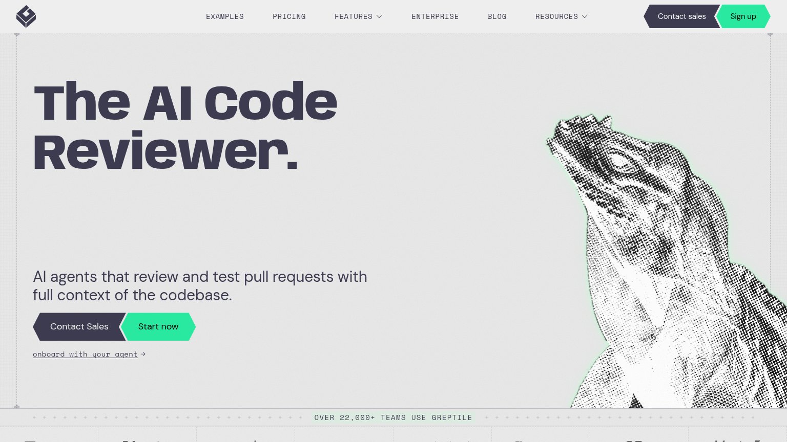
| "OVER 22,000+ TEAMS USE GREPTILE" usage banner | |
| Video card labeled "Agentic Batch Changes — Available today" | |
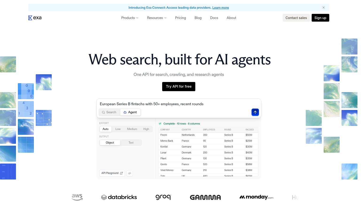
| Customer logo wall showing AWS, Databricks, Groq, Gamma, and monday.com | |
| Code snippet visual ("async function handler...") suggesting a developer-focused product |
Mobile web
18PoorThe phone experience as a first-class citizen.
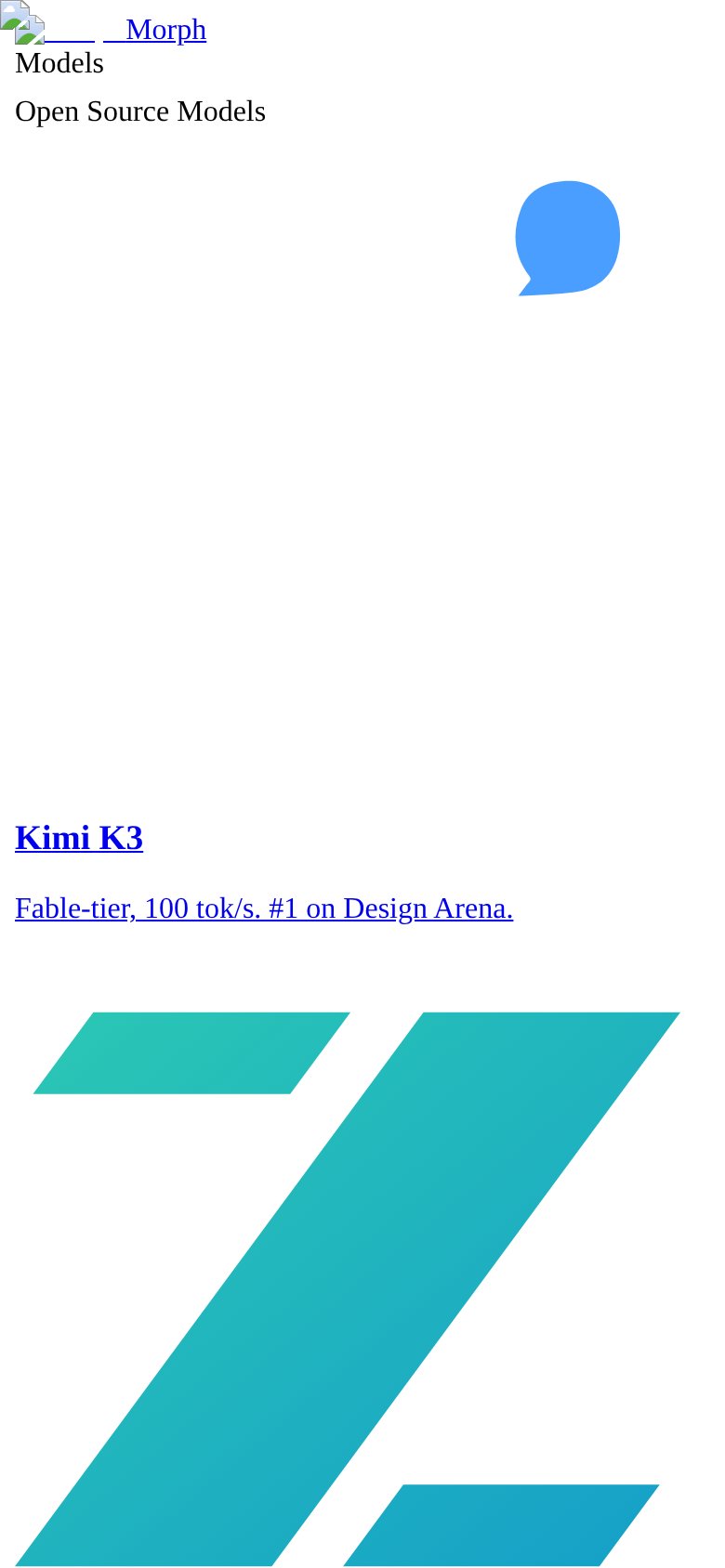
What works
What to improve
Value props
28PoorTitle, subtitle, hero — do they sell the product's true value?
Morph’s headline
Kimi K3
Fable-tier, 100 tok/s. #1 on Design Arena.
Working
Could improve
CTA
32PoorCopy, size, verb, cost-feel — does the primary CTA earn the click?
How Morph compares
Recommended rewrites