
Your landing page’s weakest score is Trust.
How Sourcegraph ranks
Trust
42PoorProof that the product is real, competent, and safe to try.
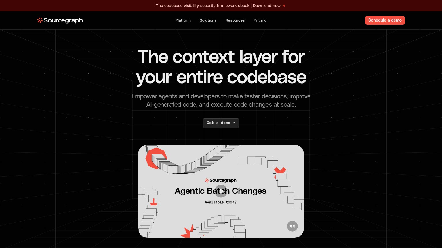
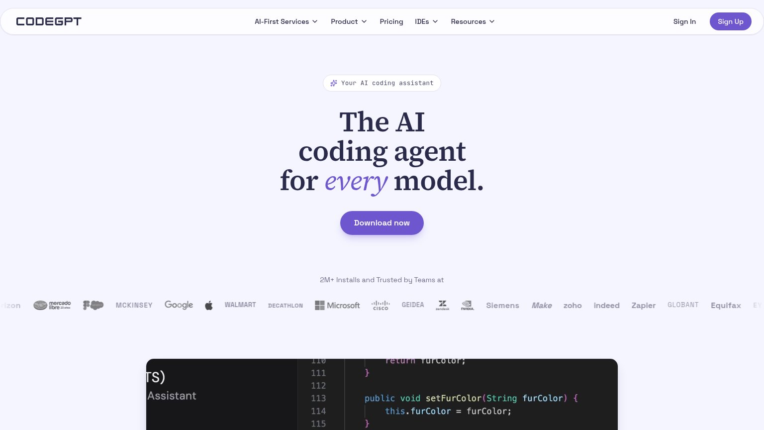
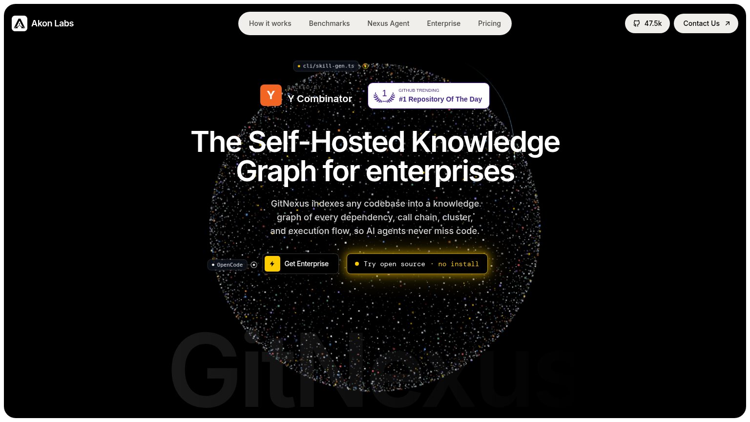

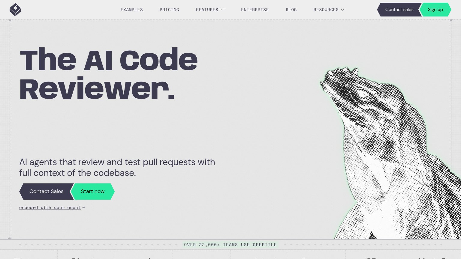
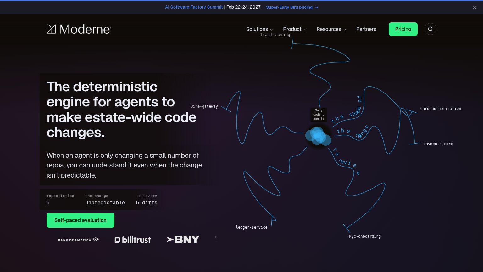
| Trust read | |
|---|---|
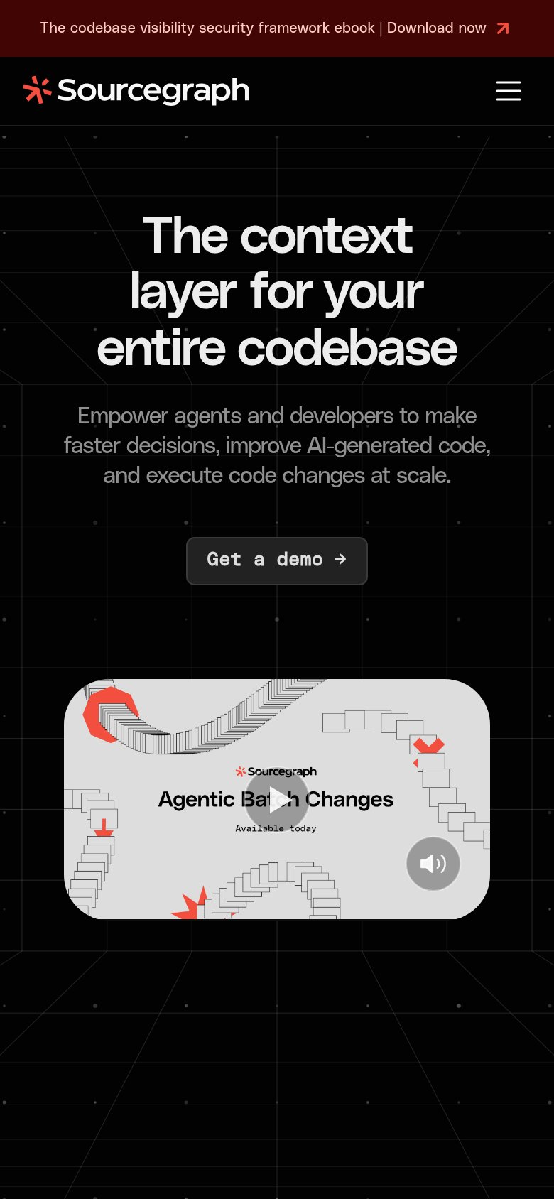
| Sourcegraph | Video card labeled "Agentic Batch Changes — Available today" |
| 47.5k GitHub star counter in the navigation | |
| "OVER 22,000+ TEAMS USE GREPTILE" usage banner | |
| Customer logo row: Bank of America, Billtrust, BNY beneath the CTA | |
| "2M+ Installs and Trusted by Teams at" followed by Microsoft, Google, Walmart, Cisco, NVIDIA logo wall | |
| "Trusted by leading engineering teams" logo strip with Cribl, Clio, Cloudbeds, Big Cartel, dott, and perk+ |
CTA
62FairCopy, size, verb, cost-feel — does the primary CTA earn the click?
Problems
- demo click feels costly, sales-gated
- low-contrast gray button in hero
- label differs from nav's 'Schedule a demo'
- hero button smaller than nav CTA pull
Value props
68FairTitle, subtitle, hero — do they sell the product's true value?
Sourcegraph’s headline
The context layer for your entire codebase
Empower agents and developers to make faster decisions, improve AI-generated code, and execute code changes at scale.
Working
Could improve
Information hierarchy
76FairDoes the design help or inhibit what the page is trying to say?
What works
What to improve
Mobile web
78FairThe phone experience as a first-class citizen.
What works
What to improve