
Your landing page’s weakest score is Trust.
How Mogo ranks
Trust
38PoorProof that the product is real, competent, and safe to try.
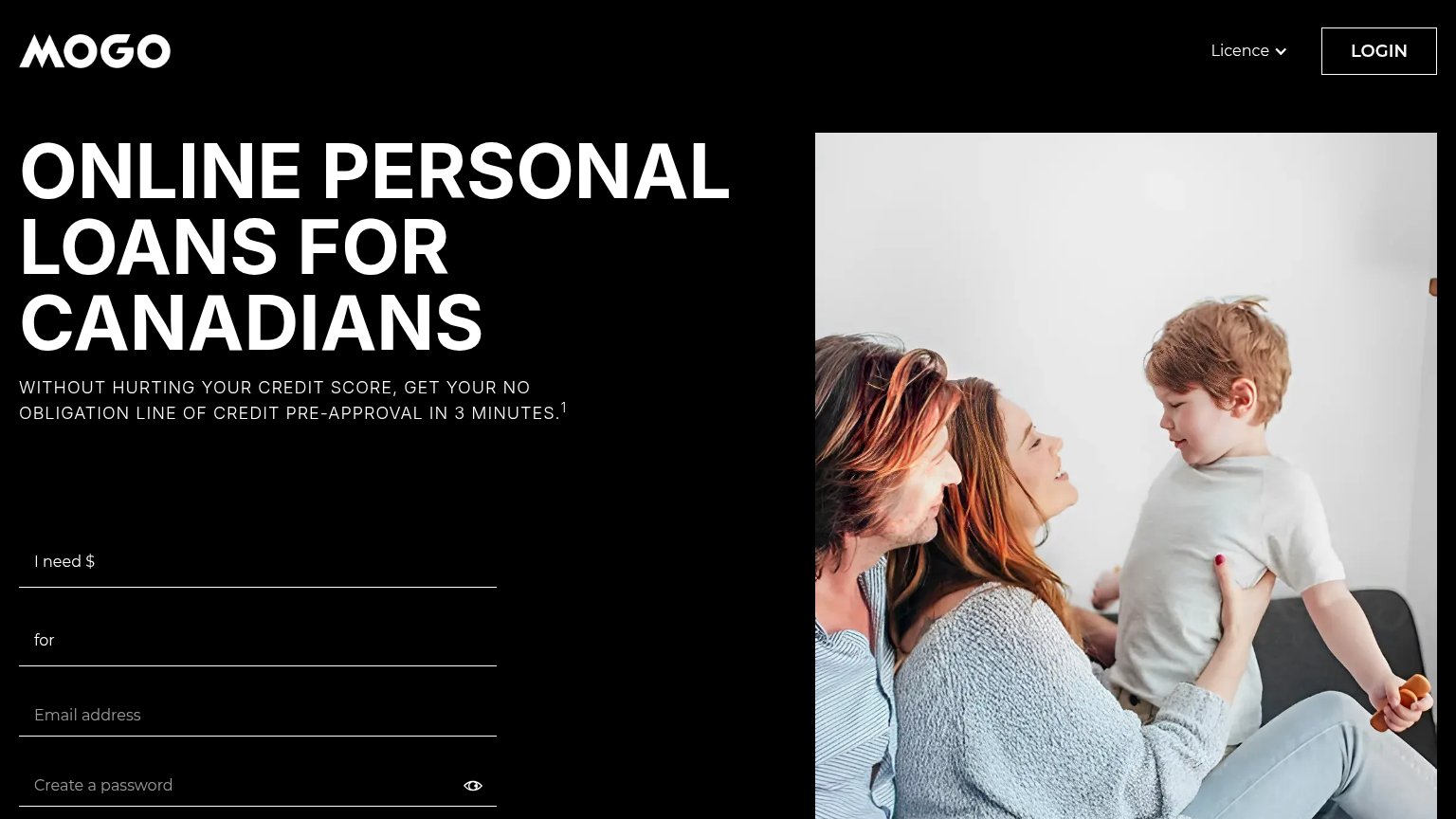
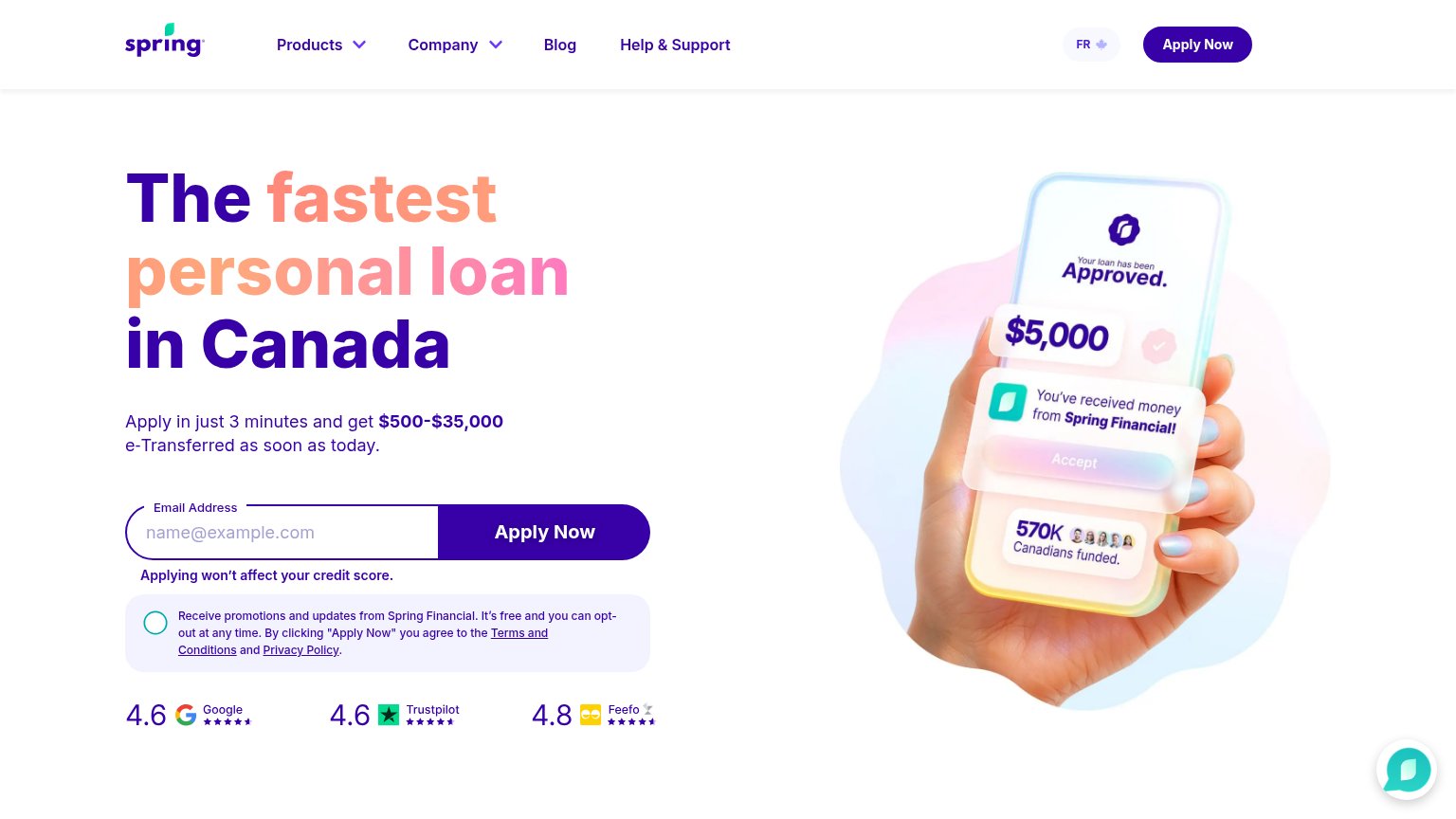
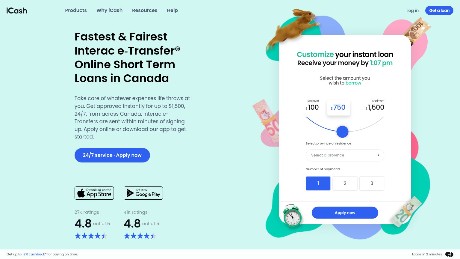

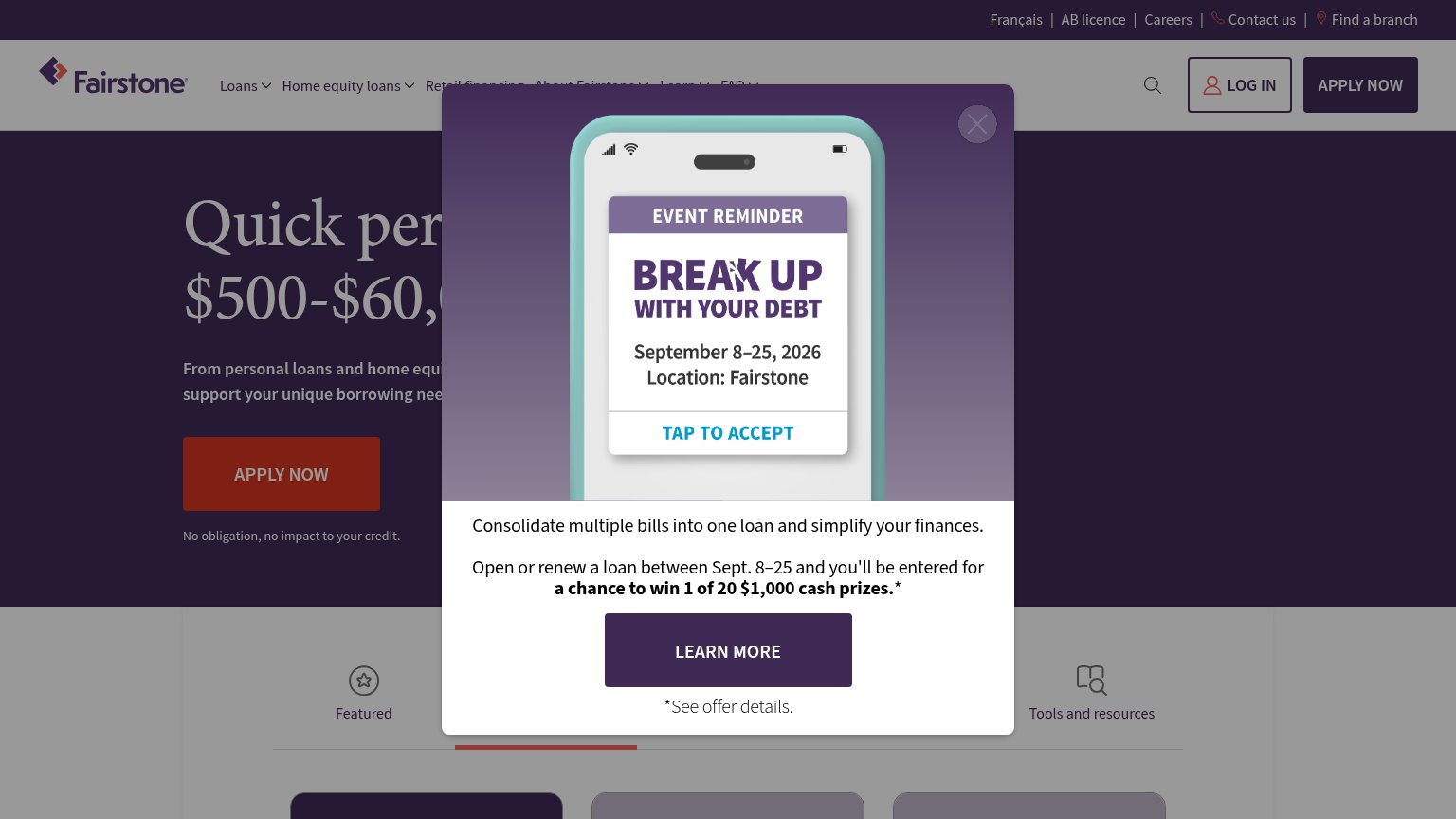
| Trust read | |
|---|---|
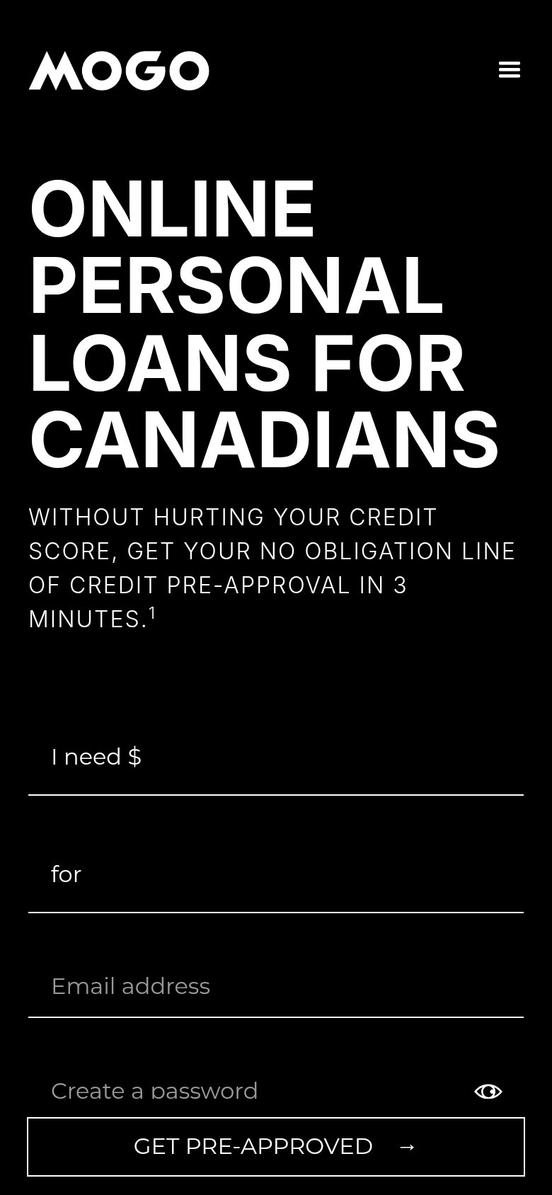
| Mogo | "WITHOUT HURTING YOUR CREDIT SCORE, GET YOUR NO OBLIGATION LINE OF CREDIT PRE-APPROVAL IN 3 MINUTES." subheadline |
| Trustpilot badge: "Excellent 4.8 out of 5" | |
| Review-score bar: "4.6 Google, 4.6 Trustpilot, 4.8 Feefo" beneath the Apply Now form | |
| "No obligation, no impact to your credit." beneath the APPLY NOW button | |
| "41K ratings 4.8 out of 5" beside the Google Play badge | |
| "Available on" App Store / Google Play badges (mobile capture) |
CTA
68FairCopy, size, verb, cost-feel — does the primary CTA earn the click?
Problems
- submit cut off on desktop fold
- password field raises commitment
- 4 fields before first value
- arrow adds no meaning to label
Mobile web
68FairThe phone experience as a first-class citizen.
What works
What to improve
Information hierarchy
72FairDoes the design help or inhibit what the page is trying to say?
What works
What to improve
Value props
72FairTitle, subtitle, hero — do they sell the product's true value?
Mogo’s headline
ONLINE PERSONAL LOANS FOR CANADIANS
WITHOUT HURTING YOUR CREDIT SCORE, GET YOUR NO OBLIGATION LINE OF CREDIT PRE-APPROVAL IN 3 MINUTES.
Working
Could improve