
Your landing page’s weakest score is Mobile web.
How Fairstone ranks
Mobile web
42PoorThe phone experience as a first-class citizen.
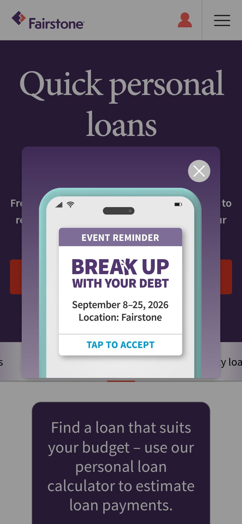
The mobile fold is dominated by a "Break Up With Fairstone's Debt" promo modal that sits directly on top of the red "Apply now" button, leaving only two slivers of the primary CTA visible on either side — the tap the page exists to capture is physically blocked. The modal itself is a working pop-up (it routes to a loan-renewal contest), but on the phone its "Learn more" button and prize copy are cut off below the fold, so it blocks the primary action without even completing its own conversion job. Behind the overlay, the fundamentals are decent: the nav collapses to a clean hamburger-plus-login header, and the "Quick personal loans" headline scales legibly at two lines. The single biggest lever is suppressing or shrinking the promo modal on mobile so the full-width "Apply now" button is tappable in the first viewport.
Trust
44PoorProof that the product is real, competent, and safe to try.
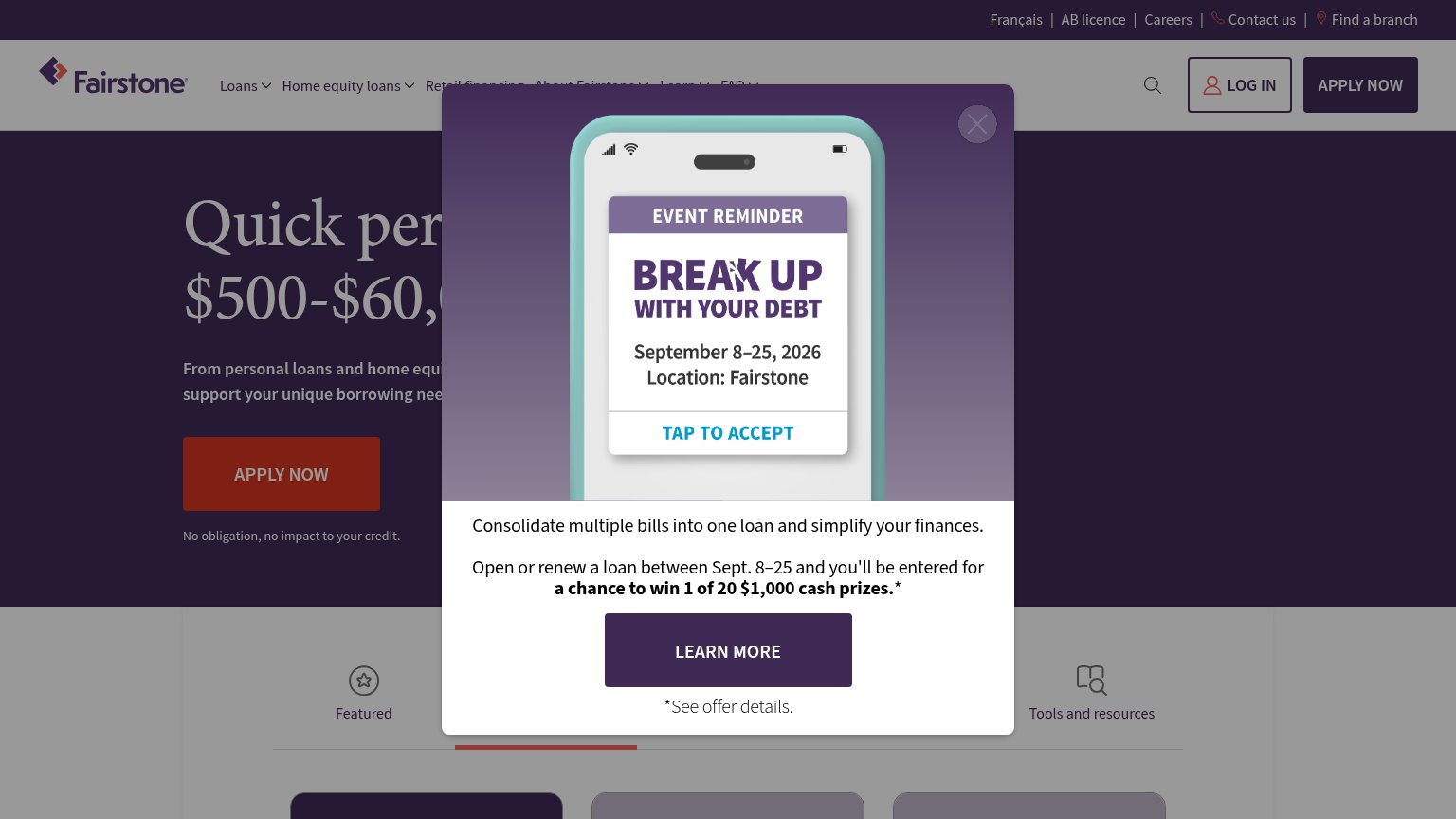
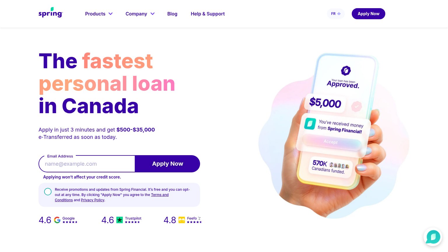
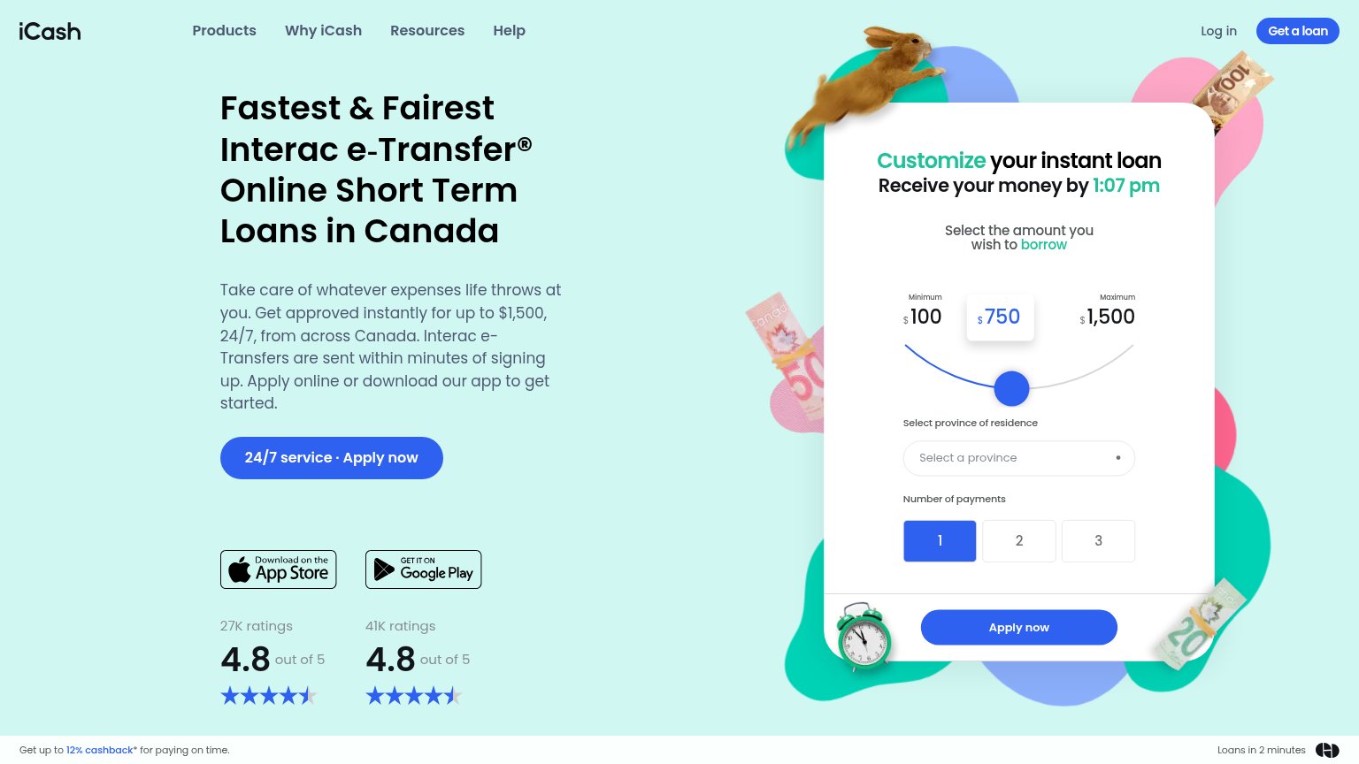

| Trust read | |
|---|---|
| Fairstone | "No obligation, no impact to your credit." beneath the APPLY NOW button |
| Trustpilot badge: "Excellent 4.8 out of 5" | |
| "WITHOUT HURTING YOUR CREDIT SCORE, GET YOUR NO OBLIGATION LINE OF CREDIT PRE-APPROVAL IN 3 MINUTES." subheadline | |
| Review-score bar: "4.6 Google, 4.6 Trustpilot, 4.8 Feefo" beneath the Apply Now form | |
| "41K ratings 4.8 out of 5" beside the Google Play badge | |
| "Available on" App Store / Google Play badges (mobile capture) |
Information hierarchy
48PoorDoes the design help or inhibit what the page is trying to say?
What works
What to improve
Value props
64FairTitle, subtitle, hero — do they sell the product's true value?
Quick personal loans $500-$60,000
From personal loans and home equity loans... support your unique borrowing needs
Working
Could improve
CTA
68FairCopy, size, verb, cost-feel — does the primary CTA earn the click?
How Fairstone compares
Recommended rewrites