
Your landing page’s weakest score is Information hierarchy.
How Karoo ranks
56Growth scoreupdated
category scores
category scoresShowHide
Information hierarchy
42PoorDoes the design help or inhibit what the page is trying to say?
 123
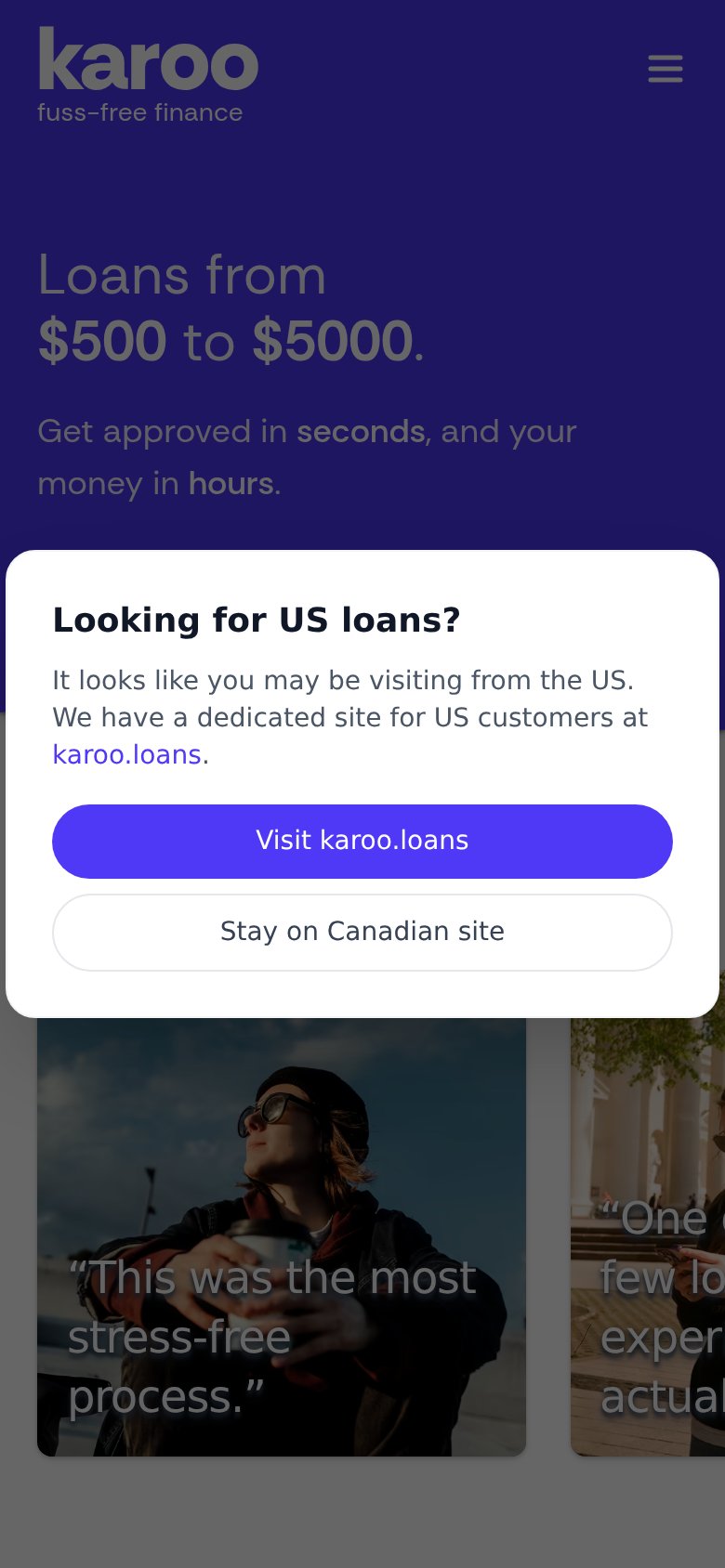
- US loans geo-modal — Overlay dims the headline and steals the fold's only bold CTA, pushing visitors off-site to karoo.loans.
- Testimonial card row — Five equal-weight photo cards with low-contrast overlaid quotes compete at once and read as noise, not proof.
- Nav links and Log in — Home, Who we are, Support and a boxed Log in outrank the absent primary action as the fold's only clickable paths.
CTA
42PoorCopy, size, verb, cost-feel — does the primary CTA earn the click?
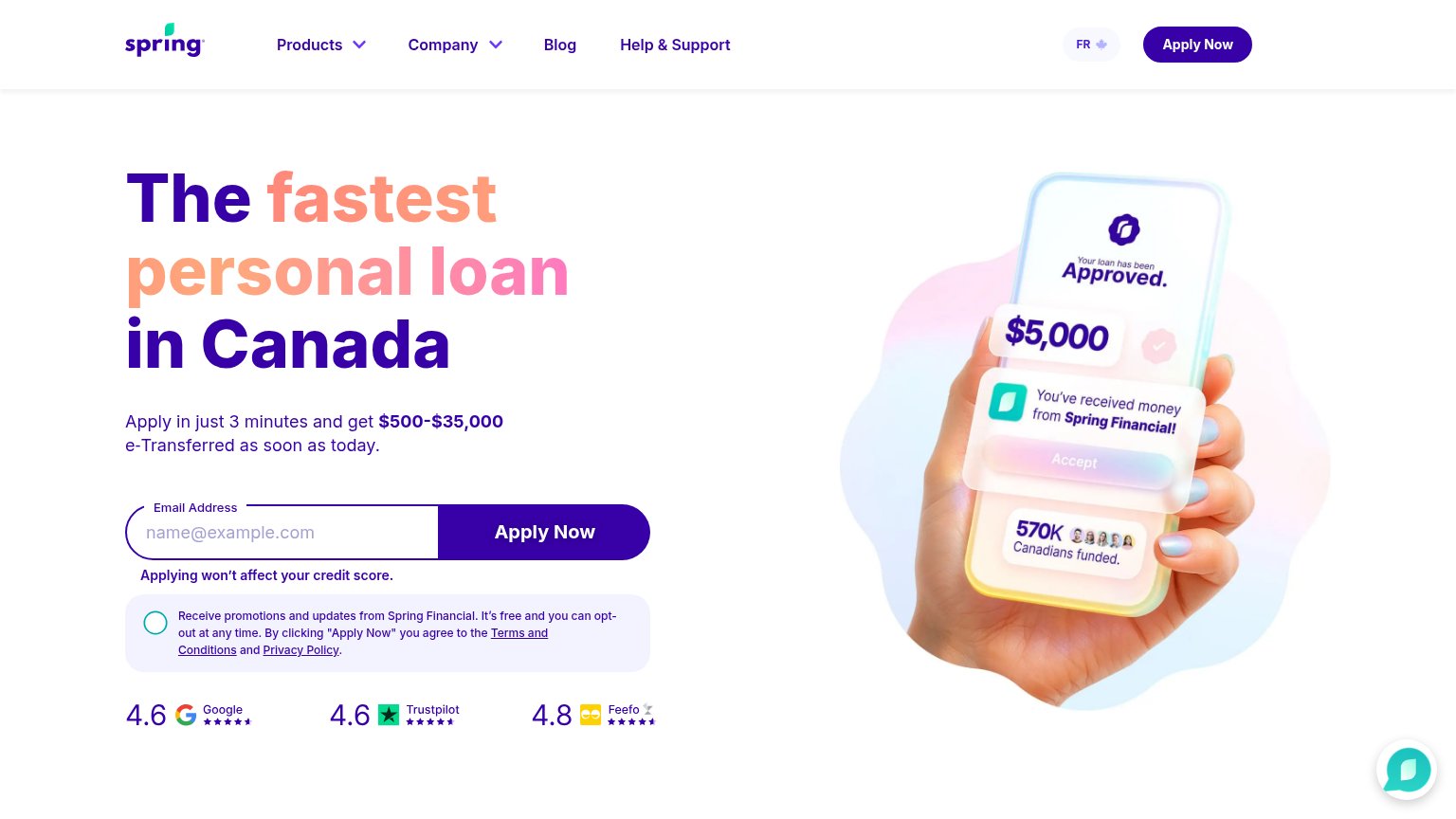
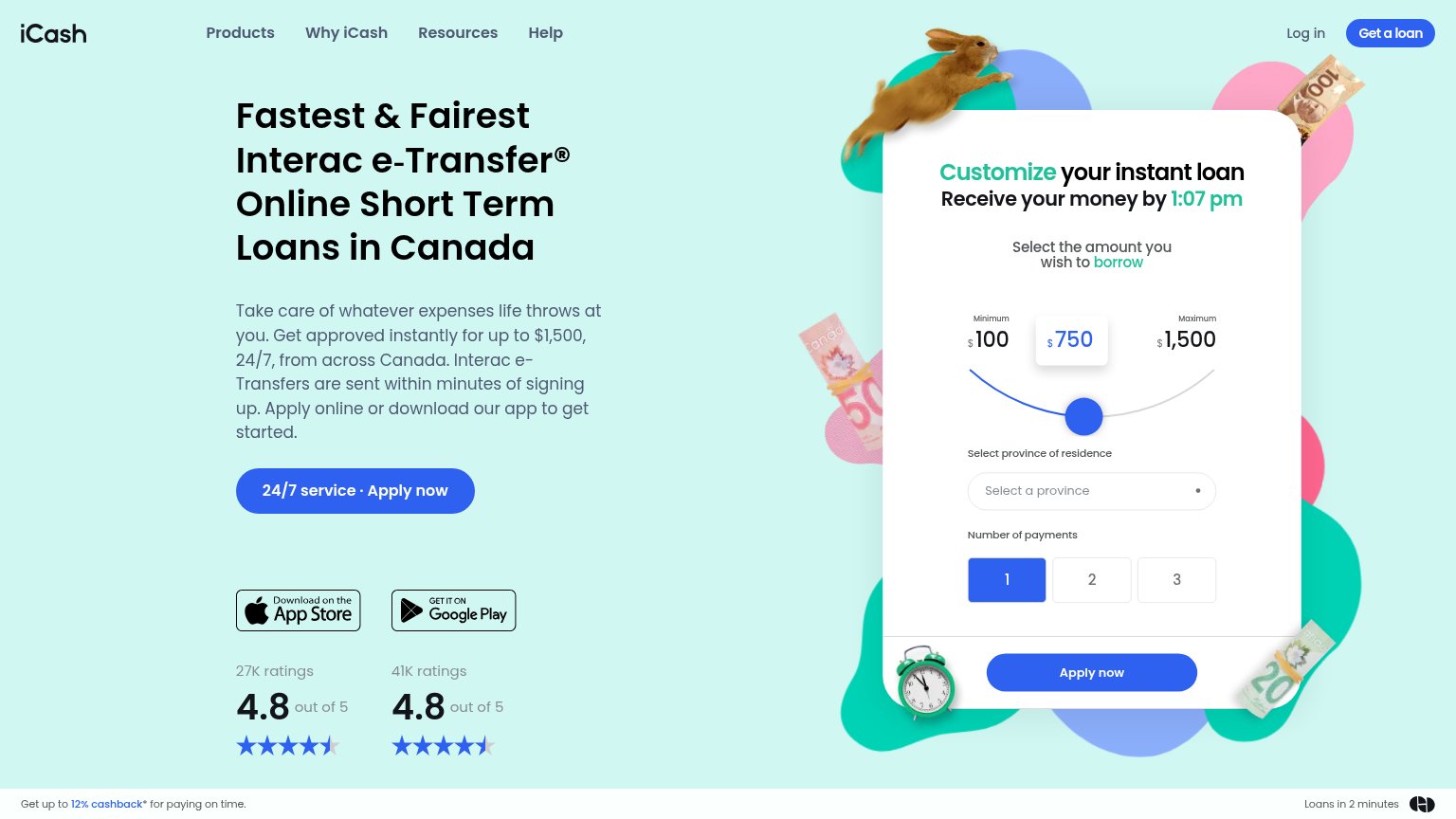
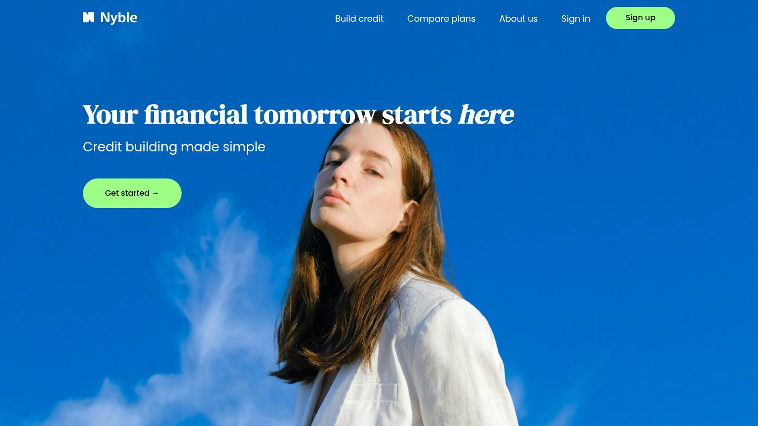
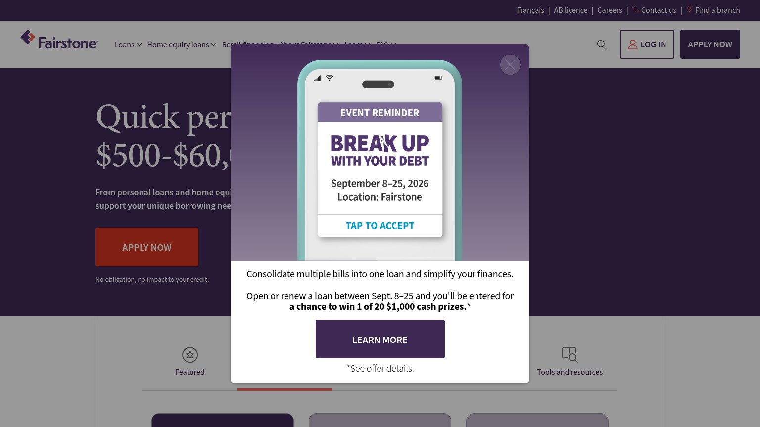
Problems
- no primary CTA in hero
- modal hijacks the fold
- only nav 'Log in' to click
- no path to apply for a loan
Mobile web
52FairThe phone experience as a first-class citizen.
What works
What to improve
Trust
58FairProof that the product is real, competent, and safe to try.
How Karoo compares
Trust read
Value props
84StrongTitle, subtitle, hero — do they sell the product's true value?
Karoo’s headline
Loans from $500 to $5000.
Get approved in seconds, and your money in hours.
Working
Could improve