
Your landing page’s weakest score is Mobile web.
How iCash ranks
Mobile web
64FairThe phone experience as a first-class citizen.
 123
- Oversized hero headline — Desktop-sized type wraps into six lines and eats most of the first viewport.
- Below-fold Apply CTA — The primary "Apply now" button sits under two text blocks, out of the first tap zone.
- Long intro paragraph — Seven wrapped lines plus a second sentence block stack between headline and CTA.
Trust
68FairProof that the product is real, competent, and safe to try.
| Trust read | |
|---|---|
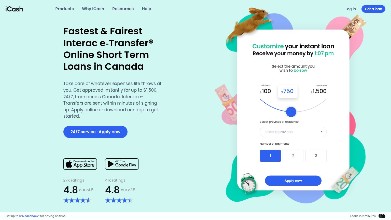
| iCash | "41K ratings 4.8 out of 5" beside the Google Play badge |
| Trustpilot badge: "Excellent 4.8 out of 5" | |
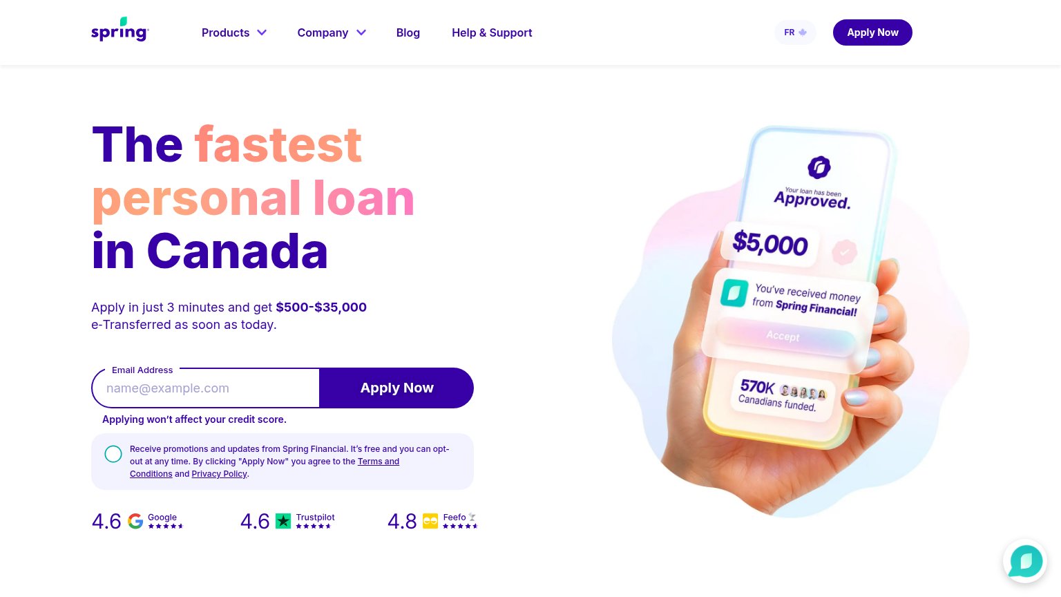
| "WITHOUT HURTING YOUR CREDIT SCORE, GET YOUR NO OBLIGATION LINE OF CREDIT PRE-APPROVAL IN 3 MINUTES." subheadline | |
| Review-score bar: "4.6 Google, 4.6 Trustpilot, 4.8 Feefo" beneath the Apply Now form | |
| "No obligation, no impact to your credit." beneath the APPLY NOW button | |
| "Available on" App Store / Google Play badges (mobile capture) |
Information hierarchy
72FairDoes the design help or inhibit what the page is trying to say?
What works
What to improve
CTA
76FairCopy, size, verb, cost-feel — does the primary CTA earn the click?
How iCash compares
Recommended rewrites
Value props
78FairTitle, subtitle, hero — do they sell the product's true value?
iCash’s headline
Fastest & Fairest Interac e-Transfer® Online Short Term Loans in Canada
Take care of whatever expenses life throws at you. Get approved instantly for up to $1,500, 24/7, from across Canada. Interac e-Transfers are sent within minutes of signing up. Apply online or download our app to get started.
Working
Could improve