
Your landing page’s weakest score is Trust.
How Markr ranks
Trust
42PoorProof that the product is real, competent, and safe to try.
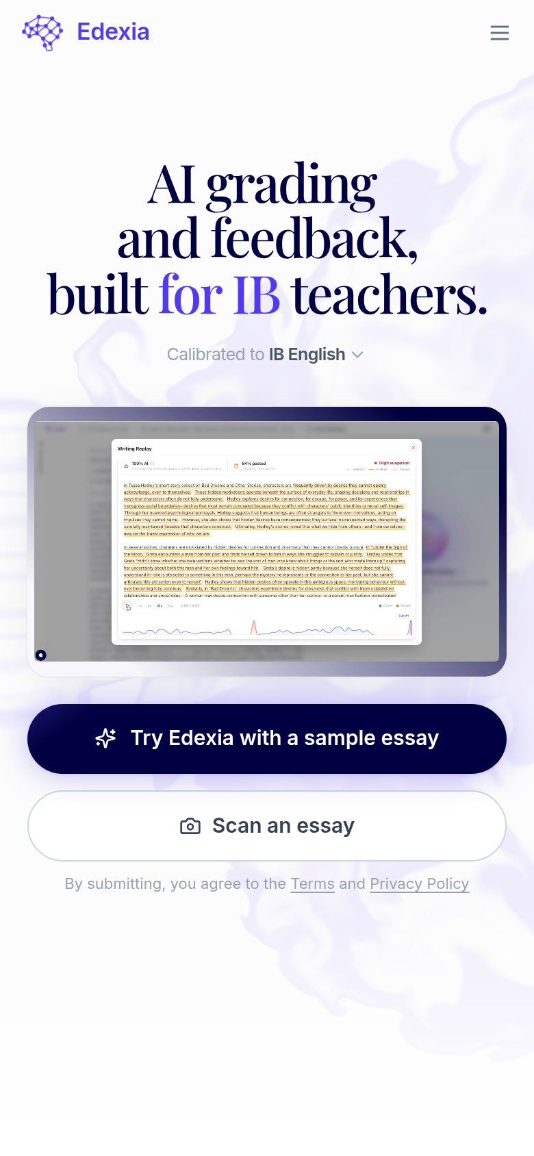
| Trust read | |
|---|---|
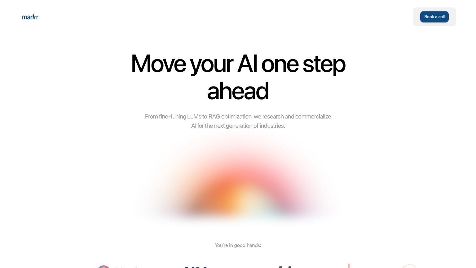
| Markr | "You're in good hands:" customer logo strip (partially visible at bottom of desktop fold) |
| Mobile "Writing Replay" product screenshot showing graded essay feedback, AI-detection scores, and a writing timeline | |
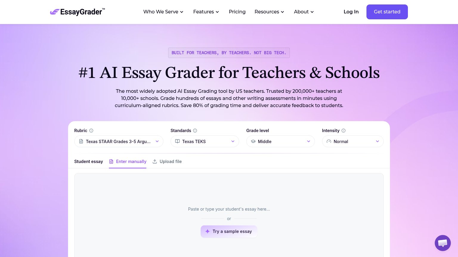
| "Trusted by 200,000+ teachers at 10,000+ schools" | |
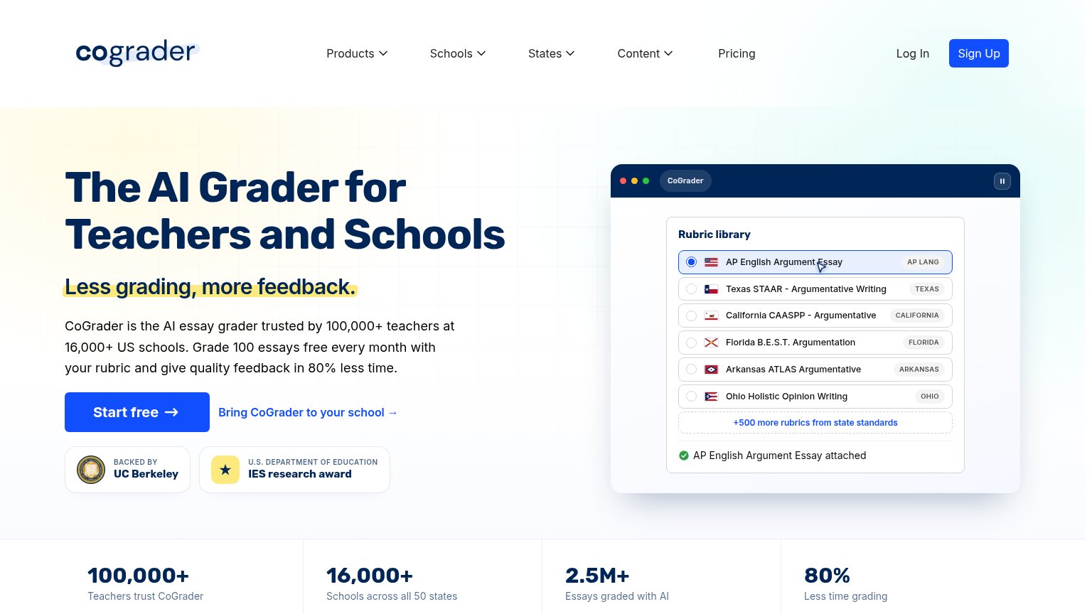
| "BACKED BY UC Berkeley" and "U.S. DEPARTMENT OF EDUCATION IES research award" badges beneath the CTA | |
| No visible trust signal identified. | |
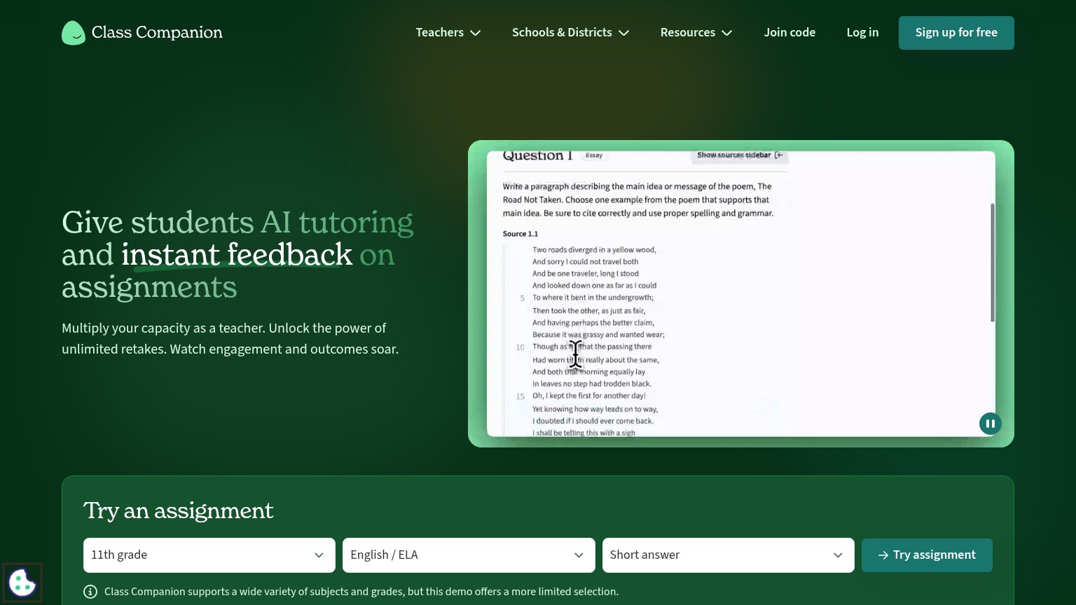
| Live product demo video showing a real assignment ("The Road Not Taken" essay question with student answer box and Submi |
Mobile web
48PoorThe phone experience as a first-class citizen.
 12
- Hamburger hides only CTA — "Book a call" is collapsed into the menu, leaving no tappable action anywhere in the mobile fold.
- Oversized hero headline — Headline wraps to four huge lines and eats most of the viewport before the value statement lands.
Value props
52FairTitle, subtitle, hero — do they sell the product's true value?
Markr’s headline
Move your AI one step ahead
From fine-tuning LLMs to RAG optimization, we research and commercialize AI for the next generation of industries.
Working
Could improve
CTA
58FairCopy, size, verb, cost-feel — does the primary CTA earn the click?
How Markr compares
Recommended rewrites
Information hierarchy
72FairDoes the design help or inhibit what the page is trying to say?
What works
What to improve