
Your landing page’s weakest score is Trust.
How Edexia ranks
69Growth scoreupdated
category scores
category scoresShowHide
Trust
48PoorProof that the product is real, competent, and safe to try.
| Trust read | |
|---|---|
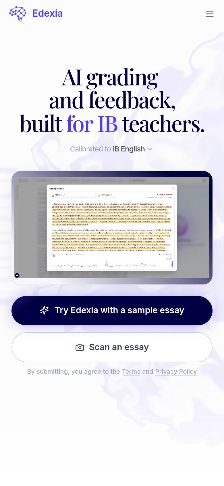
| Edexia | Mobile "Writing Replay" product screenshot showing graded essay feedback, AI-detection scores, and a writing timeline |
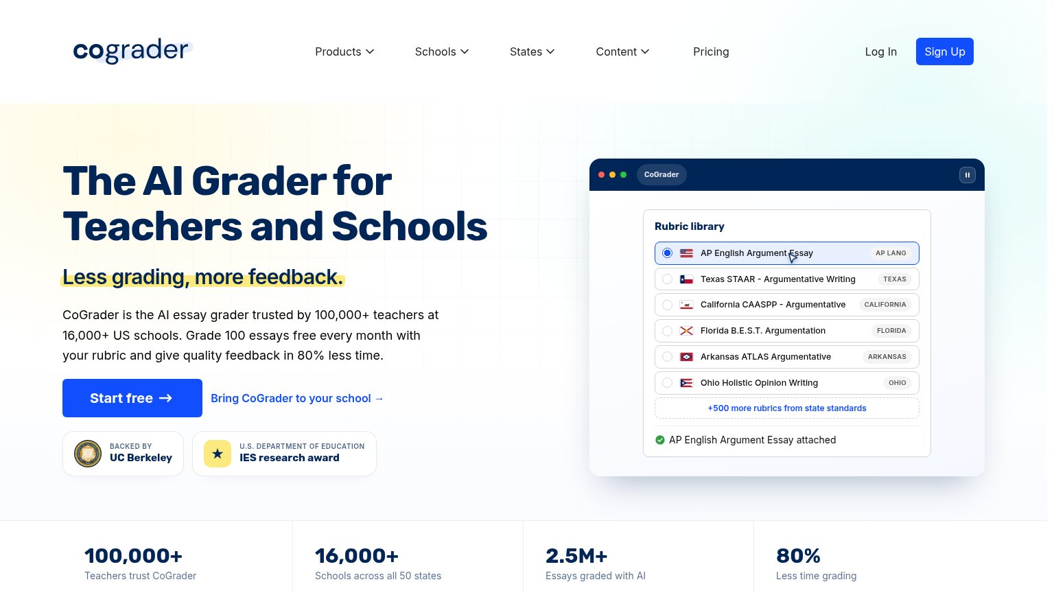
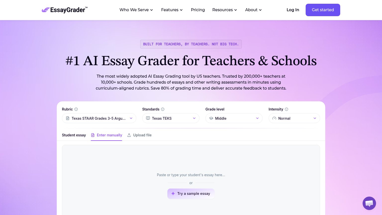
| "Trusted by 200,000+ teachers at 10,000+ schools" | |
| "BACKED BY UC Berkeley" and "U.S. DEPARTMENT OF EDUCATION IES research award" badges beneath the CTA | |
| "You're in good hands:" customer logo strip (partially visible at bottom of desktop fold) | |
| No visible trust signal identified. | |
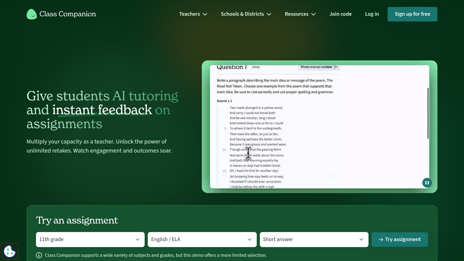
| Live product demo video showing a real assignment ("The Road Not Taken" essay question with student answer box and Submi |
Information hierarchy
68FairDoes the design help or inhibit what the page is trying to say?
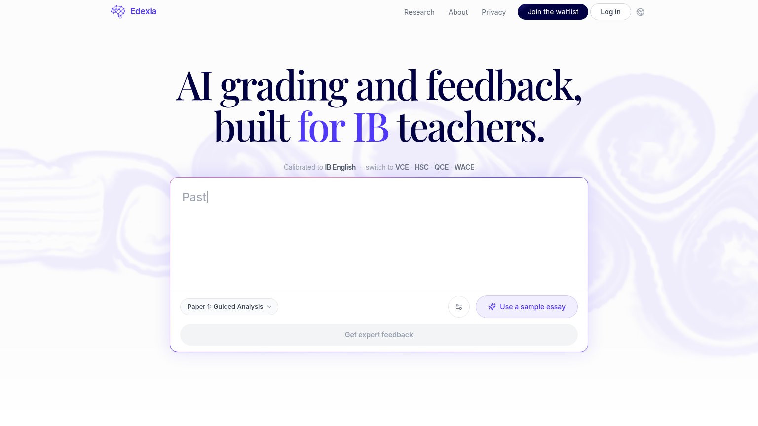 1234
- Get expert feedback button — The primary CTA is rendered in disabled grey, making the fold's one action the least visible element on the page.
- Join the waitlist button — The only high-contrast button in the fold sits in the nav corner and competes with the essay-input flow as the implied primary action.
- Exam board switch links — Five bolded links (IB English, VCE, HSC, QCE, WACE) sit directly between headline and input, adding a decision step before the action.
- Empty essay textarea — The large input shows only a truncated 'Past' placeholder, giving no instruction on what to paste or what happens next.
CTA
72FairCopy, size, verb, cost-feel — does the primary CTA earn the click?
How Edexia compares
Recommended rewrites
Value props
74FairTitle, subtitle, hero — do they sell the product's true value?
Edexia’s headline
AI grading and feedback, built for IB teachers.
Calibrated to IB English · switch to VCE · HSC · QCE · WACE
Working
Could improve
Mobile web
82StrongThe phone experience as a first-class citizen.
What works
What to improve