
Your landing page’s weakest score is Mobile web.
How CoGrader ranks
78Growth scoreupdated
category scores
category scoresShowHide
Mobile web
58FairThe phone experience as a first-class citizen.
 1
- Long body paragraph — A four-line desktop paragraph stacked under two headlines pushes any action further down the fold.
Information hierarchy
78FairDoes the design help or inhibit what the page is trying to say?
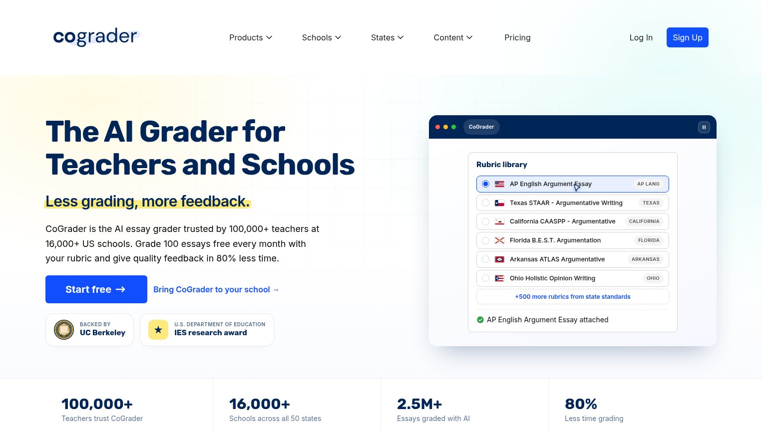 123
- Nav Sign Up button — Same solid-blue weight as "Start free," splitting the primary CTA scan between two identical buttons.
- Five nav dropdowns — Products, Schools, States, Content, and Pricing open leak paths before the visitor reaches the hero CTA.
- Bring-to-school link — Secondary CTA sits directly beside "Start free," pulling attention off the primary action.
Trust
78FairProof that the product is real, competent, and safe to try.
How CoGrader compares
Trust read
CTA
86StrongCopy, size, verb, cost-feel — does the primary CTA earn the click?
How CoGrader compares
Recommended rewrites
Value props
88StrongTitle, subtitle, hero — do they sell the product's true value?
CoGrader’s headline
The AI Grader for Teachers and Schools
Less grading, more feedback.
Working
Could improve